


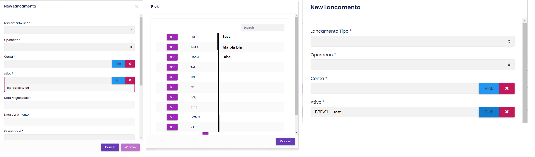
How to put 2 columns and search for them in a pick?
Hi guys, I have a little problem, how to put 2 columns and search for them in a pick, where could I make this change, in the back, front? html, proxy, controller? Can you give me an example
Check the docs before asking a question: https://docs.abp.io/en/commercial/latest/ Check the samples, to see the basic tasks: https://docs.abp.io/en/commercial/latest/samples/index The exact solution to your question may have been answered before, please use the search on the homepage.
If you're creating a bug/problem report, please include followings:
- ABP Framework version: v4.3.3
- UI type: Angular
- DB provider: EF Core
- Tiered (MVC) or Identity Server Separated (Angular): no
- Exception message and stack trace:
- Steps to reproduce the issue:"
2 Answer(s)
-
0
Hi @samuelhelou
Unfortunately, ABP lookup table component do not support displaying extra columns.
However, you can achieve this;
First way: You can handle this situation in backend side. So you can manipulate
displayNameprop like this:{displayName: "Code: HZON, Name: XXX" }With this way, you can display more than one information in one table column.Second way: You should create your lookup component and use it instead of the
abp-lookup-inputcomponent. You can follow the steps below to do this:- Create a new component with the following command:
yarn ng generate component shared/lookup-input --exportImport
SharedModuleto your module which is generated from ABP Suite.Open created
lookup-input.component.tsfile and replace its content with below code:
import { ABP, AbstractNgModelComponent, ListService } from '@abp/ng.core'; import { AfterViewInit, Component, Injector, Input } from '@angular/core'; import { NgControl } from '@angular/forms'; import { Observable } from 'rxjs'; @Component({ selector: 'app-lookup-input', templateUrl: 'lookup-input.component.html', providers: [ListService], }) export class LookupInputComponent extends AbstractNgModelComponent<string> implements AfterViewInit { @Input() getFn: (params: ABP.PageQueryParams) => Observable<ABP.PagedResponse<any>>; @Input() lookupNameProp = 'displayName'; @Input() displayNameProp = 'name'; @Input() editingData: any; @Input() pickButton = { show: true, disabled: false }; @Input() clearButton = { show: true, disabled: false }; @Input() cid?: string; selectedName = ''; isModalVisible: boolean; data = { items: [], totalCount: 0, }; pageQuery: ABP.PageQueryParams = { maxResultCount: 10, skipCount: 0, filter: '' }; private ngControl: NgControl; public readonly list: ListService; get isInvalid() { return this.ngControl.dirty && this.ngControl.invalid; } constructor(injector: Injector) { super(injector); this.list = injector.get(ListService); this.ngControl = injector.get(NgControl); this.ngControl.valueAccessor = this; } ngAfterViewInit() { if (this.value && this.editingData && this.editingData[this.displayNameProp]) { this.selectedName = this.editingData[this.displayNameProp]; } const getData = (query: ABP.PageQueryParams) => this.getFn({ ...query, ...this.pageQuery, }); const setData = list => (this.data = list); this.list.hookToQuery(getData).subscribe(setData); } pick(data: any) { this.value = data.id; this.selectedName = data[this.lookupNameProp]; this.isModalVisible = false; } onClickPick() { this.isModalVisible = true; } onClickClear() { this.value = ''; this.selectedName = ''; } writeValue(value: string): void { if (!value) this.selectedName = ''; super.writeValue(value); } }- Open created
lookup-input.component.htmlfile and replace its content with below code:
<div class="input-group"> <input [id]="cid" type="text" class="form-control" disabled [ngModel]="selectedName" [class.input-validation-error]="isInvalid" /> <div class="input-group-append"> <button *ngIf="pickButton.show" [disabled]="pickButton.disabled" class="btn btn-info" type="button" (click)="onClickPick()" > {{ { key: '::Pick', defaultValue: 'Pick' } | abpLocalization }} </button> <button *ngIf="clearButton.show" [disabled]="clearButton.disabled" class="btn btn-danger" type="button" (click)="onClickClear()" > <i class="fa fa-times"></i> </button> </div> </div> <abp-modal [(visible)]="isModalVisible"> <ng-template #abpHeader> <h3>{{ { key: '::Pick', defaultValue: 'Pick' } | abpLocalization }}</h3> </ng-template> <ng-template #abpBody> <div class="card"> <div class="card-body"> <div id="data-tables-table-filter" class="data-tables-filter"> <label ><input type="search" class="form-control" [placeholder]="'AbpUi::PagerSearch' | abpLocalization" [(ngModel)]="pageQuery.filter" (input.debounce)="list.get()" /></label> </div> <ngx-datatable [rows]="data.items" [count]="data.totalCount" [list]="list" default [headerHeight]="0" > <ngx-datatable-column [maxWidth]="150" [width]="150" [sortable]="false"> <ng-template let-row="row" let-i="rowIndex" ngx-datatable-cell-template> <button class="btn btn-primary btn-sm" type="button" (click)="pick(row)"> {{ '::Pick' | abpLocalization }} </button> </ng-template> </ngx-datatable-column> <ngx-datatable-column [sortable]="false"> <ng-template let-row="row" ngx-datatable-cell-template> {{ row[lookupNameProp] }} </ng-template> </ngx-datatable-column> <!-- you can add new column here --> </ngx-datatable> </div> </div> </ng-template> <ng-template #abpFooter> <button type="button" class="btn btn-secondary" abpClose (click)="isModalVisible = false"> {{ 'AbpUi::Cancel' | abpLocalization }} </button> </ng-template> </abp-modal>- Use the new
app-lookup-inputcomponent instead of theabp-lookup-inputcomponent.
-
0
This question has been automatically marked as stale because it has not had recent activity.


