
- ABP Framework version: 8.2
- UI Type: Angular
- Database System: SQL Server
- Steps to reproduce the issue:
Hello,
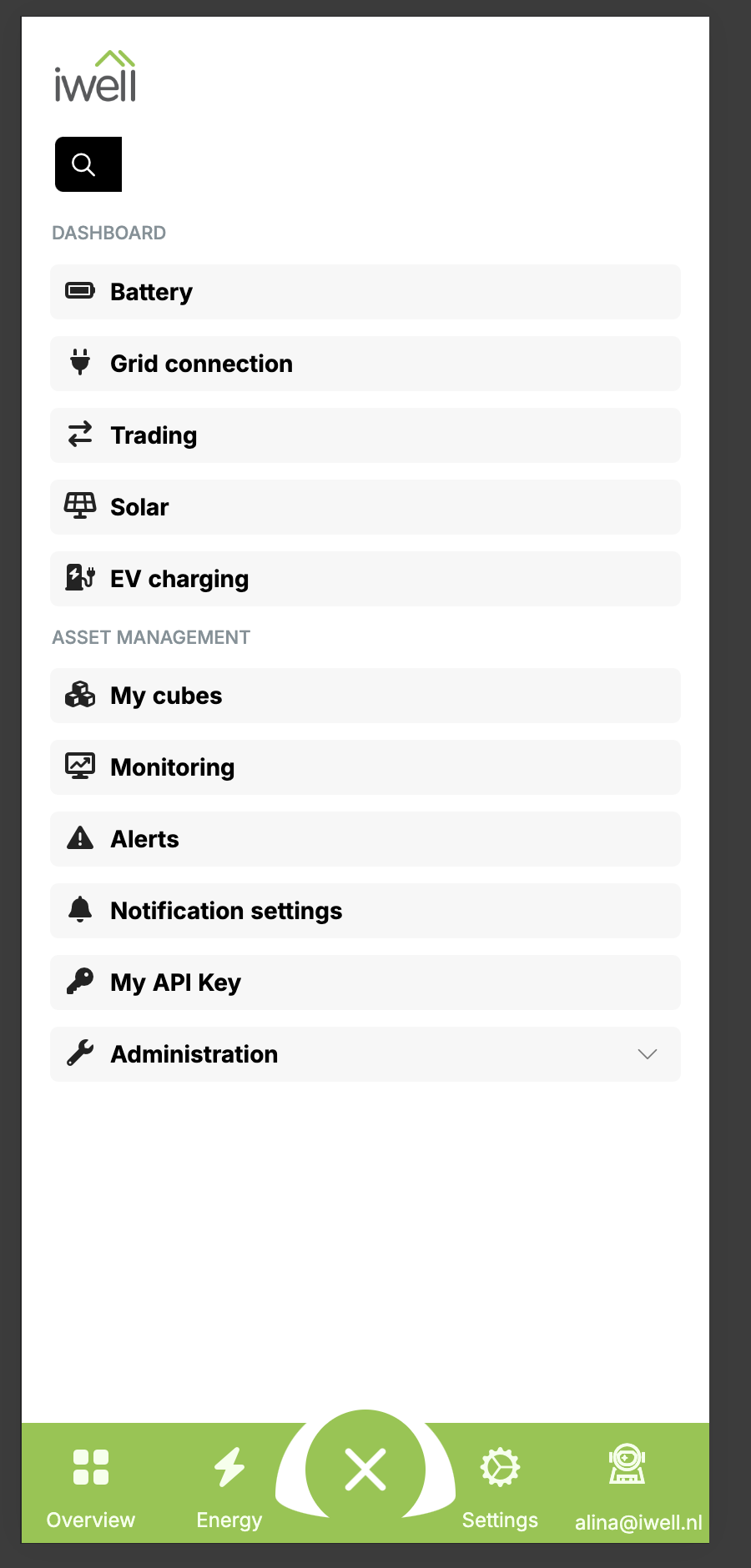
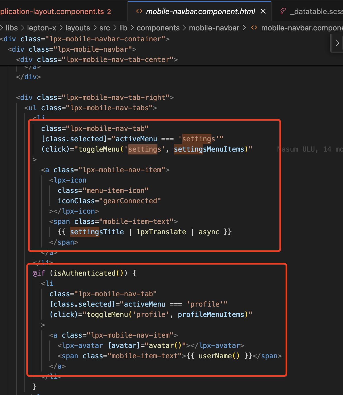
We implement the mobile version for our portal and could not find the way how to customise the eThemeLeptonXComponents.NavbarMobile rather than replacing it completely with a customs one. So we have this navbar
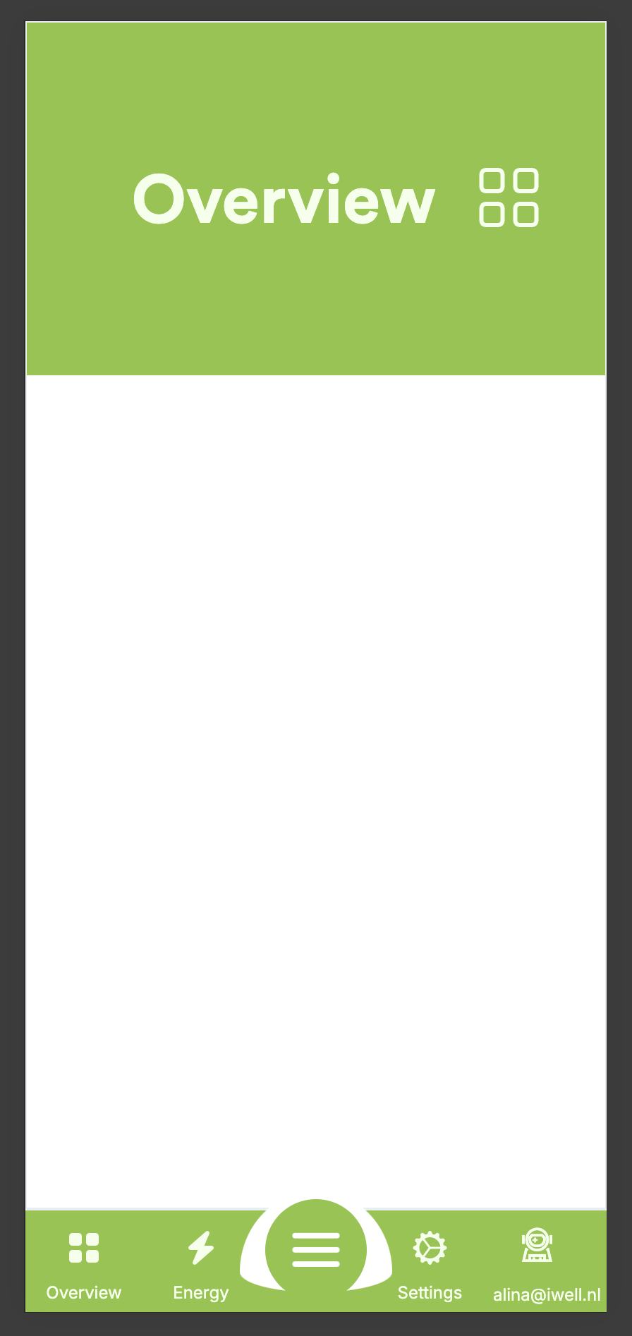
 Is there a way to:
- show all menu items in the list when menu status is open? (to show in the list Overview and Energy)
- hide Settings and Profile buttons from the main Navbar?
- Is it possible in mobile version instead of bottom Navbar to use the top bar?
Thank you!
7 Answer(s)
-
0
HI,
of course, you can override it if you want.
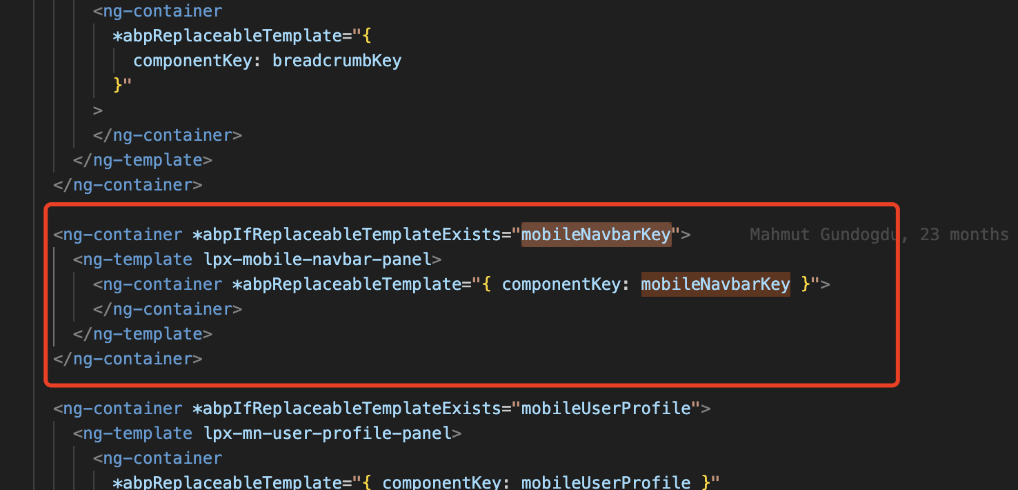
Its key is
eThemeLeptonXComponents.MobileNavbar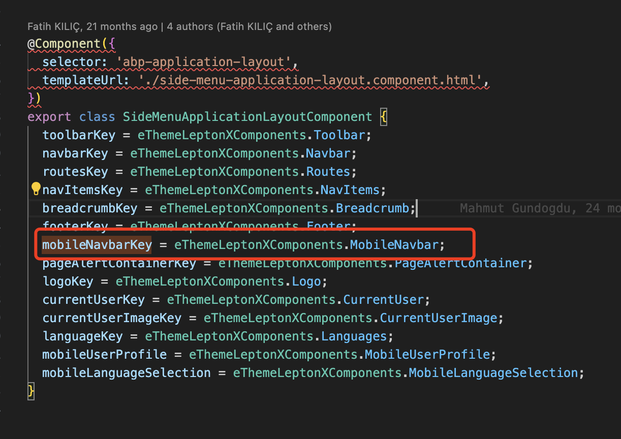
-
0
Hi liangshiwel! Thank you for your response! But is it possible to make these changes without overriding the whole component?
-
0
Hi,
Unfortunately can't
-
1
What a coincidence, I was just looking for exactly the same feature !
The way the mobile menu currently works is confusing :
The two first menu items appear as icons on the left. When one of those items is a parent item and you click on it, its children will display.....in the full menu.
Could you please fix it so we can chose which items go left and right, and which goes in the hamburger menu ?
-
0
Hi,
Unfortunately can't
Hi liangshiwai,
It seems to me that redeveloping the entire component for each project doesn't seem very generic or easy to maintain. It would be smart to make this mobile menu more flexible and customizable. Is it possible to add this to the roadmap fairly soon? Thanks
-
1
It would be really helpful to make this Navbar configurable. Could you implement it in near future? Thank you.
-
0
Hi
I will feedback to the LeptonX team


