- ABP Framework version: v8.0.3
- UI Type: Blazor Server
- Database System: EF Core (SQL Server, Oracle)
- Tiered (for MVC) or Auth Server Separated (for Angular): no
- Exception message and full stack trace:
- Steps to reproduce the issue:
Hello!
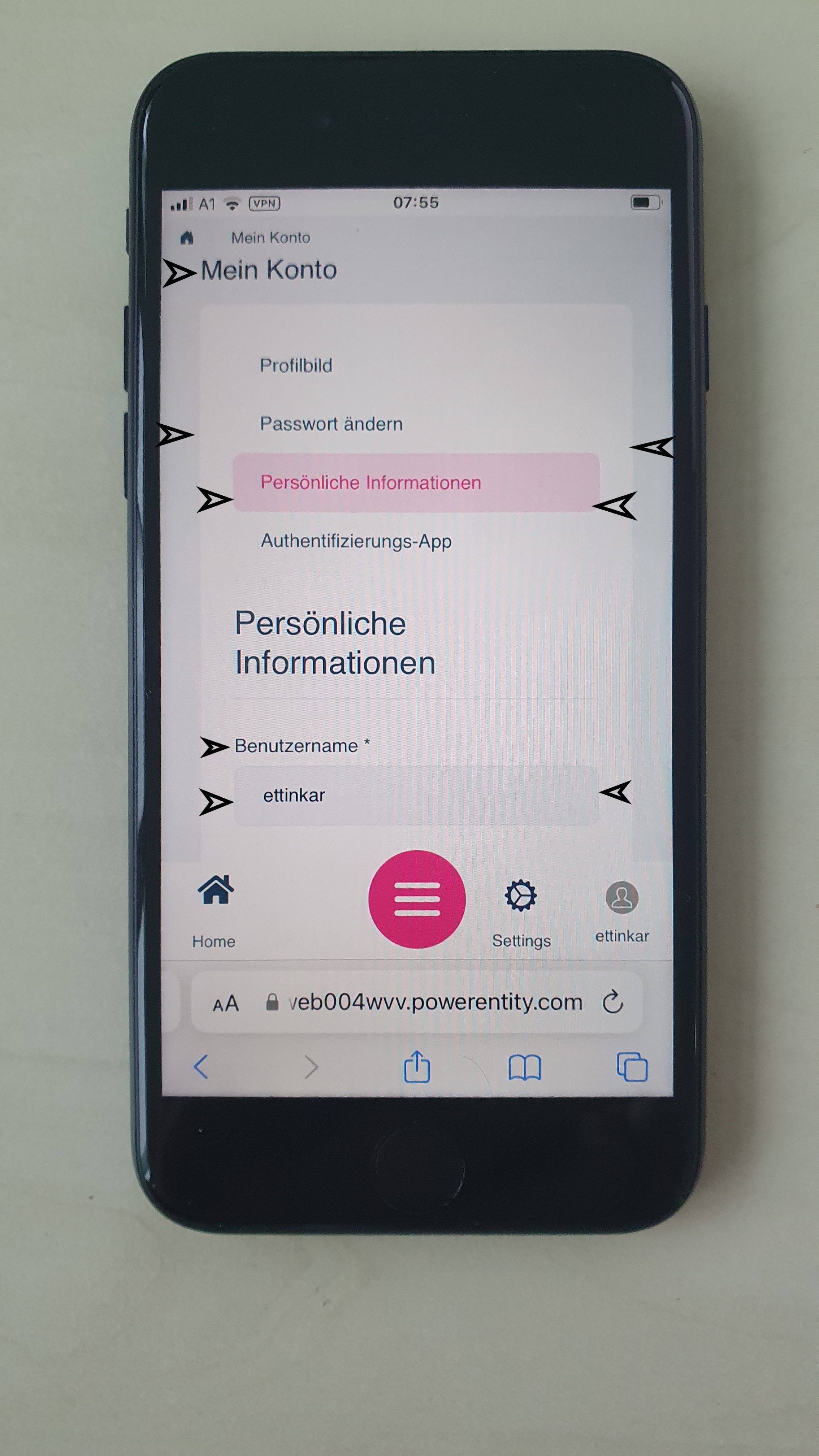
The LeptonX Pro template, which we use with Blazor-Server, wastes a lot of space in the sidebars. This is especially disadvantageous for the mobile view (see screenshot).
What possibilities are there to reduce these margins (see arrows on the screenshot) without having to redo this with an ABP update?
What is the reason for the empty space to the right of the home button?
6 Answer(s)
-
0
What is the reason for the empty space to the right of the home button?
Hi, I can help on this question for Blazor;
You can define a selector for choosing menu items on the mobile bar by using
MobileMenuSelectorinLeptonXThemeBlazorOptionsConfigure<LeptonXThemeBlazorOptions>(options => { options.MobileMenuSelector = items => items.Where(x => x.MenuItem.Name == "MyProjectName.Home" || x.MenuItem.Name == "MyProjectName.Dashboard"); });Check out: https://docs.abp.io/en/commercial/latest/themes/lepton-x/blazor?UI=Blazor#leptonxthemeblazoroptions
@design-team will answer the rest of the padding problems
-
0
Hi Karl
We will make an improvement to the margins and paddings to give you more space in the LeptonX mobile view. We appreciate your feedback.
The right side of the home button is empty so that a button can be placed there (like reports, favorite pages or shortcuts).
-
0
Hello!
Thanks for the good and quick answer!
I still have two questions:
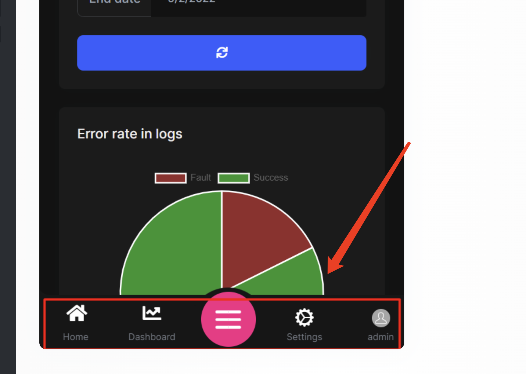
On the Mobile Navbar, can I remove the icons above Home, Settings and Admin and replace the center large “menu item” with the text Menu to make the Mobile Navbar smaller and have more space for the application?
We currently use the Blazorise DataGrid, which is very easy to program with. Unfortunately, I have not yet found a way for the DataGrid to adjust itself downwards from a certain top position to the respective screen height and display the data in a “window” with vertical scrollbars. Do you know a solution how this is possible?
-
0
By default you can't to that, you have to override original component in your project and you can customize it however you need.
You can replace
MobileNavbarcomponent in your application and fill the HTML content according to your requirements.Here the related component: https://docs.abp.io/en/commercial/latest/themes/lepton-x/blazor?UI=BlazorServer#mobile-navbar
-
0
Hi!
... By default you can't to that, you have to override original component in your project and you can customize it however you need. Does the above sentence refer to the Blazorise DataGrid or to the Mobile Navbar?
-
0


