Hi,
Can you provide any insights or suggestions to improve the performance? is await Task.Run(async ()).. is required? is seperate ouw required inside the handler?
If you need to execute main process and the event itself in a same transaction, then no, you cannot make it faster by executing in a different thread since the roll-back won't work whenever you use Task.Run. All the local events are designed to be runned in the same transaction.
But if you don't need to execute in the same transaction, you can use IDistributedEventBus with RabbitMQ or Kafka. In that case you can use Inbox/Outbox Pattern to ensure all the events are consistently published and consumed. If your application goes bigger, that might be a good scenario for you
The most likely issue is that scaling the ABP application instances increases the load on the SQL Server container beyond its capacity, causing it to become unhealthy. You should primarily investigate the resource limits configured for the SQL Server Docker container (CPU, memory, disk I/O) and SQL Server's internal configuration, particularly the maximum number of connections and memory settings, to ensure they are adequate for the increased load. Additionally, checking SQL Server error logs within the container for specific error messages related to resource exhaustion or connection failures is crucial for pinpointing the exact bottleneck.
Hi,
You can manually map your physical .cshtml files to custom paths. Here is an example how it's done in CMS Kit: https://github.com/abpframework/abp/blob/a753ed676687f44949cc013fd17e75b0f4c54ddb/modules/cms-kit/src/Volo.CmsKit.Admin.Web/CmsKitAdminWebModule.cs#L113-L128
If you need more dynamic and determined at the runtime you can go with DynamicRouteTransformer, and here how it can be implemented: https://github.com/abpframework/abp/blob/dev/modules/cms-kit/src/Volo.CmsKit.Public.Web/Pages/CmsKitPageRouteValueTransformer.cs#L46 And registration: https://github.com/abpframework/abp/blob/a753ed676687f44949cc013fd17e75b0f4c54ddb/modules/cms-kit/src/Volo.CmsKit.Public.Web/CmsKitPagesConfigurationExtensions.cs#L29C38-L29C69
But you wont need the dynamic one, probably manually mapping in the Host project would be enough in your case:
options.Conventions.AddPageRoute("/Books/Index", "/CustomModule/Books);
options.Conventions.AddPageRoute("/Authors/Index", "/CustomModule/Authors);
// ...
If you wish to create client-proxy for Account module, you can still pass -m account parameter for generating client-proxy.
Ok, here is the possible reasons of the problem.You don't pass any module parameter -m and it's app by default.
Since the newly created classes included in your namespace, they started to be included in the app namespace.
Can you try adding the following attributes to your overriden Controller?
[Route("api/account")]
[Area("account")]
If Auto API Controllers is enabled in your project, your app service probably will be exposed as a controller still.
You can add RemoteService(IsEnabled = false)] attribute to your AppService too
[RemoteService(IsEnabled = false)]
[Dependency(ReplaceServices = true)]
[ExposeServices(typeof(IAccountAppService), typeof(AccountAppService), typeof(CustomAccountAppService))]
public class CustomAccountAppService : AccountAppService
Hi,
ABP Framework supports all the OpenID Connect protocols and its standards. In your case, you could already connected to your custom Azure AD login. But you need a specific implementation but that's not implemented in ABP Framework or openiddict library that we use. It's more likely related to Azure.
Still I could find something that can be related to this topic, have you tried to add prompt=select_account parameter to the querystring while redirecting?
https://stackoverflow.com/questions/59361149/allow-a-switch-accounts-prompt
https://github.com/AzureAD/microsoft-authentication-library-for-js/issues/5423
Hi,
The application and also your code behaviour can be different in the debug mode and they won't be optimized for the best performance.
You can try disabling BackgroundWorkers in debug mode if you don't need at your work and make the starting process faster
#if DEBUG
        Configure<AbpBackgroundWorkerOptions>(options =>{
            options.IsEnabled = false;
        });
#endif
Hi,
Do you use generating client proxies command without contracts ?
https://abp.io/docs/latest/framework/api-development/static-csharp-clients#without-contracts
I'll try to provide a really qucik example:
[Authorize]
public class NotificationHub : Hub
{
    public async Task SendNotification(string message)
    {
        await Clients.All.SendAsync("ReceiveNotification", message);
    }
}
Make sure you have
Volo.Abp.AspNetCore.SignalRpackage installed on your host (backend) project
<PackageReference Include="Volo.Abp.AspNetCore.SignalR" Version="9.0.4" />
[DependsOn(typeof(AbpAspNetCoreSignalRModule))]
_I assume the following configurations are done:_

```csharp
context.Services.AddSignalR();
```

```csharp
app.UseConfiguredEndpoints(endpoints =>
{
    endpoints.MapHub<NotificationHub>("/signalr-hubs/notification");
});
```
Blazor.Client project and make sure the following packages is installed and configured like below:<PackageReference Include="Microsoft.AspNetCore.Components.WebAssembly.DevServer" Version="9.0.0" PrivateAssets="all" />
<PackageReference Include="Microsoft.AspNetCore.SignalR.Client" Version="9.0.0" />
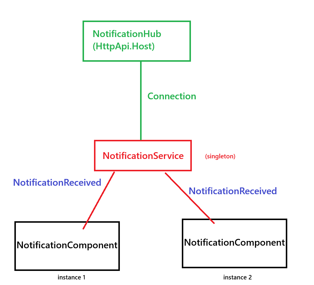
Now you're ready to implement a shared single instanced service that can be consumed from 2 different instances of notification component.
NotificationService
public class NotificationService : ISingletonDependency, IAsyncDisposable
{
    private HubConnection _hubConnection;
    private readonly ILogger<NotificationService> _logger;
    private bool _isConnected;

    // Event that components can subscribe to
    public event Action<string> OnNotificationReceived;

    public NotificationService(
        ILogger<NotificationService> logger)
    {
        _logger = logger;

        _logger.LogInformation("NotificationService Created!");
    }

    public async Task InitializeAsync()
    {
       await InitializeHubConnection();
    }

    private async Task InitializeHubConnection()
    {
         if (_hubConnection != null)
        {
            return; // Already initialized, return immediately
        }

        try
        {
            // Build the hub URL
            var hubUrl = "https://localhost:44343".TrimEnd('/') + "/signalr-hubs/notification";

            _hubConnection = new HubConnectionBuilder()
                .WithUrl(hubUrl, options =>
                {
                    // Add token if needed
                    // options.AccessTokenProvider = () => Task.FromResult(_tokenProvider.GetAccessToken());
                })
                .WithAutomaticReconnect()
                .Build();

            // Register for the ReceiveNotification event
            _hubConnection.On<string>("ReceiveNotification", (message) =>
            {
                _logger.LogInformation($"Notification received: {message}");
                OnNotificationReceived?.Invoke(message);
            });

            await _hubConnection.StartAsync();
            _isConnected = true;
            _logger.LogInformation("SignalR connection established");
        }
        catch (Exception ex)
        {
            _logger.LogError($"Error connecting to SignalR hub: {ex.Message}");
            _isConnected = false;
        }
    }

    public async ValueTask DisposeAsync()
    {
        if (_hubConnection != null)
        {
            await _hubConnection.DisposeAsync();
        }
    }
}
NotificationComponent.razor
@namespace AbpSolution40.Blazor.Client.Components.Notification
@using AbpSolution40.Blazor.Client.Services
@using Microsoft.Extensions.Logging
@using System.Collections.Generic
@implements IDisposable
@inject NotificationService NotificationService
@inject ILogger<NotificationComponent> Logger


<Dropdown>
    <DropdownToggle Color="Color.Primary">
    <button type="button" class="btn btn-outline-primary position-relative">
        <i class="fa fa-bell"></i>
        @if (Notifications.Count > 0)
        {
            <span class="position-absolute top-0 start-100 translate-middle badge rounded-pill bg-danger">
                @Notifications.Count
                <span class="visually-hidden">unread notifications</span>
            </span>
        }
    </button>
    </DropdownToggle>
    <DropdownMenu>
        @foreach (var notification in Notifications)
        {
            <DropdownItem>
                <span>@notification.Message</span>
                <small class="notification-time">@notification.Timestamp.ToString("g")</small>
            </DropdownItem>
        }
    </DropdownMenu>
</Dropdown>

@code {
    private List<NotificationItem> Notifications { get; set; } = new List<NotificationItem>();
    protected override async Task OnInitializedAsync()
    {
        await base.OnInitializedAsync();

        NotificationService.OnNotificationReceived += HandleNotificationReceived;
        await NotificationService.InitializeAsync();

        Logger.LogInformation("NotificationComponent initialized");
    }

    private void HandleNotificationReceived(string message)
    {
        var notification = new NotificationItem
        {
            Id = Guid.NewGuid(),
            Message = message,
            Timestamp = DateTime.Now
        };

        Notifications.Add(notification);
        StateHasChanged();
    }

    public void Dispose()
    {
        NotificationService.OnNotificationReceived -= HandleNotificationReceived;
    }

    public class NotificationItem
    {
        public Guid Id { get; set; }
        public string Message { get; set; } = string.Empty;
        public DateTime Timestamp { get; set; }
    }
}          Id = Guid.NewGuid(),
            Message = message,
            Timestamp = DateTime.Now
        };

        Notifications.Add(notification);
        StateHasChanged();
    }

    private void ToggleNotificationsPopup()
    {
        _isPopupVisible = !_isPopupVisible;
    }

    private void RemoveNotification(NotificationItem notification)
    {
        Notifications.Remove(notification);
        StateHasChanged();
    }

    public void Dispose()
    {
        NotificationService.OnNotificationReceived -= HandleNotificationReceived;
    }

    public class NotificationItem
    {
        public Guid Id { get; set; }
        public string Message { get; set; } = string.Empty;
        public DateTime Timestamp { get; set; }
    }
}
And of course I configured this component in my newly created Toolbar Contributor:
public class AbpSolution40ToolbarContributor : IToolbarContributor
{
    public Task ConfigureToolbarAsync(IToolbarConfigurationContext context)
    {
        if (context.Toolbar.Name == StandardToolbars.Main)
        {
            context.Toolbar.Items.Add(new ToolbarItem(typeof(NotificationComponent)));
        }
        return Task.CompletedTask;
    }
}
And configured it in the ...ClientModule.cs
Configure<AbpToolbarOptions>(options =>
{
    options.Contributors.Add(new AbpSolution40ToolbarContributor());
});
It doesn't matter how many time the component is initialized. The NotificationService in the client-side is Singleton and it doesn't matter how many time it's resolved. There will be always single hub connection that listens the changes and delivers changes into component by using a C# Event named OnNotificationReceived.
Hi,
Can you double check if abp install-libs command is executed in the pipeline.
Also please check ABI CLI version in the machine that pipeline runs on it.
Somehow it might be updated or removed, you can use the exact same cli version with your project to restore packages properly:
dotnet tool update -g volo.abp.cli --version 8.2.1


