0
bma.ffm.dev@sjrb.ca created
- ABP Framework version: v6.0.3
- UI type: Angular
- DB provider: EF Core
- Tiered (MVC) or Identity Server Separated (Angular): no
- Exception message and stack trace:N/A
- Steps to reproduce the issue:"
- Create a view that includes a form-switch. set to false / off. see: https://x.leptontheme.com/components/bootstrap/check-radio# (issue is reproducible from examples on this page)
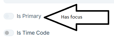
- If light theme: click tab until form-switch control is selected, or toggle the switch twice. The nob part of the switch becomes very difficult to see

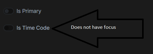
- if dark theme: The nob part of the switch is very difficult to see when in the false / off position. The concern here is that user's might not realize that this is an input control.

1 Answer(s)
-
0
Hello,
Thanks for reporting the issue, i opened an internal issue. I will inform you when the fix available


