0
thaithiendi created
Dear Support Team,
One day, I update to bootstrap5 and Abp framework 4.3.3 to 5.3.3
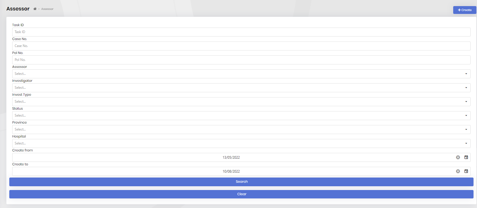
My layout page showed incorrectly
Old: I want it to look like this
 New: But now it look like this
 And this my code with abp-row:
<abp-row>
    <abp-column size-lg="_2" size-md="_12" class="input-group input-daterange d-block">
        <abp-row>
            <abp-column size-lg="_12">
                <abp-button class="mt-md-2 mb-md-2" size="Block" id="btnSearch" text="Search" icon="fa-compress" button-type="Primary" />
            </abp-column>
        </abp-row>
    </abp-column>
    <abp-column size-lg="_2" size-md="_12" class="input-group input-daterange d-block">
        <abp-row>
            <abp-column size-lg="_12">
                <abp-button class="mt-md-2 mb-md-2" size="Block" id="btnClear" text="Clear" icon="fa-compress" button-type="Primary" />
            </abp-column>
        </abp-row>
    </abp-column>
</abp-row>
Please tell me how to fix it.
- ABP Framework version: v5.3.3
- UI type: MVC
- DB provider: EF Core
- Tiered (MVC) or Identity Server Separated (Angular): yes
- Exception message and stack trace:
- Steps to reproduce the issue:"
2 Answer(s)
-
0
We use the ABP framework on our websites, but we did not encounter such a problem. We need to examine it in detail. However, before starting the detailed examination, can you write the code below and send the rendered version using your browser's developer tool?
        <abp-container>
            <abp-row>
                <abp-column>1 of 2</abp-column>
                <abp-column>2 of 2</abp-column>
            </abp-row>
            <abp-row>
                <abp-column>1 of 3</abp-column>
                <abp-column>2 of 3</abp-column>
                <abp-column>3 of 3</abp-column>
            </abp-row>
        </abp-container>
The rendered version should look like this:
         <div class="container">
            <div class="row">
                <div class="col">1 of 2</div>
                <div class="col">2 of 2</div>
            </div>
            <div class="row">
                <div class="col">1 of 3</div>
                <div class="col">2 of 3</div>
                <div class="col">3 of 3</div>
            </div>
        </div>
If there is no problem with this, we may need to examine the CSS.
-
0
Thanks berkansasmaz.


