


Color Psychology in Web Design: How to Choose the Perfect Palette in 2025
The Importance of Color Psychology in Web Design
First impressions online happen in under 50 milliseconds, and studies show that up to 90% of a user’s initial perception is based on color. In 2025, as digital competition intensifies, brands cannot rely on functionality alone—users expect emotionally engaging and visually strategic designs.
Whether you’re designing for e-commerce, SaaS, lifestyle blogs, or creative portfolios, the right color palette is more than decoration. It directly influences:
- Trust and credibility (blue = reliability, green = balance)
- Conversions and urgency (red for CTAs, orange for enthusiasm)
- Brand recall (consistent use of signature colors builds recognition)
- User comfort and inclusivity (high contrast, accessibility standards)
👉 In short, color psychology is not a design afterthought—it’s a core driver of user engagement, retention, and revenue growth.
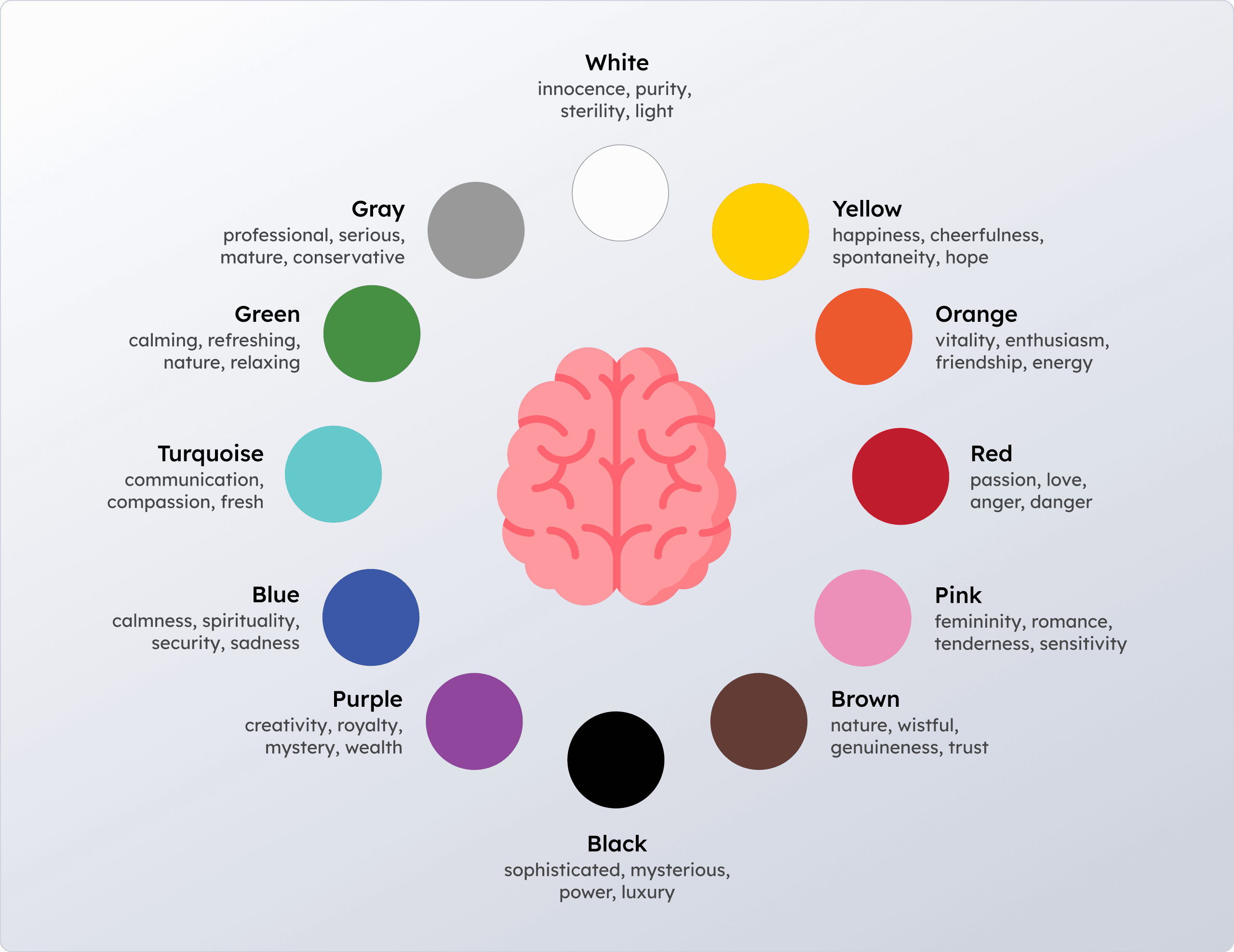
The Psychology of Color: How Hues Shape Human Behavior
Color psychology explains how different hues influence emotion, perception, and decision-making. Let’s explore the most common colors in web design:
🔴 Red – Sparks urgency and excitement. Common in sales promotions, e-commerce banners, and notifications.
Example: YouTube’s red play button signals attention and action.🟠 Orange – Represents energy, warmth, and enthusiasm.
Example: Amazon’s orange “Add to Cart” button guides users toward purchases.🟡 Yellow – Radiates optimism, creativity, and energy.
Example: Snapchat’s bright yellow interface reflects playfulness and innovation.🟢 Green – Suggests growth, sustainability, and wellness.
Example: Whole Foods and health apps use green to symbolize balance and eco-conscious values.🔵 Blue – Signals trust, calm, and stability.
Example: PayPal and LinkedIn use blue to reinforce security and professionalism.🟣 Purple – Symbolizes luxury, creativity, and imagination.
Example: Beauty brands like Urban Decay use purple to highlight creativity and exclusivity.⚫ Black – Conveys sophistication and exclusivity.
Example: Apple and Chanel use black to emphasize premium value.⚪ White – Symbolizes purity, simplicity, and clarity.
Example: Apple’s predominantly white interfaces highlight elegance and minimalism.
👉 Pro Insight: Combine psychology with analytics. Tools like Hotjar and Google Optimize reveal how color placement (e.g., green vs. red CTA buttons) impacts conversion rates.
Beyond Psychology: Cultural Differences in Color Meaning
In global web design, one palette does not fit all. Colors have different cultural associations that can influence user perception:
- White – Purity and minimalism in Western cultures, but associated with mourning in parts of East Asia.
- Red – Danger in the West, but luck and prosperity in China.
- Green – Islamically significant in the Middle East, while in the West it often symbolizes money.
- Black – Luxury in the West, but mourning in many cultures.
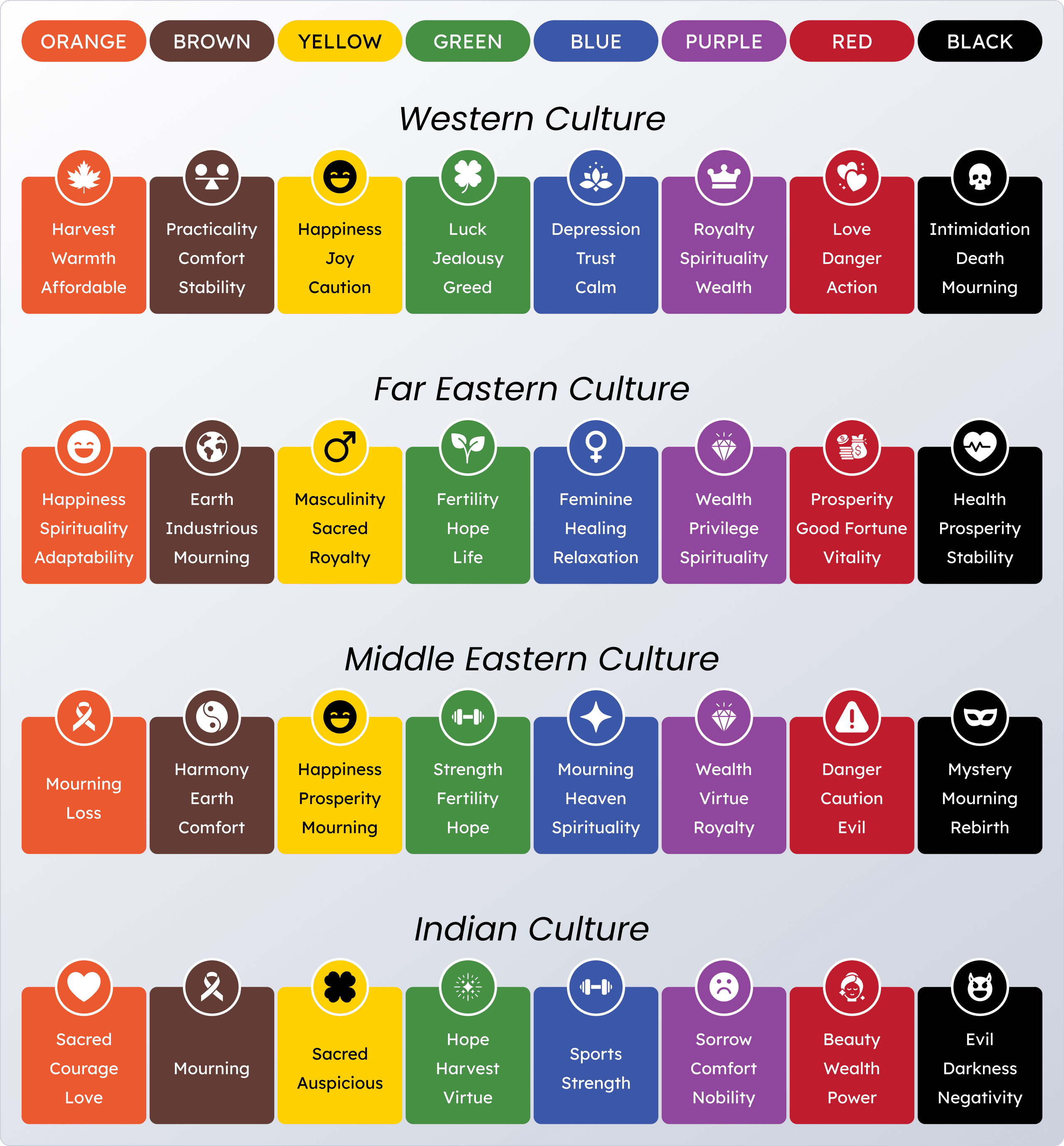
👉 For international brands, it’s crucial to localize website color palettes to avoid misinterpretations.
Web Design Color Trends for 2025
The digital landscape evolves rapidly, and so do color preferences. The biggest color palette trends in 2025 include:
Neo-Minimalist Neutrals ✨
Soft beiges, warm grays, and creamy whites offer calm, distraction-free interfaces—ideal for B2B websites and productivity apps.
Vibrant Gradients & Neon Accents 🌈
Tech and e-commerce brands embrace multi-tone gradients and neon highlights to reflect energy and innovation.
Dark Mode with High-Contrast Highlights 🌑
Now a default in many apps, dark mode improves eye comfort while allowing accent colors to stand out for easier navigation.
Nature-Inspired Palettes 🍃
Eco-conscious businesses are adopting earthy greens, ocean blues, and muted browns to connect with sustainability-minded users.
Soft Pastels for Inclusivity 💕
Gentle tones—lavenders, light pinks, and mints—are trending in lifestyle, wellness, and community-driven platforms thanks to their approachable feel.
Dynamic AI-Driven Palettes 🤖
AI enables adaptive color systems that change in real-time based on time of day, user mood, or demographics.
👉 Case Study: Spotify uses dark backgrounds but personalizes accents with vibrant colors that align with playlists and campaigns.
Best Practices for Choosing the Perfect Website Color Palette
A successful palette balances brand identity, psychology, accessibility, and testing. Follow these steps:
Anchor in Brand Identity
Select a primary color that embodies your company’s values.
Example: Tiffany & Co.’s teal blue has become globally iconic.
Apply the 60-30-10 Rule
60% background
30% secondary tone
10% accent (CTAs, highlights)
This ratio maintains visual balance.Leverage Color Theory
Use complementary or triadic harmonies for better contrast and consistency.Prioritize Accessibility (WCAG Standards)
Ensure a minimum 4.5:1 contrast ratio for text and use color-blind–friendly palettes.Account for Cultural Meanings
Research local associations before targeting global markets.Test Across Devices & Modes
Preview palettes in both light and dark modes, and across desktop, mobile, and tablet.A/B Test for Conversions
Experiment with button colors, background shades, and highlights to find what performs best.
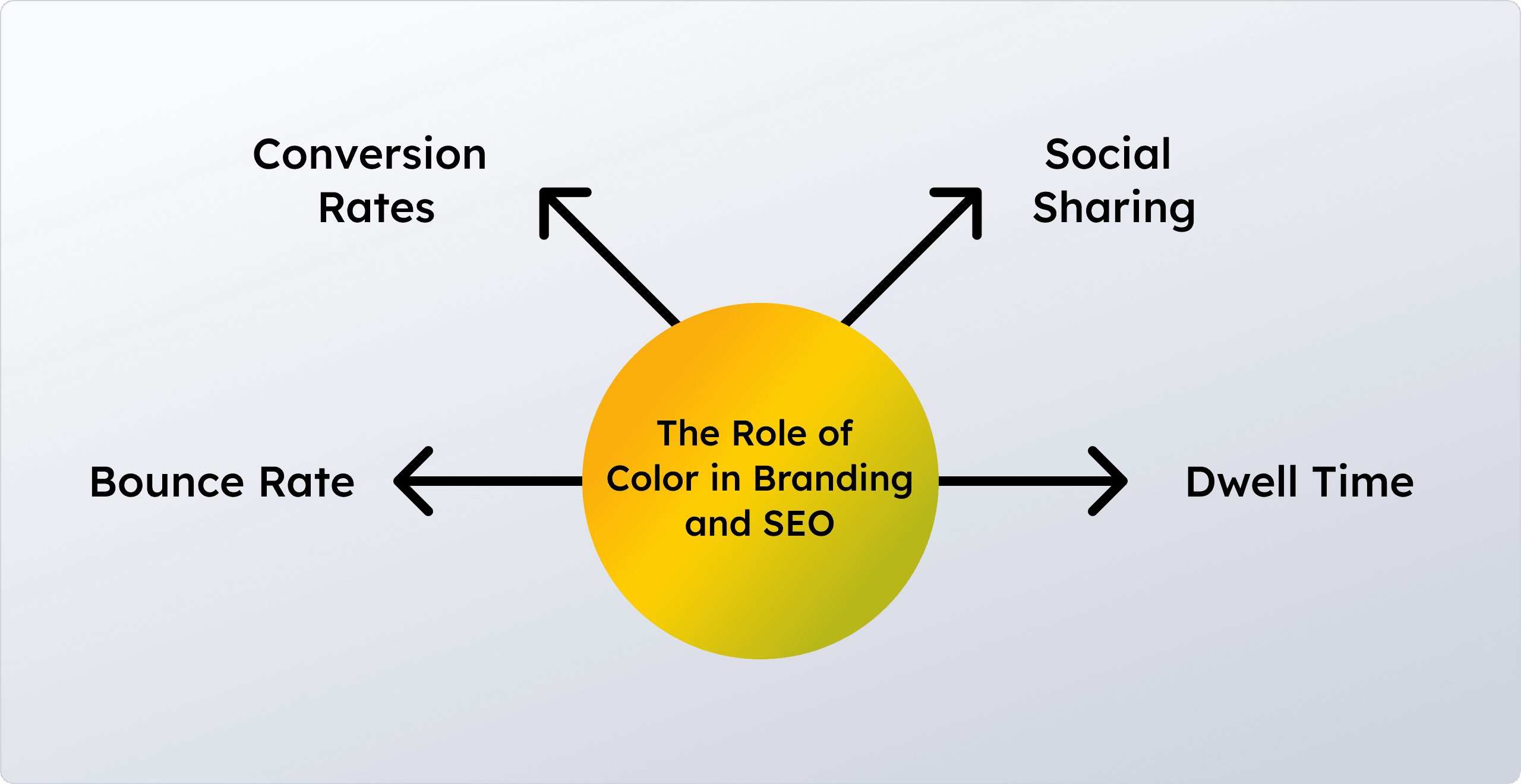
The Role of Color in Branding and SEO
Color impacts brand authority and indirectly influences SEO by shaping user behavior:
- Bounce Rate – Engaging palettes keep users onsite longer.
- Dwell Time – Comfortable color schemes encourage scrolling.
- Conversion Rates – Optimized CTAs improve click-throughs.
- Social Sharing – Bold, appealing colors increase shareability
Future Outlook: Where Color Psychology Is Headed
- Mood-Adaptive Websites
Platforms will adjust palettes based on detected user mood or behavior. - AR & VR Color Experiences
Immersive 3D design will require palettes that adapt across realities. - Inclusive Color Systems
Accessibility-first palettes will become the standard, ensuring usability for all.
Final Thoughts
In 2025, the perfect color palette blends psychological insights, cultural awareness, and data-driven testing. Colors are no longer just visual accents—they are storytelling tools that build trust, guide behavior, and boost conversions.
👉 Brands that embrace color psychology in web design today will not only stand out visually but also gain lasting competitive and business advantages.


Comments
Halime Yavaş Karayay 25 weeks ago
Great read! I really liked the way you explained the psychology of colors.
Elanur Oğuz 25 weeks ago
Great article🙂 It shows how color psychology in web design impacts not only aesthetics but also user behavior.