


 ABP Contributor Program
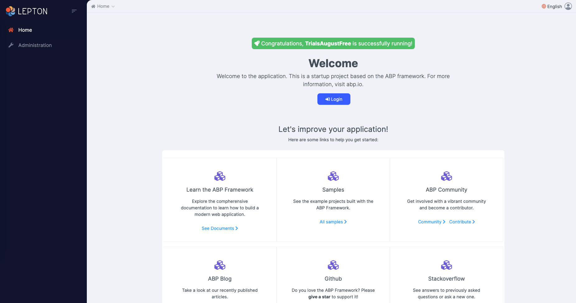
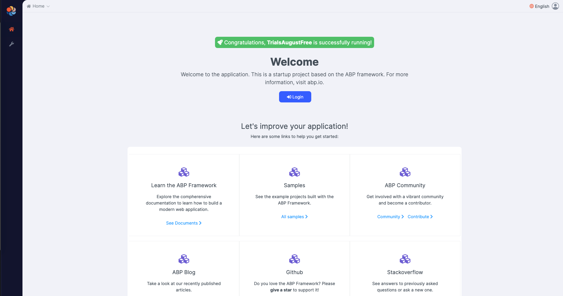
LeptonX Theme for ABP Framework: Alpha Release
We are excited to announce that the alpha version of the LeptonX theme has been released! As stated in this blog post, LeptonX comes in different shapes. For this release, we introduce only ABP based projects with the Angular UI. So, if you are already using the ABP Framework and Angular as the frontend choice, you can integrate these packages into your project today.
The theme has been deployed with two versions: LeptonX-lite (free) and LeptonX (commercial).
Note that this theme currently only works for the Angular UI. Please keep waiting for other UI options.
Open-Source
This section shows how to replace the basic theme (that comes with open source ABP Framework startup template) with the new LeptonX-lite theme.
To add LeptonX-lite into your project,
- Install
@abp/ng.theme.lepton-xNPM package
npm install @abp/ng.theme.lepton-x@preview or
yarn add @abp/ng.theme.lepton-x@preview
- Then, we need to edit the styles array in
angular.jsonto replace the existing style with the new one.
Replace the following style
{
  "input": "node_modules/bootstrap/dist/css/bootstrap.min.css",
  "inject": true,
  "bundleName": "bootstrap-ltr.min"
},
with
"node_modules/@volo/ngx-lepton-x.lite/styles/sidemenu-layout.min.css",
"node_modules/bootstrap-icons/font/bootstrap-icons.css",
- Finally, remove
ThemeBasicModulefromapp.module.tsandshared.module.ts, and import the related modules inapp.module.ts
import { ThemeLeptonXModule } from '@abp/ng.theme.lepton-x';
import { SideMenuLayoutModule } from '@abp/ng.theme.lepton-x/layouts';

@NgModule({
  imports: [
    // ...
    ThemeLeptonXModule.forRoot(),
    SideMenuLayoutModule.forRoot(),
  ],
  // ...
})
export class AppModule {}
Note: If you employ Resource Owner Password Flow for authorization, you should import the following module as well:
import { AccountLayoutModule } from '@abp/ng.theme.lepton-x/account';

@NgModule({
  // ...
  imports: [
    // ...
    AccountLayoutModule.forRoot(),
    // ...
  ],
  // ...
})
export class AppModule {}
To change the logos and brand color of the LeptonX, simply add the following CSS to the styles.scss
:root {
  --lpx-logo: url('/assets/images/logo.png');
  --lpx-logo-icon: url('/assets/images/logo-icon.png');
  --lpx-brand: #edae53;
}
--lpx-logois used to place the logo in the menu.--lpx-logo-iconis a square icon used when the menu is collapsed.--lpx-brandis a color used throughout the application, especially on active elements.
ABP Commercial
This section shows how to replace the lepton theme (that comes with the ABP Commercial startup template) with the new LeptonX theme.
To add LeptonX into your existing projects,
- Firstly, install
@volosoft/abp.ng.theme.lepton-xNPM package
npm install @volosoft/abp.ng.theme.lepton-x@preview or
yarn add @volosoft/abp.ng.theme.lepton-x@preview
- Then, edit
angular.jsonas follows:
Remove the following config from the styles array since LeptonX provides bootstrap as embedded in its CSS.
{
  "input": "node_modules/bootstrap/dist/css/bootstrap.min.css",
  "inject": true,
  "bundleName": "bootstrap-ltr.min"
},
Add the following ones into the styles array
{
  "input": "node_modules/@volosoft/ngx-lepton-x/styles/themes/dark.css",
  "inject": false,
  "bundleName": "lepton-x.dark"
},
{
  "input": "node_modules/@volosoft/ngx-lepton-x/styles/themes/dim.css",
  "inject": false,
  "bundleName": "lepton-x.dim"
},
{
  "input": "node_modules/@volosoft/ngx-lepton-x/styles/themes/light.css",
  "inject": false,
  "bundleName": "lepton-x.light"
},
"node_modules/@volosoft/ngx-lepton-x/styles/css/sidemenu-layout.min.css",
"node_modules/bootstrap-icons/font/bootstrap-icons.css",
Three of them are related to the theming and will be loaded during runtime. That's why they are not injected into the head as a style. Hence, the "inject": false
The fourth one depends on which layout you want to use. For now, there is only sidemenu-layout available. In the future, there will be many layouts to choose from.
The last one is bootstrap-icons which are being used throughout the components.
- At last, remove
ThemeLeptonModulefromapp.module.tsandshared.module.ts, and import the following modules inapp.module.ts
import { ThemeLeptonXModule } from '@volosoft/abp.ng.theme.lepton-x';
import { AbpSideMenuLayoutModule } from '@volosoft/abp.ng.theme.lepton-x/layouts';

@NgModule({
  // ...
  imports: [
    // ...
    ThemeLeptonXModule.forRoot(),
    AbpSideMenuLayoutModule.forRoot(), // depends on which layout you choose
    // ...
  ],
  // ...
})
export class AppModule {}
Note: If you employ Resource Owner Password Flow for authorization, you should import the following module as well:
import { AccountLayoutModule } from '@volosoft/abp.ng.theme.lepton-x/account';

@NgModule({
  // ...
  imports: [
    // ...
    AccountLayoutModule.forRoot({
      layout: {
        authLayoutImg: '/assets/images/login-bg.jpg',
      },
    }),
    // ...
  ],
  // ...
})
export class AppModule {}
authLayoutImg: (Optional) If not given, a default image will be placed on the authentication pages.
- At this point,
LeptonXtheme should be up and running within your application. However, you may need to overwrite some css variables based your needs for every theme available as follows:
:root {
  .lpx-theme-dark {
    --lpx-logo: url('/assets/images/logo/logo-light.svg');
    --lpx-logo-icon: url('/assets/images/logo/logo-light-icon.svg');
    --lpx-brand: #edae53;
  }

  .lpx-theme-dim {
    --lpx-logo: url('/assets/images/logo/logo-light.svg');
    --lpx-logo-icon: url('/assets/images/logo/logo-light-icon.svg');
    --lpx-brand: #f15835;
  }

  .lpx-theme-light {
    --lpx-logo: url('/assets/images/logo/logo-dark.svg');
    --lpx-logo-icon: url('/assets/images/logo/logo-dark-icon.svg');
    --lpx-brand: #69aada;
  }
}
When the user selects a theme, the corresponding CSS class is added to the body, so you can write specific CSS rules to each theme.
Conclusion
In this blog post, I've explained how to use the alpha version of the new LeptonX theme for ABP-based solutions. Please, keep in mind that this is an alpha version, and we will continue to work on the LeptonX theme. The APIs are bound to change and breaking changes may be introduced in future versions.
We would like you to try it out with the latest version of the ABP Framework and give us feedback at lepton@volosoft.com or open an issue on this repository: https://github.com/volosoft/lepton-theme


Comments
menxin@gmail.com 237 weeks ago
Good job!!
Ümit Kocabıçak 237 weeks ago
Very nice. Looking forward to MVC.
VIJAY NALLALA 237 weeks ago
I have replaced - but still theme showing old on commercial version.
bunyamin 236 weeks ago
Hello Vijay, Did you remove
ThemeLeptonModulefromapp.module.tsandshared.module.ts?Thanh Vo Le 234 weeks ago
Nice job team! Do you have plan for the final release of LeptonX in commercial ?
Halil İbrahim Kalkan 234 weeks ago
Thanks :) 1.0 stable release will be just after ABP 5.0 which will be released in December.
Claus Bogner 227 weeks ago
Hi hikalkan, will 1.0 stable also support MVC? :) Thanks and best regards Claus
vivienkorpys@outlook.fr 228 weeks ago
Thanks nice jobs to the team. The 1.0 stable release will be just after ABP 5.0 which will be released in December with the support of other UI framework like blazor ?
VIJAY NALLALA 221 weeks ago
anyone looking for commercial version? we are also looking new themes. but i am doing my own? is theme from abp team or out side?
paul.harriman 220 weeks ago
I've applied the changes for Lepton-X. Do we have to wait until the release to see any enhancements to the code? Also will the themes be tenant based or can they be user based?
VIJAY NALLALA 219 weeks ago
Can you please provide update npm/NUGET for MVC, angular Lib final version. I want to switch the new themes on v5.0
wanjackcool@qq.com 201 weeks ago
nice