How to add dark mode support to the Basic Theme in 3 steps?
Basic Theme uses plain bootstrap and does not have any custom colors & styles. This article will show you how to add dark mode support to the Basic Theme.
Bootstrap brings the Color Modes feature with version 5.3. This feature allows you to add dark mode support to your website with a single line of code. Adding the data-bs-theme="dark" attribute changes the color mode of the element to dark mode.
Instructions
Create a new project with the following command:
abp new BasicThemeDarkMode -t app --theme basicCreate a component that toggles the color mode.
Create a new file named
Components/ChangeTheme/Default.cshtml:<div class="text-light mt-1"> <button class="btn text-light" href="#" id="ToolbarChangeTheme"> <i class="fas fa-sun"></i> </button> </div>Create a new file named
Components/ChangeTheme/ChangeThemeViewComponent.cs:using Microsoft.AspNetCore.Mvc; using Volo.Abp.AspNetCore.Mvc; namespace BasicThemeDarkMode.Web.Components.ChangeTheme; [Widget(ScriptFiles = new[]{"/Components/ChangeTheme/ChangeTheme.js"})] public class ChangeThemeViewComponent : AbpViewComponent { public IViewComponentResult Invoke() { return View("~/Components/ChangeTheme/Default.cshtml"); } }Create a JavaScript that manages the last selected theme and toggles the color mode. It stores the last selected theme in the local storage. So, you don't need to store it in the database.
- Create a new file named
Components/ChangeTheme/ChangeTheme.js:$(function () { function changeTheme(theme) { window.localStorage.setItem('theme', theme); document.getElementsByTagName('body')[0].setAttribute('data-bs-theme', theme); } function toggleTheme(){ getTheme() == 'light' ? changeTheme('dark') : changeTheme('light'); } function getTheme(){ return window.localStorage.getItem('theme') ?? 'dark'; } function init(){ let theme = getTheme(); if(theme){ changeTheme(theme); } } document.getElementById('ToolbarChangeTheme').addEventListener('click', () => { toggleTheme(); }); init(); });
- Create a new file named
Create a new Toolbar Contributor and add a newly created view component to the application toolbar.
Create a new class named
BasicThemeDarkModeToolbarContributor.cs:using BasicThemeDarkMode.Web.Components.ChangeTheme; using System.Threading.Tasks; using Volo.Abp.AspNetCore.Mvc.UI.Theme.Shared.Toolbars; namespace BasicThemeDarkMode.Web; public class BasicThemeDarkModeToolbarContributor : IToolbarContributor { public Task ConfigureToolbarAsync(IToolbarConfigurationContext context) { if (context.Toolbar.Name == StandardToolbars.Main) { context.Toolbar.Items .Add(new ToolbarItem(typeof(ChangeThemeViewComponent))); } return Task.CompletedTask; } }Configure Toolbar Options and add a newly created contributor:
Configure<AbpToolbarOptions>(options =>
{
    options.Contributors.Add(new BasicThemeDarkModeToolbarContributor());
});
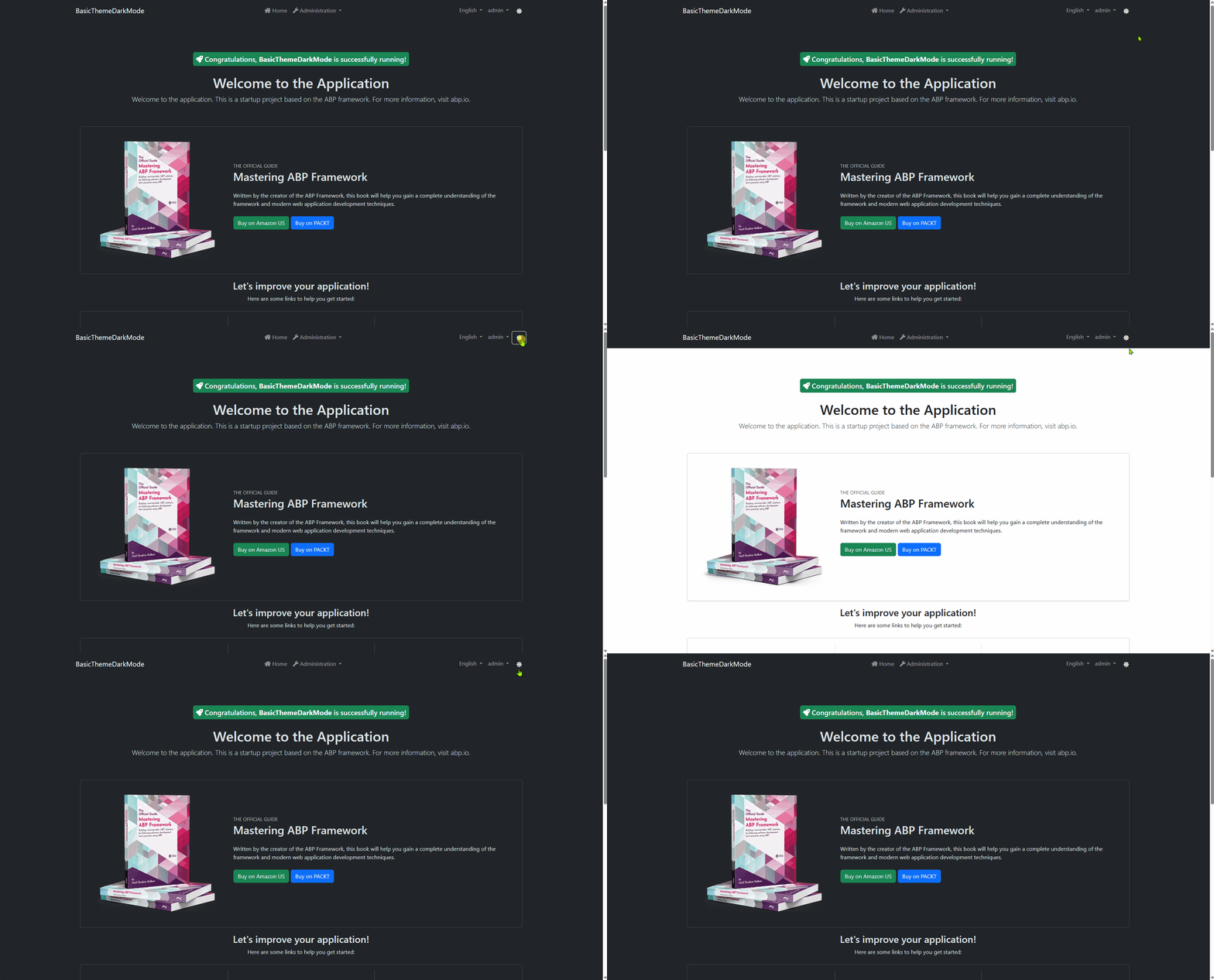
That's it! Now, you can toggle the color mode by clicking the sun icon in the toolbar:

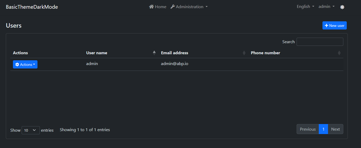
Users Page in Dark Mode:

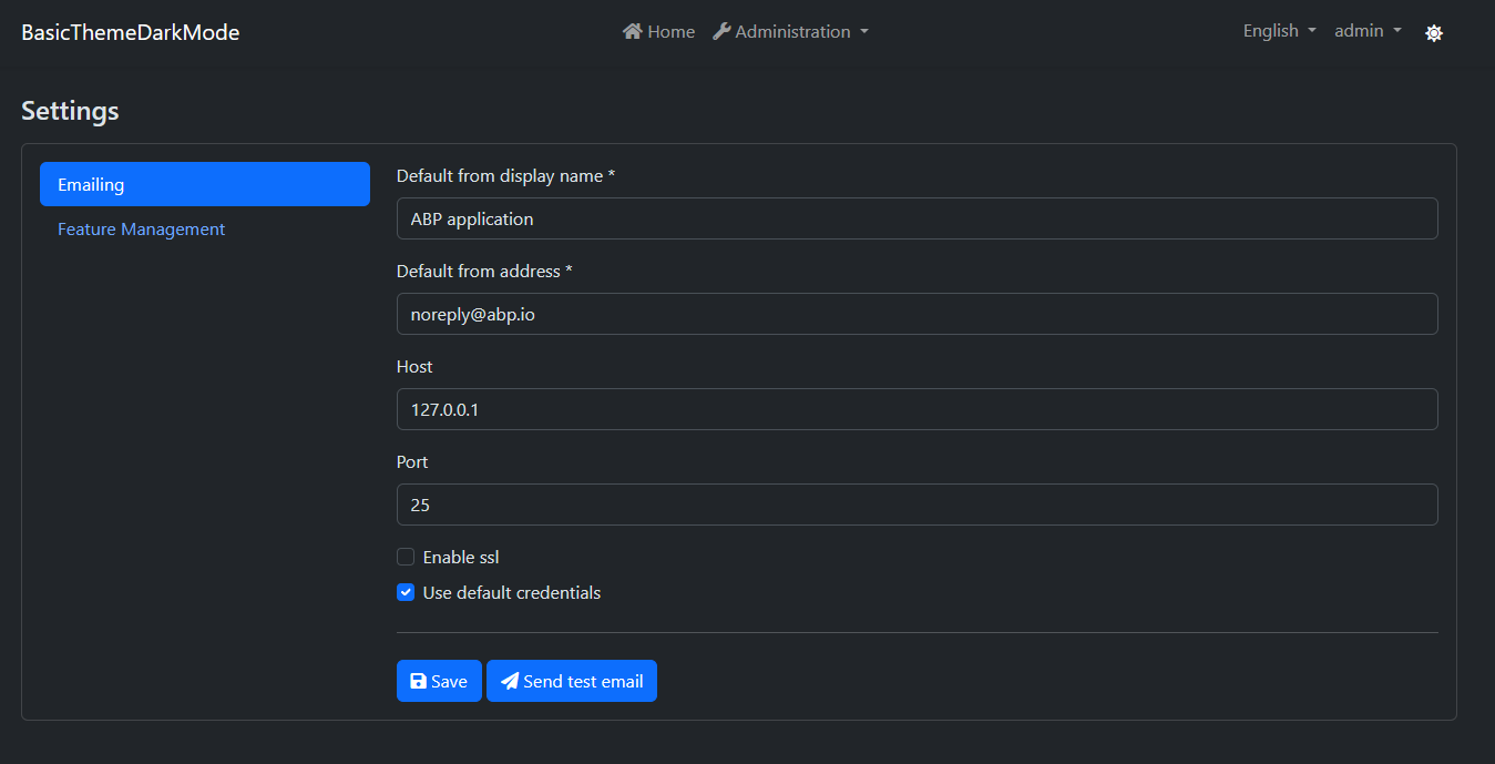
Settings Page in Dark Mode:

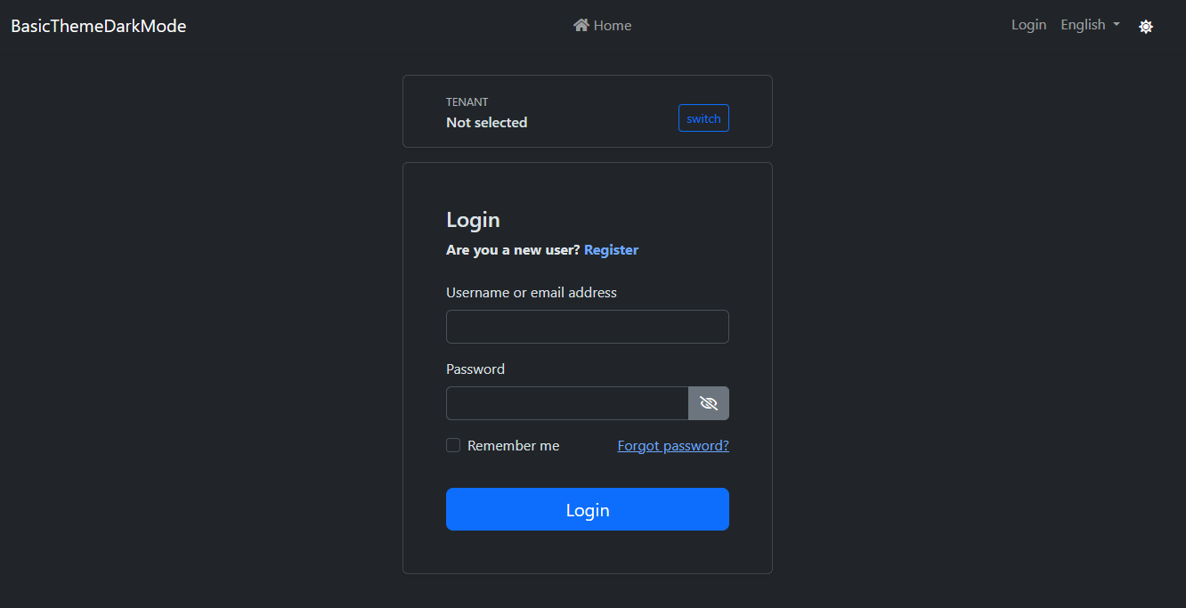
Login Page in Dark Mode:

Conclusion
The theme is stored in local storage and it's initialized on the client-side. You can use Cookies to render the page in the last selected theme on server-side to prevent the flash effect while navigating pages. This document shows the concept of adding dark mode support of bootstrap to the Basic Theme.


Comments
Engincan Veske 135 weeks ago
Great post, thanks for sharing.
Halil İbrahim Kalkan 135 weeks ago
Thanks for the great post.