


Extensible Table Row Detail for Angular UI
Introduction
The <abp-extensible-table-row-detail> component allows you to add expandable row details to any <abp-extensible-table>. When users click the expand icon, additional content is revealed below the row.
Quick Start
Step 1. Import the Component
Import ExtensibleTableRowDetailComponent in your component:
import {
  ExtensibleTableComponent,
  ExtensibleTableRowDetailComponent
} from '@abp/ng.components/extensible';

@Component({
  // ...
  imports: [
    ExtensibleTableComponent,
    ExtensibleTableRowDetailComponent,
  ],
})
export class MyComponent { }
Step 2. Add Row Detail Template
Place <abp-extensible-table-row-detail> inside <abp-extensible-table> with an ng-template:
<abp-extensible-table [data]="data.items" [recordsTotal]="data.totalCount" [list]="list">
  <abp-extensible-table-row-detail>
    <ng-template let-row="row" let-expanded="expanded">
      <div class="p-3">
        <h5>{{ row.name }}</h5>
        <p>ID: {{ row.id }}</p>
        <p>Status: {{ row.isActive ? 'Active' : 'Inactive' }}</p>
      </div>
    </ng-template>
  </abp-extensible-table-row-detail>
</abp-extensible-table>
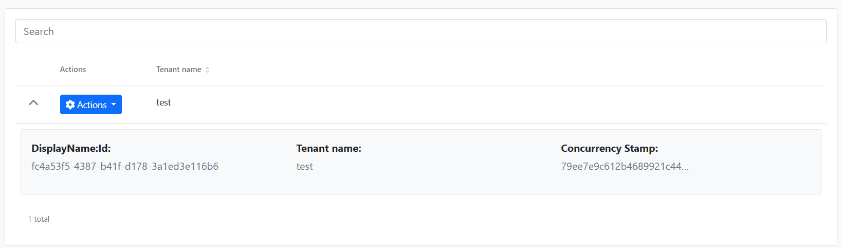
An expand/collapse chevron icon will automatically appear in the first column of each row.
API
ExtensibleTableRowDetailComponent
| Input | Type | Default | Description |
|---|---|---|---|
rowHeight |
string | number |
'100%' |
Height of the expanded row detail area |
Template Context Variables
| Variable | Type | Description |
|---|---|---|
row |
R |
The current row data object |
expanded |
boolean |
Whether the row is currently expanded |
Usage Examples
Basic Example
Display additional information when a row is expanded:
<abp-extensible-table [data]="data.items" [list]="list">
  <abp-extensible-table-row-detail>
    <ng-template let-row="row">
      <div class="p-3 border rounded m-2">
        <strong>Details for: {{ row.name }}</strong>
        <pre>{{ row | json }}</pre>
      </div>
    </ng-template>
  </abp-extensible-table-row-detail>
</abp-extensible-table>
With Custom Row Height
Specify a fixed height for the detail area:
<abp-extensible-table-row-detail [rowHeight]="200">
  <ng-template let-row="row">
    <div class="p-3">Fixed 200px height content</div>
  </ng-template>
</abp-extensible-table-row-detail>
Using Expanded State
Apply conditional styling based on expansion state:
<abp-extensible-table-row-detail>
  <ng-template let-row="row" let-expanded="expanded">
    <div class="p-3" [class.fade-in]="expanded">
      <p>This row is {{ expanded ? 'expanded' : 'collapsed' }}</p>
    </div>
  </ng-template>
</abp-extensible-table-row-detail>
With Badges and Localization
<abp-extensible-table-row-detail>
  <ng-template let-row="row">
    <div class="p-3 bg-light border rounded m-2">
      <div class="row">
        <div class="col-md-6">
          <p class="mb-1"><strong>{{ 'MyModule::Name' | abpLocalization }}</strong></p>
          <p class="text-muted">{{ row.name }}</p>
        </div>
        <div class="col-md-6">
          <p class="mb-1"><strong>{{ 'MyModule::Status' | abpLocalization }}</strong></p>
          <p>
            @if (row.isActive) {
              <span class="badge bg-success">{{ 'AbpUi::Yes' | abpLocalization }}</span>
            } @else {
              <span class="badge bg-secondary">{{ 'AbpUi::No' | abpLocalization }}</span>
            }
          </p>
        </div>
      </div>
    </div>
  </ng-template>
</abp-extensible-table-row-detail>
Alternative: Direct Template Input
For simpler use cases, you can use the rowDetailTemplate input on <abp-extensible-table> directly:
<abp-extensible-table
  [data]="data.items"
  [list]="list"
  [rowDetailTemplate]="detailTemplate"
/>

<ng-template #detailTemplate let-row="row">
  <div class="p-3">{{ row.name }}</div>
</ng-template>
Events
rowDetailToggle
The rowDetailToggle output emits when a row is expanded or collapsed:
<abp-extensible-table
  [data]="data.items"
  [list]="list"
  (rowDetailToggle)="onRowToggle($event)"
>
  <abp-extensible-table-row-detail>
    <ng-template let-row="row">...</ng-template>
  </abp-extensible-table-row-detail>
</abp-extensible-table>
onRowToggle(row: MyDto) {
  console.log('Row toggled:', row);
}


