


Form Input Component
The ABP FormInput Component is a reusable form input component for the text type.
Inputs
labellabelClass (default form-label)inputPlaceholderinputReadonlyinputClass (default form-control)
Outputs
formBlurformFocus
Usage
The ABP FormInput component (AbpFormInputComponent) is a standalone component. You can import it directly in your component:
import { Component } from "@angular/core";
import { AbpFormInputComponent } from "@abp/ng.theme.shared";

@Component({
  selector: 'app-form-input-demo',
  imports: [AbpFormInputComponent],
  templateUrl: './form-input-demo.component.html',
})
export class FormInputDemoComponent {}
Then, the abp-form-input component can be used in your template. See the example below:
<div class="row">
<div class="col-4">
<abp-form-input
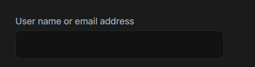
label="AbpAccount::UserNameOrEmailAddress"
inputId="login-input-user-name-or-email-address"
></abp-form-input>
</div>
</div>
See the form input result below:


