


LeptonX Blazor UI
LeptonX theme is implemented and ready to use with ABP Commercial. No custom implementation is needed for Blazor Server & WebAssembly.
Installation
Add Volo.Abp.AspNetCore.Components.WebAssembly.LeptonXTheme package to your Blazor WASM application.
dotnet add package Volo.Abp.AspNetCore.Components.WebAssembly.LeptonXTheme --prereleaseRemove old theme from DependsOn attribute in your module class and add AbpAspNetCoreComponentsWebAssemblyLeptonXThemeModule type to DependsOn attribute.
[DependsOn(
-    typeof(LeptonThemeManagementBlazorModule),
-    typeof(AbpAspNetCoreComponentsWebAssemblyLeptonThemeModule),
+    typeof(AbpAspNetCoreComponentsWebAssemblyLeptonXThemeModule)
)]
- Change startup
Appcomponent with the LeptonX one.Add following using declaration and remove your old theme using declaration.
using Volo.Abp.AspNetCore.Components.Web.LeptonXTheme.Components;Make sure
Appcomponent in following block isVolo.Abp.AspNetCore.Components.Web.LeptonXTheme.Components.App// Make sure the 'App' comes from 'Volo.Abp.AspNetCore.Components.Web.LeptonXTheme.Components' namespace. builder.RootComponents.Add<App>("#ApplicationContainer");- If you can't remove or not sure which one is the old theme's using statements, you can use full name of that class:
builder.RootComponents.Add<Volo.Abp.AspNetCore.Components.Web.LeptonXTheme.Components.App>("#ApplicationContainer");
- If you can't remove or not sure which one is the old theme's using statements, you can use full name of that class:
Customization
Themes
You can set default theme or add or remove themes via using LeptonXThemeOptions.
DefaultStyle: Defines deffault fallback theme. Default value is DimConfigure<LeptonXThemeOptions>(options => { options.DefaultStyle = LeptonXStyleNames.Dark; });Styles: Defines selectable themes from UI.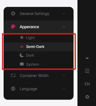
Configure<LeptonXThemeOptions>(options => { // Removing existing themes options.Styles.Remove(LeptonXStyleNames.Light); // Adding a new theme options.Styles.Add("red", new LeptonXThemeStyle( LocalizableString.Create<YourResource>("Theme:Red"), "bi bi-circle-fill")); });red.cssandbootstrap-red.csshave to be added under wwwroot/side-menu/css/ folder for switching to your custom theme properly when selected.
LeptonXThemeBlazorOptions
Layout options of Blazor UI can be manageable via using LeptonXThemeMvcOptions.
Layout: Layout of main application. Default value isLeptonXMvcLayouts.SideMenuConfigure<LeptonXThemeBlazorOptions>(options => { options.Layout = LeptonXBlazorLayouts.SideMenu; // Or your custom implemented layout: options.Layout = typeof(MyCustomLayoutComponent); });MobileMenuSelector: Defines items to be displayed at mobile menu. Default value is first 2 items from main menu items.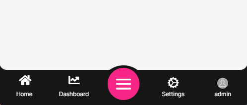
Configure<LeptonXThemeBlazorOptions>(options =>
{
    options.MobileMenuSelector = items => items.Where(x => x.MenuItem.Name == "Home" || x.MenuItem.Name == "Dashboard");
});


