


ASP.NET Core MVC / Razor Pages: Data Tables
A Data Table (aka Data Grid) is a UI component to show tabular data to the users. There are a lot of Data table components/libraries and you can use any one you like with the ABP Framework. However, the startup templates come with the DataTables.Net library as pre-installed and configured. ABP Framework provides adapters for this library and make it easy to use with the API endpoints.
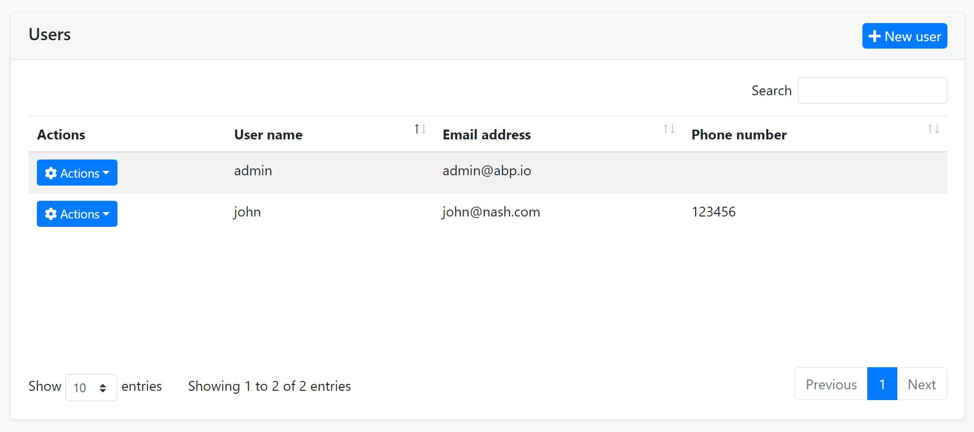
An example screenshot from the user management page that shows the user list in a data table:
DataTables.Net Integration
First of all, you can follow the official documentation to understand how the DataTables.Net works. This section will focus on the ABP addons & integration points rather than fully covering the usage of this library.
A Quick Example
You can follow the web application development tutorial for a complete example application that uses the DataTables.Net as the Data Table. This section shows a minimalist example.
You do nothing to add DataTables.Net library to the page since it is already added to the global bundle by default.
First, add an abp-table as shown below, with an id:
<abp-table striped-rows="true" id="BooksTable"></abp-table>
abp-tableis a Tag Helper defined by the ABP Framework, but a simple<table...>tag would also work.
Then call the DataTable plugin on the table selector:
var dataTable = $('#BooksTable').DataTable(
    abp.libs.datatables.normalizeConfiguration({
        serverSide: true,
        paging: true,
        order: [[1, "asc"]],
        searching: false,
        ajax: abp.libs.datatables.createAjax(acme.bookStore.books.book.getList),
        columnDefs: [
            {
                title: l('Actions'),
                rowAction: {
                    items:
                        [
                            {
                                text: l('Edit'),
                                action: function (data) {
                                    ///...
                                }
                            }
                        ]
                }
            },
            {
                title: l('Name'),
                data: "name"
            },
            {
                title: l('PublishDate'),
                data: "publishDate",
                render: function (data) {
                    return luxon
                        .DateTime
                        .fromISO(data, {
                            locale: abp.localization.currentCulture.name
                        }).toLocaleString();
                }
            },
            {
                title: l('Price'),
                data: "price"
            }
        ]
    })
);
The example code above uses some ABP integration features those will be explained in the next sections.
Configuration Normalization
abp.libs.datatables.normalizeConfiguration function takes a DataTables configuration and normalizes to simplify it;
- Sets
scrollXoption totrue, if not set. - Sets
targetindex for the column definitions. - Sets the
languageoption to localize the table in the current language.
Default Configuration
normalizeConfiguration uses the default configuration. You can change the default configuration using the abp.libs.datatables.defaultConfigurations object. Example:
abp.libs.datatables.defaultConfigurations.scrollX = false;
Here, the all configuration options;
scrollX:falseby default.dom: Default value is<"dataTable_filters"f>rt<"row dataTable_footer"<"col-auto"l><"col-auto"i><"col"p>>.language: A function that returns the localization text using the current language.
AJAX Adapter
DataTables.Net has its own expected data format while getting results of an AJAX call to the server to get the table data. They are especially related how paging and sorting parameters are sent and received. ABP Framework also offers its own conventions for the client-server AJAX communication.
The abp.libs.datatables.createAjax method (used in the example above) adapts request and response data format and perfectly works with the Dynamic JavaScript Client Proxy system.
This works automatically, so most of the times you don't need to know how it works. See the DTO document if you want to learn more about IPagedAndSortedResultRequest, IPagedResult and other standard interfaces and base DTO classes those are used in client to server communication.
The createAjax also supports you to customize request parameters and handle the responses.
Example:
var inputAction = function () {
    return {
        id: $('#Id').val(),
        name: $('#Name').val(),
    };
};

var responseCallback = function(result) {

    // your custom code.

    return {
        recordsTotal: result.totalCount,
        recordsFiltered: result.totalCount,
        data: result.items
    };
};

ajax: abp.libs.datatables.createAjax(acme.bookStore.books.book.getList, inputAction, responseCallback)
Row Actions
rowAction is an option defined by the ABP Framework to the column definitions to show a drop down button to take actions for a row in the table.
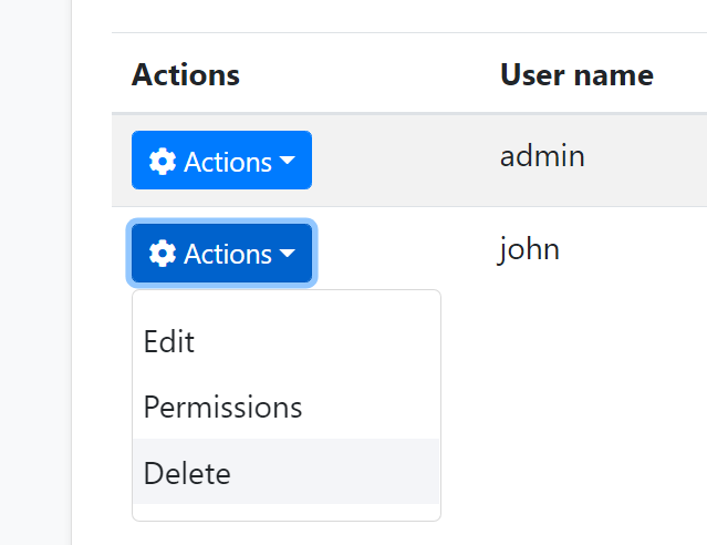
The example screenshot below shows the actions for each user in the user management table:
rowAction is defined as a part of a column definition:
{
    title: l('Actions'),
    rowAction: {
        //TODO: CONFIGURATION
    }
},
Example: Show Edit and Delete actions for a book row
{
    title: l('Actions'),
    rowAction: {
        items:
            [
                {
                    text: l('Edit'),
                    action: function (data) {
                        //TODO: Open a modal to edit the book
                    }
                },
                {
                    text: l('Delete'),
                    confirmMessage: function (data) {
                        return "Are you sure to delete the book " + data.record.name;
                    },
                    action: function (data) {
                        acme.bookStore.books.book
                            .delete(data.record.id)
                            .then(function() {
                                abp.notify.info("Successfully deleted!");
                                data.table.ajax.reload();
                            });
                    }
                }
            ]
    }
},
Action Items
items is an array of action definitions. An action definition can have the following options;
text: The text (astring) for this action to be shown in the actions drop down.action: Afunctionthat is executed when the user clicks to the action. The function takes adataargument that has the following fields;data.record: This is the data object related to the row. You can access the data fields likedata.record.id,data.record.name... etc.data.table: The DataTables instance.
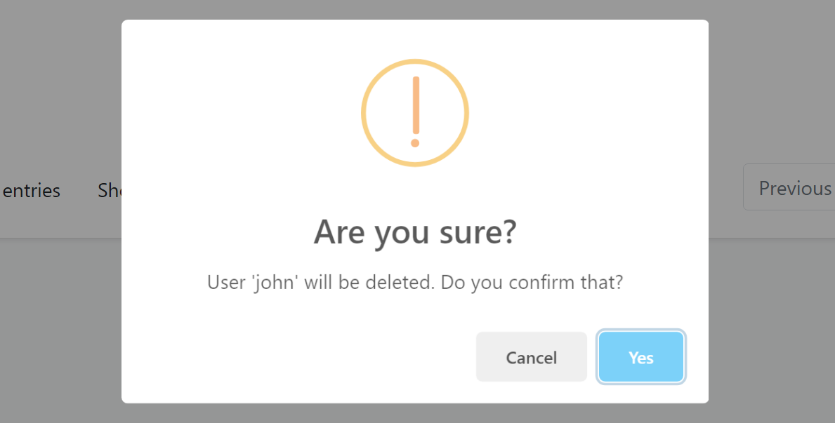
confirmMessage: Afunction(see the example above) that returns a message (string) to show a dialog to get a confirmation from the user before executing theaction. Example confirmation dialog:
You can use the localization system to show a localized message.
visible: Aboolor afunctionthat returns abool. If the result isfalse, then the action is not shown in the actions dropdown. This is generally combined by the authorization system to hide the action if the user has no permission to take this action. Example:
visible: abp.auth.isGranted('BookStore.Books.Delete');
If you define a function, then the function has two arguments: record (the data object of the related row) and the table (the DataTable instance). So, you can decide to show/hide the action dynamically, based on the row data and other conditions.
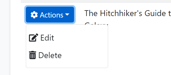
iconClass: Can be used to show a font-icon, like a Font-Awesome icon (ex:fas fa-trash-alt), near to the action text. Example screenshot:
enabled: Afunctionthat returns aboolto disable the action. Thefunctiontakes adataobject with two fields:data.recordis the data object related to the row anddata.tableis the DataTables instance.displayNameHtml: Set this totrueis thetextvalue contains HTML tags.
There are some rules with the action items;
- If none of the action items is visible then the actions column is not rendered.
Data Format
The Problem
See the Creation Time column in the example below:
{
    title: l('CreationTime'),
    data: "creationTime",
    render: function (data) {
        return luxon
            .DateTime
            .fromISO(data, {
                locale: abp.localization.currentCulture.name
            }).toLocaleString(luxon.DateTime.DATETIME_SHORT);
    }
}
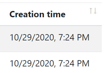
The render is a standard DataTables option to render the column content by a custom function. This example uses the luxon library (which is installed by default) to write a human readable value of the creationTime in the current user's language. Example output of the column:
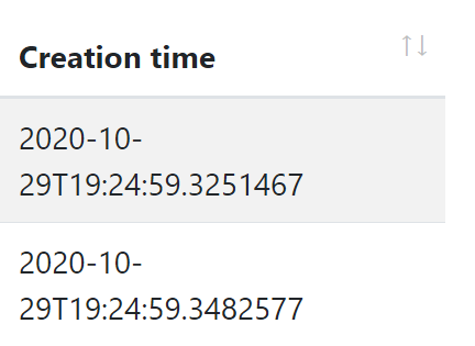
If you don't define the render option, then the result will be ugly and not user friendly:
However, rendering a DateTime is almost same and repeating the same rendering logic everywhere is against to the DRY (Don't Repeat Yourself!) principle.
dataFormat Option
dataFormat column option specifies the data format that is used to render the column data. The same output could be accomplished using the following column definition:
{
    title: l('CreationTime'),
    data: "creationTime",
    dataFormat: 'datetime'
}
dataFormat: 'datetime' specifies the data format for this column. There are a few pre-defined dataFormats:
boolean: Shows acheckicon fortrueandtimesicon forfalsevalue and useful to renderboolvalues.date: Shows date part of aDateTimevalue, formatted based on the current culture.datetime: Shows date & time (excluding seconds) of aDateTimevalue, formatted based on the current culture.
Default Renderers
abp.libs.datatables.defaultRenderers option allows you to define new data formats and set renderers for them.
Example: Render male / female icons based on the gender
abp.libs.datatables.defaultRenderers['gender'] = function(value) {
    if (value === 'f') {
        return '<i class="fa fa-venus"></i>';
    } else {
        return '<i class="fa fa-mars"></i>';
    }
};
Assuming that the possible values for a column data is f and m, the gender data format shows female/male icons instead of f and m texts. You can now set dataFormat: 'gender' for a column definition that has the proper data values.
You can write the default renderers in a single JavaScript file and add it to the Global Script Bundle, so you can reuse them in all the pages.
Other Data Grids
You can use any library you like. For example, see this article to learn how to use DevExtreme Data Grid in your applications.


