


I’ve reviewed the latest ABP documentation and samples, but couldn’t find guidance on extending LeptonX UI behavior for accessibility (keyboard interaction and ARIA support).
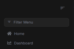
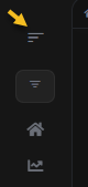
Context In the LeptonX UI layout, the left navigation menu includes a collapse icon (the small ) that narrows the sidebar to icon-only mode. When collapsed, it automatically expands again when hovered with the mouse.
However, this interaction currently depends entirely on mouse hover, which makes it inaccessible to keyboard and screen reader users. When the menu is collapsed, there’s no keyboard-focusable control available to re-expand it.
What I’m Trying to Achieve
I’d like to implement keyboard accessibility and ARIA support for the LeptonX sidebar collapse/expand toggle, in alignment with WCAG 2.1 AA requirements.
Specifically, the improvements should:
- Make the collapse icon keyboard focusable ( or role="button").
- Toggle the sidebar state on Enter/Space.
- Expose the menu’s state via aria-expanded="true|false".
- Keep a persistent, focusable toggle even when the sidebar is collapsed.
- Optionally expand the sidebar when it gains keyboard focus (to match hover behavior).
Current HTML Structure
<lpx-icon iconclass="bi bi-filter-left" class="menu-collapse-icon hidden-in-hover-trigger" ng-reflect-icon-class="bi bi-filter-left"> <i aria-hidden="true" class="lpx-icon bi bi-filter-left"></i> </lpx-icon>
Goal Example (Accessible Version)
<button type="button" class="menu-collapse-icon" [attr.aria-label]="isCollapsed ? 'Expand navigation' : 'Collapse navigation'" [attr.aria-expanded]="!isCollapsed" (click)="toggleSidebar()">
Where toggleSidebar() updates the isCollapsed state and toggles a CSS class on the sidebar container.
Request for Assistance Could you please advise on:
- The best practice or extension point in LeptonX layout to override or extend this behavior cleanly?
- Whether there’s a recommended way to customize or replace the collapse icon template within the lpx-layout component.
- If any ABP-provided directive/service already handles sidebar state so we can bind to it instead of reimplementing the logic.
- Any considerations to maintain compatibility with LeptonX hover-trigger behavior while adding focus-trigger support.
Environment Info ABP Framework Version: 9.x UI Framework: Angular (LeptonX Theme) Solution Type: Modular Monolith (ABP Commercial) Browser: Chrome 141 Accessibility Tools Used: NVDA, Axe, and WAVE
Steps to Reproduce
Run the Angular application with LeptonX theme. Collapse the left navigation using the collapse icon. Attempt to re-expand using only the keyboard — there’s no focusable element. Observe: menu can only expand on mouse hover, not via keyboard.
Expected Result
Keyboard users should be able to toggle the sidebar state using Tab + Enter/Space, and assistive technologies should receive correct aria-expanded and label updates.
4 Answer(s)
-
0
- Solution Here’s a safe, upgrade-friendly way to make the LeptonX Angular left sidebar toggle fully keyboard-accessible while keeping LeptonX’s hover behavior.
A) Use the theme’s replaceable component hook to customize the layout header/toolbar area where the collapse icon lives
- Create your own component that renders an always-focusable button for collapse/expand, exposes ARIA, and handles keyboard.
- Register it as a replaceable component so you don’t patch theme sources.
Example registration (in your ThemeModule or a shared module initialized at app bootstrap):
import { NgModule } from '@angular/core';
import { ReplaceableComponentsService } from '@abp/ng.core';
import { eThemeLeptonXComponents } from '@abp/ng.theme.lepton-x'; // adjust import to your version
import { AccessibleSidebarToggleComponent } from './accessible-sidebar-toggle.component';

@NgModule({
  declarations: [AccessibleSidebarToggleComponent],
  exports: [AccessibleSidebarToggleComponent]
})
export class ThemeCustomizationModule {
  constructor(rc: ReplaceableComponentsService) {
    rc.add({
      key: eThemeLeptonXComponents.Navbar, // or the exact header/toolbar key used by your layout
      component: AccessibleSidebarToggleComponent,
    });
  }
}
B) Implement the toggle component by binding to LeptonX/Theme Shared layout state (do not re-implement state)
- ABP Angular themes keep layout state in a layout service (theme-shared). Use it to get/set “collapsed/expanded” so the rest of the theme stays in sync (CSS classes, hover behavior, etc.).
Example component:
import { Component, HostListener, ChangeDetectionStrategy } from '@angular/core';
import { Observable } from 'rxjs';
import { map } from 'rxjs/operators';
// Layout service location may differ by version; it’s typically in @abp/ng.theme.shared or @abp/ng.theme.lepton-x
import { LayoutService } from '@abp/ng.theme.shared'; // adjust import path to your version

@Component({
  selector: 'app-accessible-sidebar-toggle',
  template: `
    <button
      type="button"
      class="menu-collapse-icon"
      [attr.aria-label]="(isCollapsed$ | async) ? 'Expand navigation' : 'Collapse navigation'"
      [attr.aria-expanded]="!(isCollapsed$ | async)"
      (click)="toggleSidebar()"
      (keydown)="onKeydown($event)"
    >
      <i class="bi" [ngClass]="(isCollapsed$ | async) ? 'bi-filter-right' : 'bi-filter-left'"></i>
    </button>
  `,
  changeDetection: ChangeDetectionStrategy.OnPush,
})
export class AccessibleSidebarToggleComponent {
  // Expose collapsed state from the theme’s layout service
  isCollapsed$: Observable<boolean> = this.layout.state$.pipe(map(s => !!s?.sidebarCollapsed));

  constructor(private layout: LayoutService) {}

  toggleSidebar(): void {
    const cur = this.layout.getState()?.sidebarCollapsed ?? false;
    this.layout.setState({ sidebarCollapsed: !cur });
  }

  onKeydown(e: KeyboardEvent): void {
    if (e.key === 'Enter' || e.key === ' ') {
      e.preventDefault();
      this.toggleSidebar();
    }
  }

  // Optional: expand on focus to mirror hover
  @HostListener('focusin')
  onFocusIn(): void {
    const cur = this.layout.getState()?.sidebarCollapsed ?? false;
    if (cur) {
      this.layout.setState({ sidebarCollapsed: false });
    }
  }
}
Notes:
- The class “menu-collapse-icon” is kept for styling consistency. You can add your own CSS as needed.
- aria-expanded reflects the expanded state of the navigation region (true when sidebar is visible).
- The button remains focusable in both collapsed and expanded states because it’s always rendered.
- The focus handler expands the sidebar when keyboard focus lands on the toggle, matching the hover experience. If you prefer not to auto-expand on focus, remove the HostListener.
C) Keep hover-trigger behavior
- LeptonX uses “hover-trigger” to expand when collapsed on mouse hover. Do not remove that behavior; by using the theme’s layout state, hover-trigger will continue to work. Your button simply adds keyboard and ARIA on top of it.
D) Where to place the toggle
- If the original collapse icon is inside the layout’s Navbar/Toolbar area, replacing the Navbar replaceable component is typically the right extension point.
- If your app uses SideMenuLayoutModule or TopMenuLayoutModule variants, ensure you register the replacement in a module that’s loaded with your chosen layout, and use the correct key from eThemeLeptonXComponents for that layout version.
E) Persisting user choice (optional)
- If you want the collapsed state to persist, subscribe to the state$ and store sidebarCollapsed in localStorage, then initialize the LayoutService state on app start accordingly:
// On app init
const saved = localStorage.getItem('sidebarCollapsed') === 'true';
layout.setState({ sidebarCollapsed: saved });

// When state changes
layout.state$.subscribe(s => localStorage.setItem('sidebarCollapsed', String(!!s?.sidebarCollapsed)));
F) Minimal template-only alternative
- If you prefer not to replace the whole Navbar, you can still add a focusable button near the existing icon by creating a small component projected into a replaceable region (if your version exposes such a slot). The essential parts remain: role=button (native button), aria-expanded, Enter/Space handling, and binding to the LayoutService.
- Sources
- ABP Replaceable components (Angular) guidance:
- https://abp.io/support/questions/3746
- Example of LeptonX replaceable component keys (LeptonX Lite Angular docs show the pattern of using eThemeLeptonXComponents.Navbar):
- https://abp.io/docs/latest/ui-themes/lepton-x-lite/angular
This response was generated by AI. If it didn’t solve your problem, feel free to post a new answer — our support team will jump in to help you soon.
-
0
It looks to me like I'd have to replace the whole navbar.
How can I add a request for the Lepton-X theme to be changed so that when its expanded the collapse icon is visible:
and when Its collapsed, the expand icon is visble:
Also making accessible as a button would be preferred.
thanks
-
0
- Solution You don’t have to replace the whole navbar to ask for this to be built into the LeptonX theme. To request product changes (add a persistent, keyboard-accessible collapse/expand button that swaps icons based on state), use ABP Commercial’s official channels below so it’s tracked by the LeptonX team:
What to request
- Always-render a real button for the sidebar toggle (not hover-only), with:
- type="button", tabindex=0 (native button already focusable)
- aria-label bound to the action (Expand navigation / Collapse navigation)
- aria-expanded bound to the current sidebar state
- Enter/Space to toggle
- Icon swap based on state:
- Expanded: show “collapse” icon (e.g., bi-filter-left)
- Collapsed: show “expand” icon (e.g., bi-filter-right)
- Keep hover-trigger behavior, but not as the only way; the button must be present and focusable in both states.
- Expose the state through the theme’s layout service so existing CSS/behavior stays in sync.
How to submit the request
- Open a feature request (or support ticket tagged as “feature request”) describing:
- Problem: sidebar relies on hover; no keyboard re-expand path.
- Proposed solution: a persistent, accessible toggle button with ARIA and keyboard handling; icon swaps by state.
- Acceptance criteria: WCAG 2.1 AA—keyboard operable and correct aria-expanded; no regression to hover behavior.
- Environment details you already listed (ABP 9.x, Angular LeptonX, tools used).
- Include your screenshots and a suggested HTML/Angular snippet:
- Example: <button type="button" class="menu-collapse-icon" [attr.aria-label]="isCollapsed ? 'Expand navigation' : 'Collapse navigation'" [attr.aria-expanded]="!isCollapsed" (click)="toggleSidebar()"> <i class="bi" [ngClass]="isCollapsed ? 'bi-filter-right' : 'bi-filter-left'"></i> </button>
Interim workaround (minimal replacement)
- If you want this today without forking theme sources:
- Use ReplaceableComponentsService to replace only the Navbar component with a small wrapper that adds the button and binds to the theme’s layout state. This keeps upgrades manageable and retains hover behavior because you’ll use the theme’s state service rather than custom state.
- Sources
- Replaceable component usage pattern in LeptonX Angular:
- https://abp.io/docs/latest/ui-themes/lepton-x-lite/angular
- ABP module/modularity background (for placing the customization cleanly):
- https://abp.io/docs/latest/framework/architecture/modularity/basics
- Community Q&A demonstrating replaceable component discovery/usage:
- https://abp.io/support/questions/3746
This response was generated by AI. If it didn’t solve your problem, feel free to post a new answer — our support team will jump in to help you soon.
-
0
Added issue to backlog: https://github.com/abpframework/abp/issues/24077


