LeptonX Lite Blazor UI
LeptonX Lite has implementation for the ABP Framework Blazor WebAssembly & Blazor Server. It's a simplified variation of the LeptonX Theme.
If you are looking for a professional, enterprise ready theme, you can check the LeptonX Theme, which is a part of ABP Commercial.
See the Theming document to learn about themes.
Installation
This theme is already installed when you create a new solution using the startup templates. If you are using any other template, you can install this theme by following the steps below:
Complete the MVC Razor Pages Installation for the HttpApi.Host application first. If the solution is tiered/micro-service, complete the MVC steps for all MVC applications such as HttpApi.Host and if Auth Server is separated, install to the OpenIddict.
Add Volo.Abp.AspNetCore.Components.WebAssembly.LeptonXLiteTheme package to your Blazor WebAssembly application with the following command:
dotnet add package Volo.Abp.AspNetCore.Components.WebAssembly.LeptonXLiteTheme --prereleaseRemove Volo.Abp.AspNetCore.Components.WebAssembly.BasicTheme reference from the project since it's not necessary after switching to LeptonX Lite.
Remove the old theme from the DependsOn attribute in your module class and add the AbpAspNetCoreComponentsWebAssemblyLeptonXLiteThemeModule type to the DependsOn attribute.
[DependsOn(
     // Remove BasicTheme module from DependsOn attribute
-    typeof(AbpAspNetCoreComponentsWebAssemblyBasicThemeModule),

    // Add LeptonX Lite module to DependsOn attribute
+    typeof(AbpAspNetCoreComponentsWebAssemblyLeptonXLiteThemeModule),
)]
- Change startup App component with the LeptonX one.
// Make sure the 'App' comes from 'Volo.Abp.AspNetCore.Components.Web.LeptonXLiteTheme.Themes.LeptonXLite' namespace.
builder.RootComponents.Add<App>("#ApplicationContainer");
- Run the
abp bundlecommand in your Blazor application folder.
Customization
Layout
- Create a razor page, like
MyMainLayout.razor, in your blazor application as shown below:
@using Volo.Abp.AspNetCore.Components.Web.LeptonXLiteTheme.Themes.LeptonXLite;
@using Volo.Abp.DependencyInjection

@inherits MainLayout
@attribute [ExposeServices(typeof(MainLayout))]
@attribute [Dependency(ReplaceServices = true)]

@Name

@code {
    string Name = "My Main Layout";
}
- If you prefer to use a code-behind file for the C# code of your component, create a razor component, like
MyMainLayout.razor.cs, in your blazor application as shown below:
[ExposeServices(typeof(MainLayout))]
[Dependency(ReplaceServices = true)]
namespace LeptonXLite.DemoApp.Blazor.MyComponents
{
    public partial class MyMainLayout
    {
        public string Name = "My Main Layout";
    }
}
Don't forget to remove the repeated attributes from the razor page! Don't forget to remove the
@codesection from the razor page!
Toolbars
LeptonX Lite includes separeted toolbars for desktop & mobile. You can manage toolbars independently. Toolbar names can be accessible in the LeptonXLiteToolbars class.
LeptonXLiteToolbars.MainLeptonXLiteToolbars.MainMobile
public async Task ConfigureToolbarAsync(IToolbarConfigurationContext context)
{
    if (context.Toolbar.Name == LeptonXLiteToolbars.Main)
    {
        context.Toolbar.Items.Add(new ToolbarItem(typeof(MyDesktopComponent)));
    }

    if (context.Toolbar.Name == LeptonXLiteToolbars.MainMobile)
    {
        context.Toolbar.Items.Add(new ToolbarItem(typeof(MyMobileComponent)));
    }

    return Task.CompletedTask;
}
Components
LeptonX Blazor is built on the basis of components. You can use the components in your application as you wish, or you can customize the components by overriding them. If you want to override a component please follow the steps.
Branding Component
The branding component is a simple component that can be used to display your brand. It contains a logo and a company name.
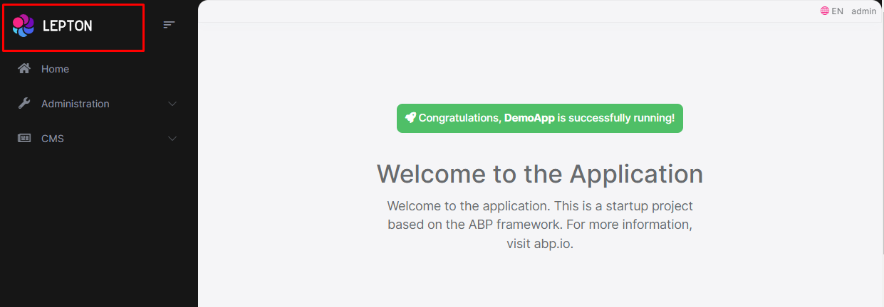
How to Override Branding Component
- Create a razor page, like
MyBrandingComponent.razor, in your blazor application as shown below:
@using Volo.Abp.AspNetCore.Components.Web.LeptonXLiteTheme.Themes.LeptonXLite;
@using Volo.Abp.DependencyInjection

@inherits Branding
@attribute [ExposeServices(typeof(Branding))]
@attribute [Dependency(ReplaceServices = true)]

@Name

@code {
    string Name = "My Branding Component";
}
- If you prefer to use a code-behind file for the C# code of your component, create a razor component, like
MyBrandingComponent.razor.cs, in your blazor application as shown below:
namespace LeptonXLite.DemoApp.Blazor.MyComponents
{
    public partial class MyBrandingComponent
    {
        public string Name = "My Branding Component";
    }
}
How to override the favicon
Startup templates contain favicon.ico files under the wwwroot folder of the Blazor application. You can change this file to override the current favicon.
Breadcrumb Component
On websites that have a lot of pages, breadcrumb navigation can greatly enhance the way users find their way around. In terms of usability, breadcrumbs reduce the number of actions a website visitor needs to take in order to get to a higher-level page, and they improve the findability of website sections and pages.
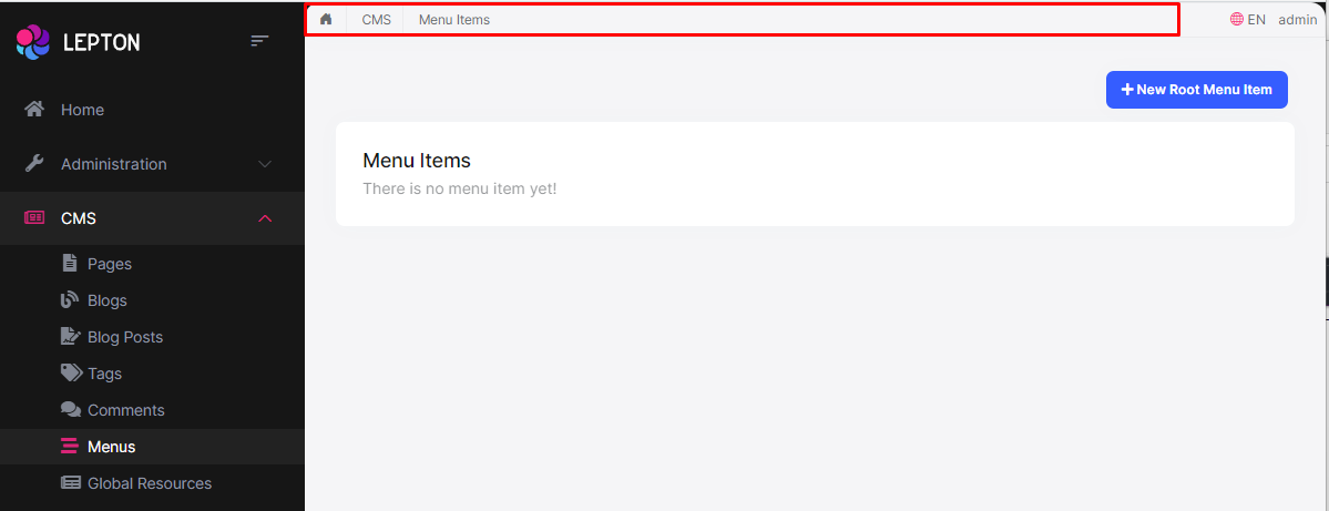
How to Override the BreadCrumb Component
- Create a razor page, like
MyBreadcrumbsComponent.razor, in your blazor application as shown below:
@using Volo.Abp.AspNetCore.Components.Web.LeptonXLiteTheme.Themes.LeptonXLite;
@using Volo.Abp.DependencyInjection

@inherits Breadcrumbs
@attribute [ExposeServices(typeof(Breadcrumbs))]
@attribute [Dependency(ReplaceServices = true)]

@Name

@code {
    string Name = "My Breadcrumbs Component";
}
- If you prefer to use a code-behind file for the C# code of your component, create a razor component, like
MyBreadcrumbsComponent.razor.cs, in your blazor application as shown below:
using Volo.Abp.AspNetCore.Components.Web.LeptonXLiteTheme.Themes.LeptonXLite;
using Volo.Abp.DependencyInjection;

namespace LeptonXLite.DemoApp.Blazor.MyComponents
{
    [ExposeServices(typeof(Breadcrumbs))]
    [Dependency(ReplaceServices = true)]
    public partial class MyBreadcrumbsComponent
    {
        public string Name = "My Breadcrumbs Component";
    }
}
Main Menu Component
Sidebar menus have been used as a directory for Related Pages for a Service offering, Navigation items for a specific service or topic and even just as Links the user may be interested in.

How to Override the Main Menu Component
- Create a razor page, like
MyMainMenuComponent.razor, in your blazor application as shown below:
@using Volo.Abp.AspNetCore.Components.Web.LeptonXLiteTheme.Themes.LeptonXLite.Navigation;
@using Volo.Abp.DependencyInjection

@inherits MainMenu
@attribute [ExposeServices(typeof(MainMenu))]
@attribute [Dependency(ReplaceServices = true)]

@Name

@code {
    string Name = "My Main Menu Component";
}
- If you prefer to use a code-behind file for the C# code of your component, create a razor component, like
MyMainMenu.razor.cs, in your blazor application as shown below:
using Volo.Abp.AspNetCore.Components.Web.LeptonXLiteTheme.Themes.LeptonXLite.Navigation;
using Volo.Abp.DependencyInjection;

namespace LeptonXLite.DemoApp.Blazor.MyComponents
{
    [ExposeServices(typeof(MainMenu))]
    [Dependency(ReplaceServices = true)]
    public partial class MainMenu
    {
        public string Name = "My Main Menu Component";
    }
}
The main menu renders the menu items dynamically. The menu item is a razor component named
MainMenuItem.razor.csin the same namespace with main menu and you can override it like the main menu.
Toolbar Items Component
Toolbar items are used to add extra functionality to the toolbar. The toolbar is a horizontal bar that contains a group of toolbar items.
How to Override the Toolbar Items Component
- Create a razor page, like
MyToolbarItemsComponent.razor, in your blazor application as shown below:
@using Volo.Abp.AspNetCore.Components.Web.LeptonXLiteTheme.Themes.LeptonXLite;
@using Volo.Abp.DependencyInjection

@inherits ToolbarItemsComponent
@attribute [ExposeServices(typeof(ToolbarItemsComponent))]
@attribute [Dependency(ReplaceServices = true)]

@Name

@code {
    string Name = "My Toolbar Items Component";
}
- If you prefer to use a code-behind file for the C# code of your component, create a razor component, like
MyToolbarItemsComponent.razor.cs, in your blazor application as shown below:
using Volo.Abp.AspNetCore.Components.Web.LeptonXLiteTheme.Themes.LeptonXLite;
using Volo.Abp.DependencyInjection;

namespace LeptonXLite.DemoApp.Blazor.MyComponents
{
    [ExposeServices(typeof(ToolbarItemsComponent))]
    [Dependency(ReplaceServices = true)]
    public partial class MyToolbarItemsComponent
    {
        public string Name = "My Toolbar Items Component";
    }
}
Language Switch Component
Think about a multi-lingual website and the first thing that could hit your mind is the language switch component. A navigation bar is a great place to embed a language switch. By embedding the language switch in the navigation bar of your website, you would make it simpler for users to find it and easily switch the language without trying to locate it across the website.
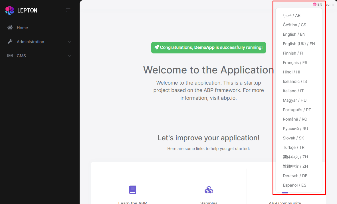
How to Override the Language Switch Component
- Create a razor page, like
MyLanguageSwitchComponent.razor, in your blazor application as shown below:
@using Volo.Abp.AspNetCore.Components.Web.LeptonXLiteTheme.Themes.LeptonXLite.Toolbar;
@using Volo.Abp.DependencyInjection

@inherits LanguageSwitchComponent
@attribute [ExposeServices(typeof(LanguageSwitchComponent))]
@attribute [Dependency(ReplaceServices = true)]

@Name

@code {
    string Name = "My Language Switch Component";
}
- If you prefer to use a code-behind file for the C# code of your component, create a razor component, like
MyLanguageSwitchComponent.razor.cs, in your blazor application as shown below:
using Volo.Abp.AspNetCore.Components.Web.LeptonXLiteTheme.Themes.LeptonXLite.Toolbar;
using Volo.Abp.DependencyInjection;

namespace LeptonXLite.DemoApp.Blazor.MyComponents
{
    [ExposeServices(typeof(LanguageSwitchComponent))]
    [Dependency(ReplaceServices = true)]
    public partial class MyLanguageSwitchComponent
    {
        public string Name = "My Language Switch Component";
    }
}
Mobile Language Switch Component
The mobile language switch component is used to switch the language of the website on mobile devices. The mobile language switch component is a dropdown menu that contains all the languages of the website.
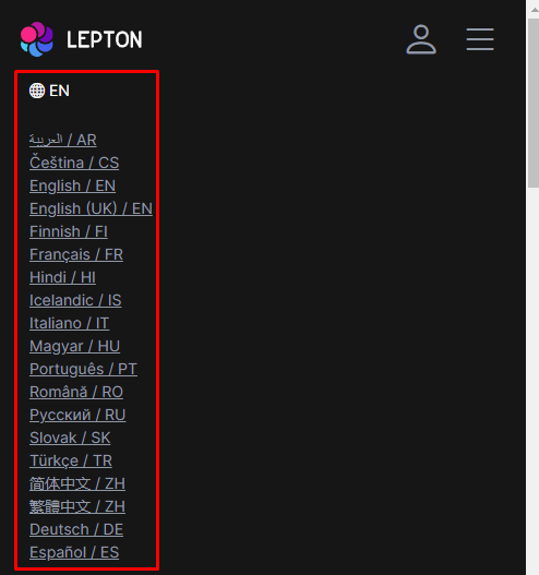
How to Override the Mobile Language Switch Component
- Create a razor page, like
MyMobilLanguageSwitchComponent.razor, in your blazor application as shown below:
@using Volo.Abp.AspNetCore.Components.Web.LeptonXLiteTheme.Themes.LeptonXLite.Toolbar;
@using Volo.Abp.DependencyInjection

@inherits MobilLanguageSwitchComponent
@attribute [ExposeServices(typeof(MobilLanguageSwitchComponent))]
@attribute [Dependency(ReplaceServices = true)]

@Name

@code {
    string Name = "My Mobile Language Switch Component";
}
- If you prefer to use a code-behind file for the C# code of your component, create a razor component, like
MyMobilLanguageSwitchComponent.razor.cs, in your blazor application as shown below:
using Volo.Abp.AspNetCore.Components.Web.LeptonXLiteTheme.Themes.LeptonXLite.Toolbar;
using Volo.Abp.DependencyInjection;

namespace LeptonXLite.DemoApp.Blazor.MyComponents
{
    [ExposeServices(typeof(MobilLanguageSwitchComponent))]
    [Dependency(ReplaceServices = true)]
    public partial class MyMobilLanguageSwitchComponent
    {
        public string Name = "My Mobile Language Switch Component";
    }
}
User Menu Component
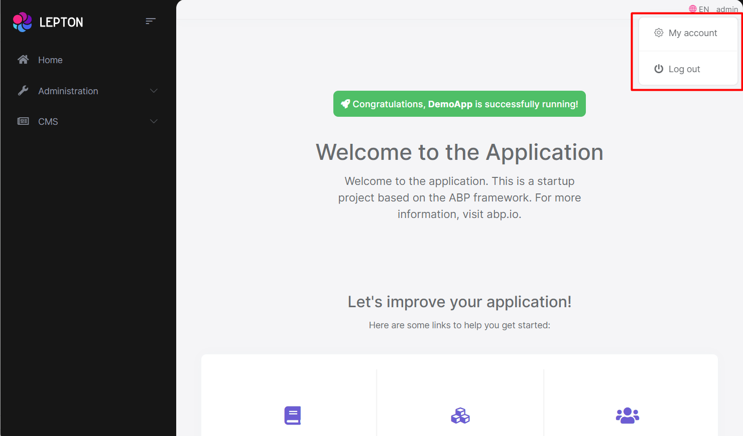
The User Menu is the menu that drops down when you click your name or profile picture in the upper right corner of your page (in the toolbar). It drops down options such as Settings, Logout, etc.
How to Override the User Menu Component
- Create a razor page, like
MyUserMenuComponent.razor, in your blazor application as shown below:
@using Volo.Abp.AspNetCore.Components.Server.LeptonXLiteTheme.Themes.LeptonXLite.Toolbar;
@using Volo.Abp.DependencyInjection

@inherits MobilLanguageSwitchComponent
@attribute [ExposeServices(typeof(MobilLanguageSwitchComponent))]
@attribute [Dependency(ReplaceServices = true)]

@Name

@code {
    string Name = "My User Menu Component";
}
- If you prefer to use a code-behind file for the C# code of your component, create a razor component, like
MyUserMenuComponent.razor.cs, in your blazor application as shown below:
using Volo.Abp.AspNetCore.Components.Server.LeptonXLiteTheme.Themes.LeptonXLite.Toolbar;
using Volo.Abp.DependencyInjection;

namespace LeptonXLite.DemoApp.Blazor.MyComponents
{
    [ExposeServices(typeof(UserMenuComponent))]
    [Dependency(ReplaceServices = true)]
    public partial class MyUserMenuComponent
    {
        public string Name = "My User Menu Component";
    }
}
Mobile User Menu Component
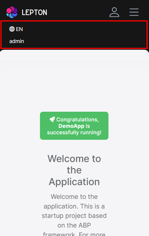
The mobile user menu component is used to display the user menu on mobile devices. The mobile user menu component is a dropdown menu that contains all the options of the user menu.
How to override the Mobile User Menu Component
- Create a razor page, like
MyMobileUserMenuComponent.razor, in your blazor application as shown below:
@using Volo.Abp.AspNetCore.Components.Server.LeptonXLiteTheme.Themes.LeptonXLite.Toolbar;
@using Volo.Abp.DependencyInjection

@inherits MobilUserMenuComponent
@attribute [ExposeServices(typeof(MobilUserMenuComponent))]
@attribute [Dependency(ReplaceServices = true)]

@Name

@code {
    string Name = "My Mobile User Menu Component";
}
- If you prefer to use a code-behind file for the C# code of your component, create a razor component, like
MyMobileUserMenuComponent.razor.cs, in your blazor application as shown below:
using Volo.Abp.AspNetCore.Components.Server.LeptonXLiteTheme.Themes.LeptonXLite.Toolbar;
using Volo.Abp.DependencyInjection;

namespace LeptonXLite.DemoApp.Blazor.MyComponents
{
    [ExposeServices(typeof(MobileUserMenuComponent))]
    [Dependency(ReplaceServices = true)]
    public partial class MyMobileUserMenuComponent
    {
        public string Name = "My Mobile User Menu Component";
    }
}


