4 Answer(s)
-
0
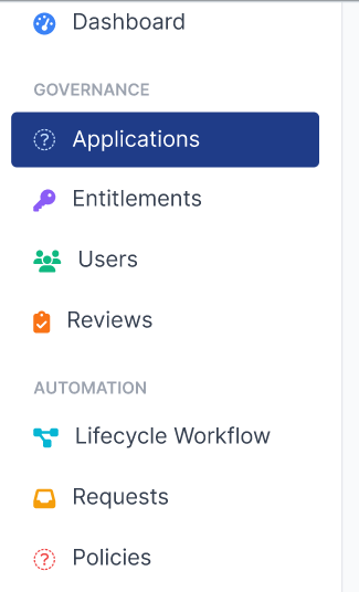
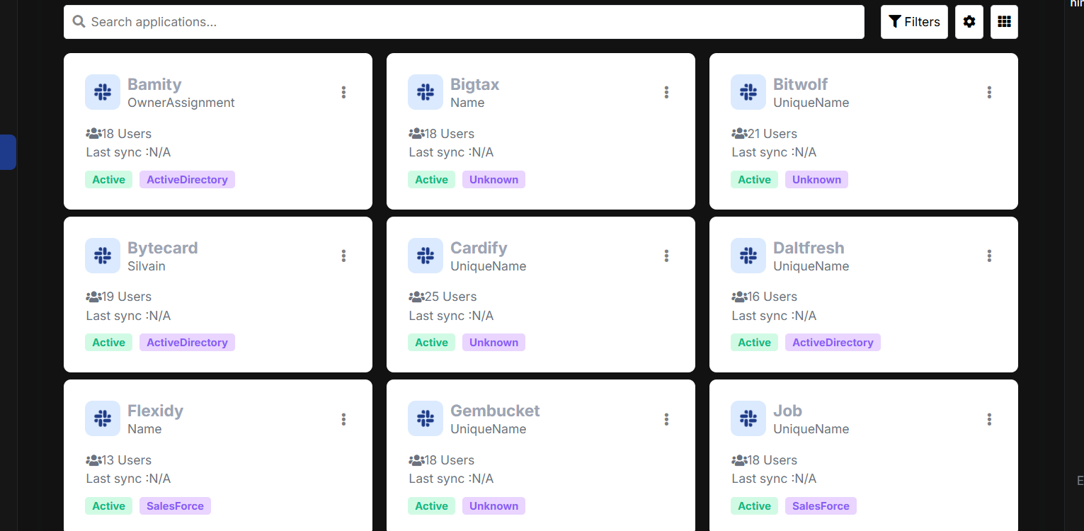
To customize the navigation header/sidebar in your ABP Angular application as shown in your image, and to control dark mode/light mode for custom components, follow these steps:
Custom Sidebar/Nav Header Layout
- Use ABP's Angular Component Replacement to create a custom sidebar component.
- Generate a new component (e.g.,
SideNavComponent) and design the HTML to match your desired layout, including section headers (like "GOVERNANCE", "AUTOMATION") and menu items with icons. - Example:
<ul class="custom-sidenav"> <li> <span class="sidenav-section">GOVERNANCE</span> </li> <li routerLink="/applications" routerLinkActive="active"> <i class="icon-applications"></i> Applications </li> <li routerLink="/entitlements"> <i class="icon-entitlements"></i> Entitlements </li> <!-- ...other items... --> <li> <span class="sidenav-section">AUTOMATION</span> </li> <li routerLink="/lifecycle-workflow"> <i class="icon-lifecycle"></i> Lifecycle Workflow </li> <!-- ... --> </ul> - Use CSS to style section headers and active states to match your design.
Replace the Default Sidebar
- Use the ABP Angular Component Replacement system to replace the default sidebar/nav component with your custom one.
- See: ABP Angular Component Replacement
Dark Mode / Light Mode Control for Custom Components
- If you are using LeptonX or a similar theme, you can programmatically set the theme style in your Angular code.
- Example for LeptonX:
import { ThemeService, StyleNames, lightTheme, darkTheme } from '@volosoft/ngx-lepton-x'; export class AppComponent { constructor(private themeService: ThemeService) {} setLightMode() { this.themeService.setTheme(lightTheme); } setDarkMode() { this.themeService.setTheme(darkTheme); } } - You can call these methods from a toggle button or based on user preference.
- For custom component styles, use CSS variables or classes that respond to the current theme.
Force a Default Theme (e.g., Always Light)
- To always use a specific theme (e.g., Light), set it in your
AppComponentor provide it in yourapp.module.tsas shown in the official support answer:import { LPX_THEMES, LPX_THEME_STYLES_DEFAULTS } from "@volosoft/ngx-lepton-x"; const defaultThemes = [...LPX_THEME_STYLES_DEFAULTS].map((theme) => { const defaultTheme = theme.styleName === "light"; return { ...theme, defaultTheme }; }); { provide: LPX_THEMES, useValue: defaultThemes } - Reference: ABP Support: Change LeptonX style to light or dark by code
- To always use a specific theme (e.g., Light), set it in your
For More Details
- See the official documentation and support threads for more advanced customization:
You can now fully control both the layout and the theme (dark/light) for your custom components in ABP Angular.
Sources:
- https://abp.io/docs/latest/framework/ui/angular/component-replacement
- https://abp.io/support/questions/2260
- https://abp.io/support/questions/5558
- https://abp.io/support/questions/5566
This response was generated by AI. If it didn’t solve your problem, feel free to post a new answer — our support team will jump in to help you soon.
-
0
-
0
Hello,
You can style your custom component based on the current theme by using the
:host-context()selector inside the component's styles. When the theme changes, a corresponding class (e.g.,lpx-theme-light,lpx-theme-dark,lpx-theme-dim) is added to the<body>element. Using:host-context(), you can dynamically apply styles depending on the active theme.Example:
import {Component} from '@angular/core';

@Component({
  selector: 'app-custom-component',
  template: `
    <div class="custom-component">
      <h2>Custom Component</h2>
      <p>This is a custom component that can be used in your Angular application.</p>
    </div>
  `,
  styles: [`
    .custom-component {
      padding: 20px;
      border: 1px solid #ddd;
      border-radius: 4px;
    }
    :host-context(.lpx-theme-light) .custom-component {
      background-color: #ffffff;
      color: [#333333](https://abp.io/QA/Questions/333333);
    }

    :host-context(.lpx-theme-dark) .custom-component {
      background-color: [#333333](https://abp.io/QA/Questions/333333);
      color: #ffffff;
    }
  `]
})

export class CustomComponent {
  constructor() {}
}
Please feel free to reach out if you need any further assistance. Best regards,
-
0
thanks its working


