ASP.NET Core MVC / Razor Pages: The Basic Theme
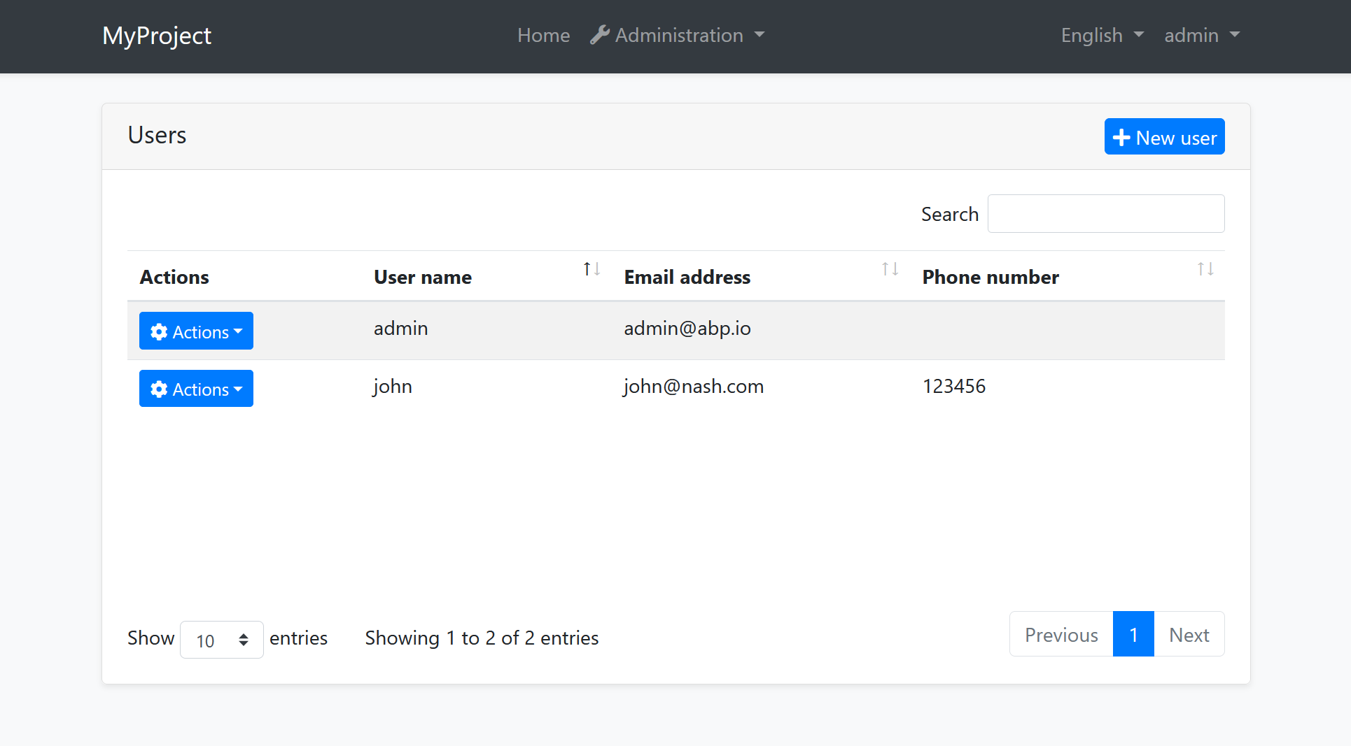
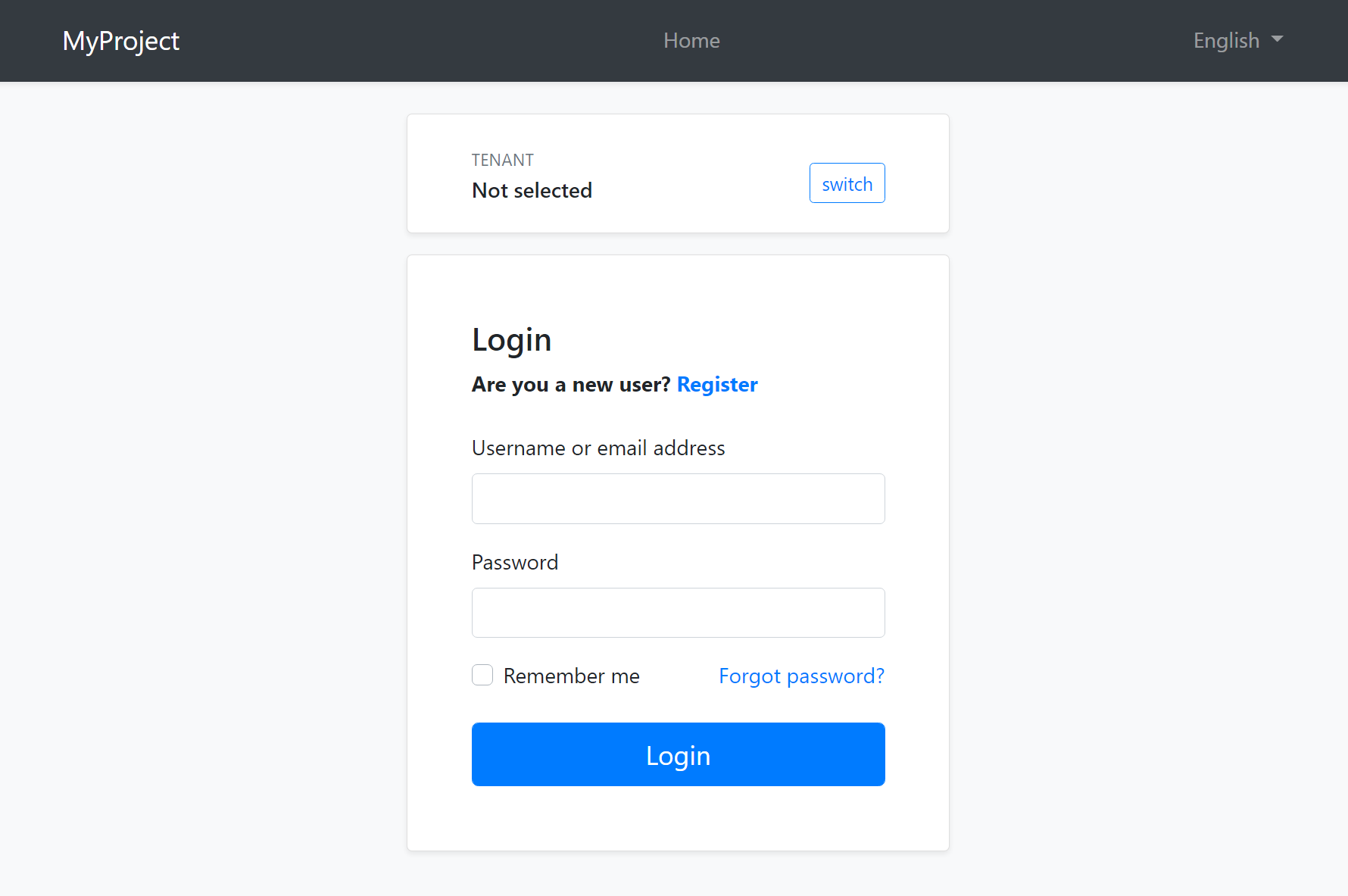
The Basic Theme is a theme implementation for the ASP.NET Core MVC / Razor Pages UI. It is a minimalist theme that doesn't add any styling on top of the plain Bootstrap. You can take the Basic Theme as the base theme and build your own theme or styling on top of it. See the Customization section.
The Basic Theme has RTL (Right-to-Left language) support.
If you are looking for a professional, enterprise ready theme, you can check the Lepton Theme, which is a part of the ABP Commercial.
See the Theming document to learn about themes.
Installation
This theme is already installed when you create a new solution using the startup templates. If you need to manually install it, follow the steps below:
- Install the Volo.Abp.AspNetCore.Mvc.UI.Theme.Basic NuGet package to your web project.
- Add
AbpAspNetCoreMvcUiBasicThemeModuleinto the[DependsOn(...)]attribute for your module class in the web project. - Install the @abp/aspnetcore.mvc.ui.theme.basic NPM package to your web project (e.g.
npm install @abp/aspnetcore.mvc.ui.theme.basicoryarn add @abp/aspnetcore.mvc.ui.theme.basic). - Run
gulpcommand in a command line terminal in the web project's folder.
Layouts
The Basic Theme implements the standard layouts. All the layouts implement the following parts;
- Global Bundles
- Page Alerts
- Layout Hooks
- Widget Resources
The Application Layout

Application Layout implements the following parts, in addition to the common parts mentioned above;
The Account Layout

Application Layout implements the following parts, in addition to the common parts mentioned above;
Empty Layout
Empty layout is empty, as its name stands for. However, it implements the common parts mentioned above.
Customization
You have two options two customize this theme:
Overriding Styles/Components
In this approach, you continue to use the the theme as NuGet and NPM packages and customize the parts you need to. There are several ways to customize it;
Override the Styles
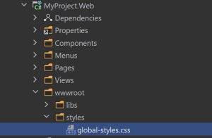
- Create a CSS file in the
wwwrootfolder of your project:

- Add the style file to the global bundle, in the
ConfigureServicesmethod of your module:
Configure<AbpBundlingOptions>(options =>
{
    options.StyleBundles.Configure(BasicThemeBundles.Styles.Global, bundle =>
    {
        bundle.AddFiles("/styles/global-styles.css");
    });
});
Override the Components
See the User Interface Customization Guide to learn how you can replace components, customize and extend the user interface.
Copy & Customize
You can download the source code of the Basic Theme, copy the project content into your solution, re-arrange the package/module dependencies (see the Installation section above to understand how it was installed to the project) and freely customize the theme based on your application requirements.


