





Dashboards
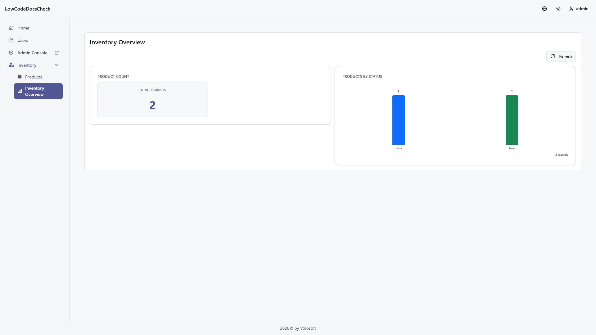
Dashboards are low-code pages that render charts, lists, and number widgets from low-code entity data. A dashboard is still a page, so it uses the normal page name, title, icon, order, group, and permission model, but its page type is dashboard and its page definition carries a nested dashboard payload. The screenshot below shows an inventory-style dashboard from the demo app, and the JSON that follows is a simplified descriptor that uses the same layout concepts.
The runtime below was generated from a low-code dashboard page definition:
Dashboard Pages
Dashboard pages live in the normal page descriptor collection. In source-controlled models, a dashboard page still belongs under pages/, not a separate dashboard folder.
Typical page-level fields include:
nametitleicontype: "dashboard"grouporderpermissionConfigdashboard
Runtime routes use the same dynamic page convention:
/dynamic/<page-name>
Layout Model
The stored dashboard descriptor uses a flat visualization list. Each visualization defines its own placement:
row: zero-based visual row indexorder: order within the rowwidth: current dashboard grid width, typically1or2
At runtime, the React UI groups those flat visualizations into rendered rows. This is similar to form layouts: storage stays flat, rendering derives the grouped structure.
{
  "name": "inventory-overview",
  "title": "Inventory Overview",
  "type": "dashboard",
  "group": "inventory",
  "dashboard": {
    "description": "Operational inventory view",
    "visualizations": [
      {
        "name": "product-count",
        "type": "numberContainer",
        "title": "Product Count",
        "row": 0,
        "order": 0,
        "width": 1,
        "numberContainer": {
          "items": [
            {
              "name": "total-products",
              "title": "Total Products",
              "entityName": "Acme.Catalog.Product",
              "aggregation": "count",
              "format": "number"
            }
          ]
        }
      },
      {
        "name": "stock-by-product",
        "type": "chart",
        "title": "Stock by Product",
        "row": 0,
        "order": 1,
        "width": 1,
        "entityName": "Acme.Catalog.Product",
        "chart": {
          "chartType": "bar",
          "xAxis": { "property": "Name" },
          "yAxis": [
            { "aggregation": "sum", "property": "StockCount", "label": "Stock" }
          ]
        }
      }
    ]
  }
}
Visualization Types
The current dashboard visualization types are:
chartlistnumberContainer
Chart
Chart visualizations define:
chartType:bar,line,pie, ordonutxAxis- one or more
yAxisaggregation series - optional
maxItems - optional
showRecordCount - optional bar orientation
List
List visualizations define:
fields- optional
sortBy maxRowsrowHeight- optional
colorBy
Number Container
Number containers hold one or more number items. Each item can define:
aggregationaggregationPropertyformatcolor- entity-specific filters and global date filter linkage
- click-through behavior
The sample descriptor above combines a number container and a chart in the same Inventory Overview page.
Filters and Interactivity
Dashboards support three filter layers:
globalFiltersfor page-level controls such as date range- visualization-level
filterfor fixed query constraints - visualization
userFiltersfor interactive filtering exposed to the runtime user
Other useful dashboard interaction fields include:
globalDateFilterPropertyshowDescriptionAsTooltipclickToSeeRecords
These options let a dashboard stay compact while still allowing drill-down behavior in the runtime.
Runtime Shape
The runtime definition exposed to React is grouped by rows and items, even though the stored descriptor is flat. The React runtime uses:
useDashboardDefinitionuseDashboardDataGET /api/low-code/ui/dashboards/{pageName}POST /api/low-code/dashboards/{pageName}/data
See React Runtime for hook-level details and route integration.
Permissions and Menu Placement
Dashboard pages are read-oriented. Generated dashboard page operations are view only, so the usual CRUD operation set does not apply.
Dashboard pages can still:
- appear inside a Page Group
- carry a menu icon and order
- use explicit or generated page permission configuration
Menu placement is handled at the page level through the normal group and order fields.