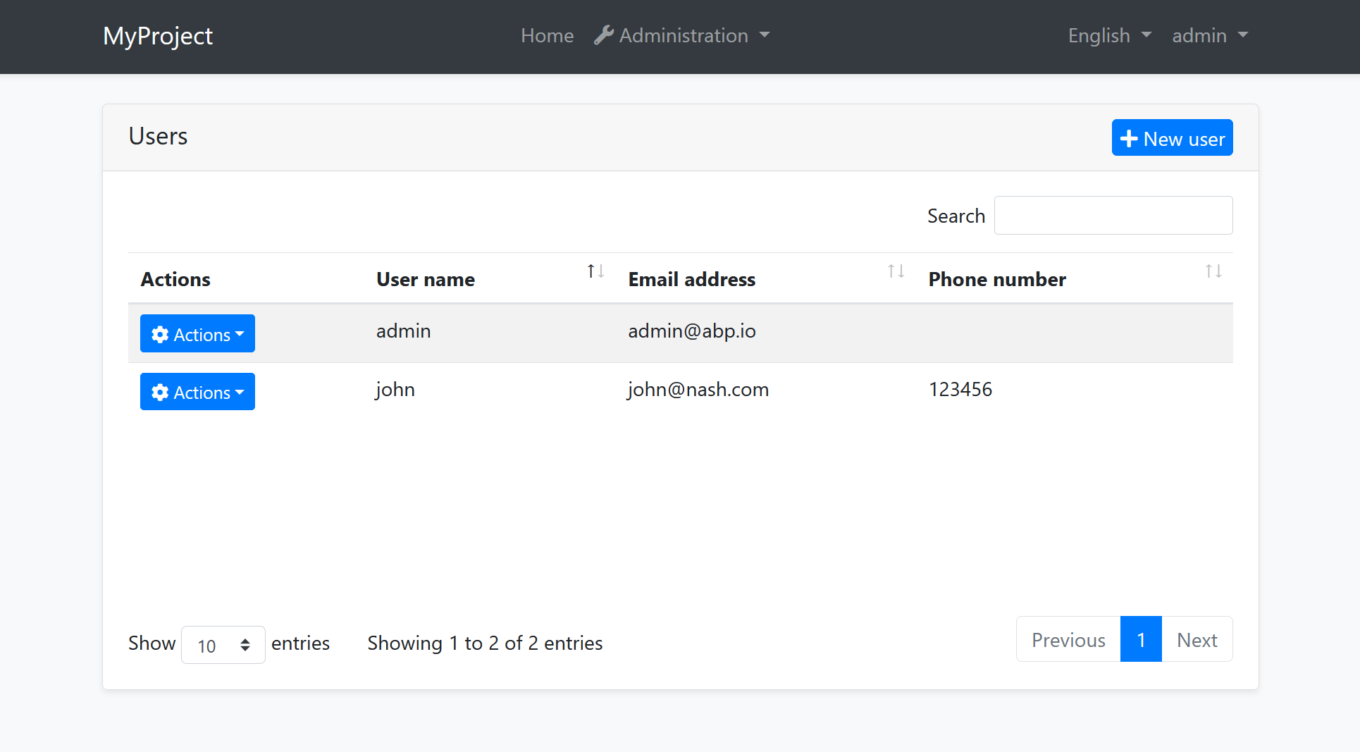
Blazor UI: Basic Theme
The Basic Theme is a theme implementation for the Blazor UI. It is a minimalist theme that doesn't add any styling on top of the plain Bootstrap. You can take the Basic Theme as the base theme and build your own theme or styling on top of it. See the Customization section.
If you are looking for a professional, enterprise ready theme, you can check the Lepton Theme, which is a part of the ABP Commercial.
See the Theming document to learn about themes.
Installation
If you need to manually this theme, follow the steps below:
Install the Volo.Abp.AspNetCore.Components.WebAssembly.BasicTheme NuGet package to your web project.
Add
AbpAspNetCoreComponentsWebAssemblyBasicThemeModuleinto the[DependsOn(...)]attribute for your module class in the your Blazor UI project.Use
Volo.Abp.AspNetCore.Components.WebAssembly.BasicTheme.Themes.Basic.Appas the root component of your application in theConfigureServicesmethod of your module:var builder = context.Services.GetSingletonInstance<WebAssemblyHostBuilder>(); builder.RootComponents.Add<App>("#ApplicationContainer");#ApplicationContaineris a selector (like<div id="ApplicationContainer">Loading...</div>) in theindex.html.Execute
abp bundlecommand under blazor project once.
The Layout

Application Layout implements the following parts, in addition to the common parts mentioned above;
- Branding Area
- Main Menu
- Main Toolbar with Language Selection & User Menu
- Page Alerts
Customization
You have two options two customize this theme:
Overriding Styles / Components
In this approach, you continue to use the theme as NuGet and NPM packages and customize the parts you need to. There are several ways to customize it;
Override the Styles
You can simply override the styles in the Global Styles file of your application.
Override the Components
See the Customization / Overriding Components to learn how you can replace components, customize and extend the user interface.
Overriding the Menu Item
Basic theme supports overriding a single menu item with a custom component. You can create a custom component and call UseComponent extension method in the MenuContributor.
using Volo.Abp.UI.Navigation;

//...

context.Menu.Items.Add(
  new ApplicationMenuItem("Custom.1", "My Custom Menu", "#")
    .UseComponent(typeof(MyMenuItemComponent)));
<li class="nav-item">
    <a href="#" class="nav-link">
        My Custom Menu
    </a>
</li>
Copy & Customize
You can run the following ABP CLI command in BlazorWebAssembly project directory to copy the source code to your solution:
abp add-package Volo.Abp.AspNetCore.Components.WebAssembly.BasicTheme --with-source-code --add-to-solution-file
Then, navigate to downloaded Volo.Abp.AspNetCore.Components.WebAssembly.BasicTheme project directory and run:
abp add-package Volo.Abp.AspNetCore.Components.Web.BasicTheme --with-source-code --add-to-solution-file
Or, you can download the source code of the Basic Theme, manually copy the project content into your solution, re-arrange the package/module dependencies (see the Installation section above to understand how it was installed to the project) and freely customize the theme based on your application requirements.


