Lookup Components
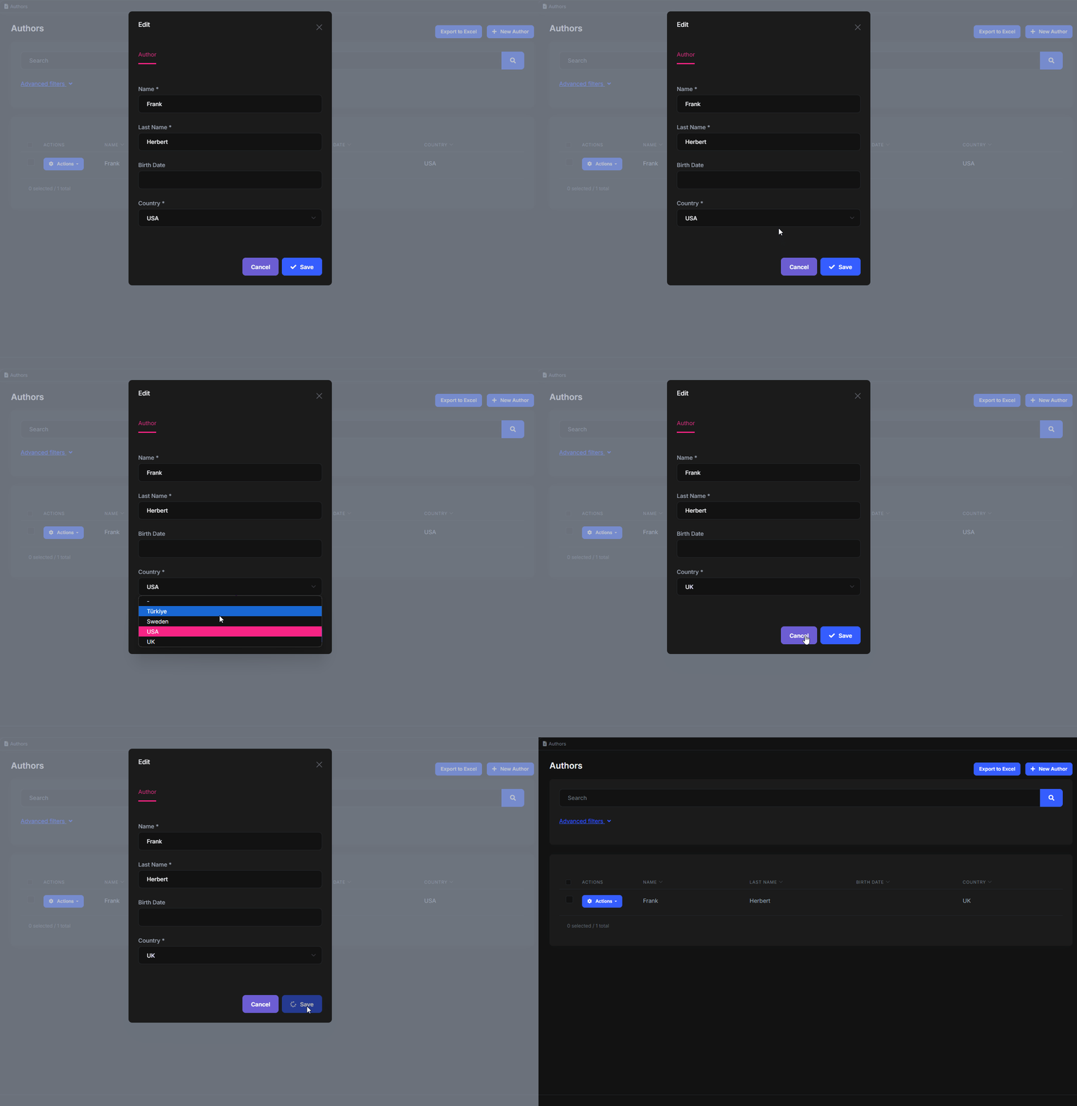
The Angular UI of ABP Commercial introduces some components with abp-lookup-... selector prefix. These components are used for retrieving relational entity data.
Setup
The components are in the @volo/abp.commercial.ng.ui package, which is included in the ABP templates. So, as long as your project is a product of these templates and unless you delete the package, you have access to the lookup components. Here is how you import them in your Angular module:
import { CommercialUiModule } from '@volo/abp.commercial.ng.ui';

@NgModule({
  imports: [
    // other imports
    CommercialUiModule,
  ],
  // rest of the module metadata
})
export class YourModule {}
Now you can use the lookup components in your components declared by this module.
Lookup HTTP Requests
The lookup requests are used by all lookup components to get the related entity records. Because of lexical this, they must be arrow functions.
@Injectable({
  providedIn: 'root'
})
export class AuthorService {
  getCountryLookup = (input: LookupRequestDto) =>
    this.restService.request<any, PagedResultDto<LookupDto<string>>>({
      method: 'GET',
      url: '/api/app/authors/country-lookup',
      params: { filter: input.filter, skipCount: input.skipCount, maxResultCount: input.maxResultCount },
    },
    { apiName: this.apiName });

  // rest of the service is removed for brevity
}
Lookup Typeahead Component
Typeahead is a good choice when you have an unknown number of records for the related entity or you want to improve the UX with a search ability. Although not the best scenario, the country picker below shows how the lookup typeahead works:

Here is how it is used in the template.
<abp-lookup-typeahead
  cid="author-country-id"
  formControlName="countryId"
  displayNameProp="name"
  [editingData]="selected?.country"
  [getFn]="service.getCountryLookup"
></abp-lookup-typeahead>
The available properties are as follows:
- cid: The id of the form control (e.g. an input or a select element) inside the lookup component. Lets form controls respond to
<label>events. - editingData: The related entity data if a record is being updated.
- displayNameProp: The property of the updated record to use as a display name in the form control.
- lookupNameProp: The property of the entity to use as a display name in options. Should macth the lookup HTTP request interface. (default: displayName)
- lookupIdProp: The property of the entity to use as the unique key in options. Should macth the lookup HTTP request interface. (default: id)
- maxResultCount: The maximum number of options to display. (default: 10)
- getFn: A function to get the related entity records with HTTP requests. Because of lexical this, it must be a an arrow function.
- disabled: This property lets you disable/enable a lookup component. (default: false).
Lookup Select Component
Select is a good choice when you have a low (and usually fixed) number of records for the related entity and search is not necessary. The country picker below shows how the lookup select works:

Here is how it is used in the template.
<abp-lookup-select
  cid="author-country-id"
  formControlName="countryId"
  displayNameProp="name"
  [getFn]="service.getCountryLookup"
></abp-lookup-select>
The available properties are as follows:
- cid: The id of the form control (e.g. an input or a select element) inside the lookup component. Lets form controls respond to
<label>events. - displayNameProp: The property of the updated record to use as a display name in the form control.
- lookupNameProp: The property of the entity to use as a display name in options. Should macth the lookup HTTP request interface. (default: displayName)
- lookupIdProp: The property of the entity to use as the unique key in options. Should macth the lookup HTTP request interface. (default: id)
- getFn: A function to get the related entity records with HTTP requests. Because of lexical this, it must be a an arrow function.
- disabled: This property lets you disable/enable a lookup component. (default: false).


