


Modal
ModalComponent is a pre-built component exposed by @abp/ng.theme.shared package to show modals. The component uses the ng-bootstrap's modal service inside to render a modal.
The abp-modal provides some additional benefits:
- It is flexible. You can pass header, body, footer templates easily by adding the templates to the
abp-modalcontent. It can also be implemented quickly. - Provides several inputs be able to customize the modal and several outputs be able to listen to some events.
- Automatically detects the close button which has a
abpClosedirective attached to and closes the modal when pressed this button. - Automatically detects the
abp-buttonand triggers its loading spinner when thebusyinput value of the modal component is true. - Automatically checks if the form inside the modal has changed, but not saved. It warns the user by displaying a confirmation popup in this case when a user tries to close the modal or refresh/close the tab of the browser.
Note: A modal can also be rendered by using the
ng-bootstrapmodal. For further information, see Modal doc on theng-bootstrapdocumentation.
Getting Started
In order to use the abp-modal in an HTML template, the ThemeSharedModule should be imported into your module like this:
// ...
import { ThemeSharedModule } from '@abp/ng.theme.shared';

@NgModule({
  //...
  imports: [..., ThemeSharedModule],
})
export class MyFeatureModule {}
Usage
You can add the abp-modal to your component very quickly. See an example:
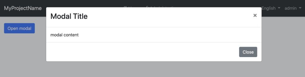
<!-- sample.component.html -->

<button class="btn btn-primary" (click)="isModalOpen = true">Open modal</button>

<abp-modal [(visible)]="isModalOpen">
  <ng-template #abpHeader>
    <h3>Modal Title</h3>
  </ng-template>

  <ng-template #abpBody>
  <p>Modal content</p>
  </ng-template>

  <ng-template #abpFooter>
    <button type="button" class="btn btn-secondary" abpClose>Close</button>
  </ng-template>
</abp-modal>
// sample.component.ts

@Component(/* component metadata */)
export class SampleComponent {
    isModalOpen = false
}
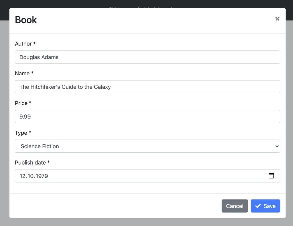
See an example form inside a modal:
<!-- book.component.ts -->

<abp-modal [(visible)]="isModalOpen" [busy]="inProgress">
  <ng-template #abpHeader>
    <h3>Book</h3>
  </ng-template>

  <ng-template #abpBody>
    <form id="book-form" [formGroup]="form" (ngSubmit)="save()">
      <div class="form-group">
        <label for="book-name">Author</label><span> * </span>
        <input type="text" id="author" class="form-control" formControlName="author" autofocus />
      </div>

      <div class="form-group">
        <label for="book-name">Name</label><span> * </span>
        <input type="text" id="book-name" class="form-control" formControlName="name" />
      </div>

      <div class="form-group">
        <label for="book-price">Price</label><span> * </span>
        <input type="number" id="book-price" class="form-control" formControlName="price" />
      </div>

      <div class="form-group">
        <label for="book-type">Type</label><span> * </span>
        <select class="form-control" id="book-type" formControlName="type">
          <option [ngValue]="null">Select a book type</option>
          <option [ngValue]="0">Undefined</option>
          <option [ngValue]="1">Adventure</option>
          <option [ngValue]="2">Biography</option>
          <option [ngValue]="3">Fantastic</option>
          <option [ngValue]="4">Science</option>
        </select>
      </div>

      <div class="form-group">
        <label for="book-publish-date">Publish date</label><span> * </span>
        <input
          id="book-publish-date"
          formControlName="publishDate"
          class="form-control"
          type="date"
        />
      </div>
    </form>
  </ng-template>

  <ng-template #abpFooter>
    <button type="button" class="btn btn-secondary" abpClose>
      Cancel
    </button>

    <button form="book-form" class="btn btn-primary" [disabled]="form.invalid || form.pristine">
      <i class="fa fa-check mr-1"></i>
      Save
    </button>
  </ng-template>
</abp-modal>
// book.component.ts

import { Component } from '@angular/core';
import { FormBuilder, Validators } from '@angular/forms';

@Component(/* component metadata */)
export class BookComponent {
 form = this.fb.group({
    author: [null, [Validators.required]],
    name: [null, [Validators.required]],
    price: [null, [Validators.required, Validators.min(0)]],
    type: [null, [Validators.required]],
    publishDate: [null, [Validators.required]],
  });

  inProgress: boolean;

  isModalOpen: boolean;

  constructor(private fb: FormBuilder, private service: BookService) {}

  save() {
    if (this.form.invalid) return;

    this.inProgress = true;

    this.service.save(this.form.value).subscribe(() => {
      this.inProgress = false;
    });
  }
}
The modal with form looks like this:
API
Inputs
visible
@Input() visible: boolean
visible is a boolean input that determines whether the modal is open. It is also can be used two-way binding.
busy
@Input() busy: boolean
busy is a boolean input that determines whether the busy status of the modal is true. When busy is true, the modal cannot be closed and the abp-button loading spinner is triggered.
options
@Input() options: NgbModalOptions
options is an input typed NgbModalOptions. It is configuration for the ng-bootstrap modal.
Examples:
animation: This is an NgbModalOption property of type boolean. It controls whether the modal opens and closes with an animation. By default, it is set to true, meaning that the modal will have a smooth transition when it opens and closes. Setting it to false will disable these animations.
import { Component } from '@angular/core';
import { NgbModal } from '@ng-bootstrap/ng-bootstrap';

@Component({
  selector: 'ngbd-modal-options',
  ...})

export class NgbdModalOptions {
  modalService = inject(NgbModal);
  animationModal(content) {
    this.modalService.open(content, { animation: true });
  }
}
The result of this configuration would be like this:

On the contrary, if we set it as false:
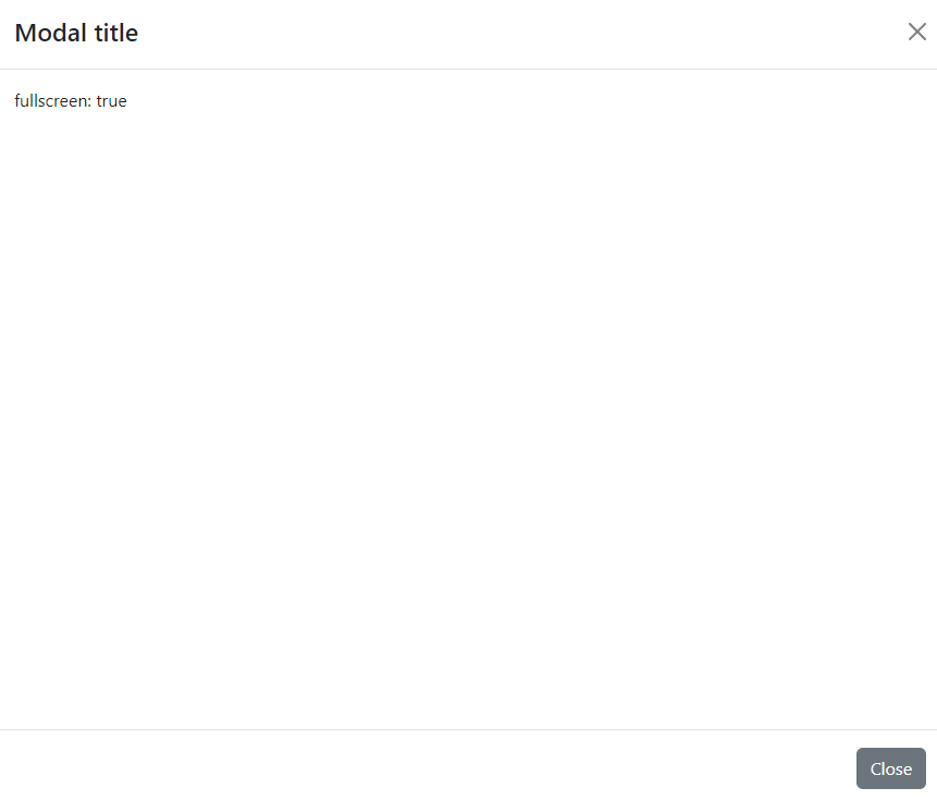
fullscreen: This is an NgbModalOption property of type boolean or string. When set totrue, the element will expand to cover the entire screen, hiding all other interface elements. When set tofalse, the element remains in its regular size and position within the page.
import { Component } from '@angular/core';
import { NgbModal } from '@ng-bootstrap/ng-bootstrap';

@Component({
 selector: 'ngbd-modal-options',
 ...})

export class NgbdModalOptions {
 modalService = inject(NgbModal);
 fullscreenModal(content) {
   this.modalService.open(content, { fullscreen: true });
 }
}
If fullscreen: true:
suppressUnsavedChangesWarning
@Input() suppressUnsavedChangesWarning: boolean
suppressUnsavedChangesWarning is a boolean input that determines whether the confirmation popup triggering active or not. It can also be set globally as shown below:
//app.module.ts

// app.module.ts

import { SUPPRESS_UNSAVED_CHANGES_WARNING } from '@abp/ng.theme.shared';

// ...

@NgModule({
  // ...
  providers: [{provide: SUPPRESS_UNSAVED_CHANGES_WARNING, useValue: true}]
})
export class AppModule {}
Note: The suppressUnsavedChangesWarning input of abp-modal value overrides the SUPPRESS_UNSAVED_CHANGES_WARNING injection token value.
Outputs
visibleChange
@Output() readonly visibleChange = new EventEmitter<boolean>();
visibleChange is an event emitted when the modal visibility has changed. The event payload is a boolean.
appear
@Output() readonly appear = new EventEmitter<void>();
appear is an event emitted when the modal has opened.
disappear
@Output() readonly disappear = new EventEmitter<void>();
disappear is an event emitted when the modal has closed.

