


LeptonX Blazor UI
LeptonX theme is implemented and ready to use with ABP. No custom implementation is needed for Blazor Server & WebAssembly.
Installation
Complete MVC Installation steps first.
Add Volo.Abp.AspNetCore.Components.Server.LeptonXTheme package to your Blazor Server application.
dotnet add package Volo.Abp.AspNetCore.Components.Server.LeptonXThemeRemove old theme from DependsOn attribute in your module class and add AbpAspNetCoreComponentsServerLeptonXThemeModule type to DependsOn attribute.
[DependsOn(
-    typeof(LeptonThemeManagementBlazorModule),
-    typeof(AbpAspNetCoreComponentsServerLeptonThemeModule),
+    typeof(AbpAspNetCoreComponentsServerLeptonXThemeModule)
)]
Update AbpBundlingOptions
options.StyleBundles.Configure(
- BlazorLeptonThemeBundles.Styles.Global,
+ BlazorLeptonXThemeBundles.Styles.Global,
  bundle =>
  {
      bundle.AddFiles("/blazor-global-styles.css");
      //You can remove the following line if you don't use Blazor CSS isolation for components
      bundle.AddFiles("/MyProjectName.Blazor.styles.css");
  });
Update
_Host.cshtmlfile. (located under Pages folder by default.)Add following usings to Locate App and BlazorLeptonXThemeBundles classes.
@using Volo.Abp.AspNetCore.Components.Web.LeptonXTheme.Components
@using Volo.Abp.AspNetCore.Components.Server.LeptonXTheme.Bundling
Then replace script & style bunles as following
- <abp-style-bundle name="@BlazorBasicThemeBundles.Styles.Global" />
+ <abp-style-bundle name="@BlazorLeptonXThemeBundles.Styles.Global" />
- <abp-script-bundle name="@BlazorBasicThemeBundles.Scripts.Global" /> + <abp-script-bundle name="@BlazorLeptonXThemeBundles.Scripts.Global" />
Source-Code
You can download the source-code of the LeptonX Theme according to you your ABP License.
Visit the LeptonX Source Code section to download the source-code.
Customization
Before starting to customize the theme, you can consider downloading the source code of the theme. You can find the original codes of related components below in the source code.
Themes
You can set default theme or add or remove themes via using LeptonXThemeOptions.
DefaultStyle: Defines deffault fallback theme. Default value is DimConfigure<LeptonXThemeOptions>(options => { options.DefaultStyle = LeptonXStyleNames.Dark; });Styles: Defines selectable themes from UI.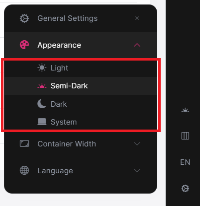
Configure<LeptonXThemeOptions>(options => { // Removing existing themes options.Styles.Remove(LeptonXStyleNames.Light); // Adding a new theme options.Styles.Add("red", new LeptonXThemeStyle( LocalizableString.Create<YourResource>("Theme:Red"), "bi bi-circle-fill")); });red.cssandbootstrap-red.csshave to be added under thewwwroot/_content/Volo.Abp.AspNetCore.Components.Web.LeptonXTheme/side-menu/css/folder to switch to your custom theme properly when selected.If your layout is TopMenu, then you have to add them under the
wwwroot/_content/Volo.Abp.AspNetCore.Components.Web.LeptonXTheme/top-menu/css/folder.
LeptonXThemeBlazorOptions
Layout options of Blazor UI can be manageable via using LeptonXThemeMvcOptions.
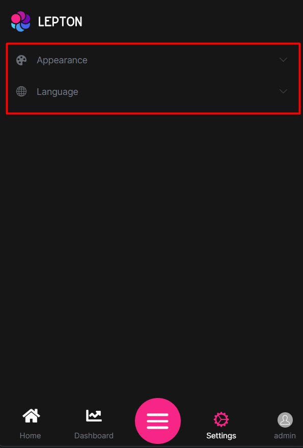
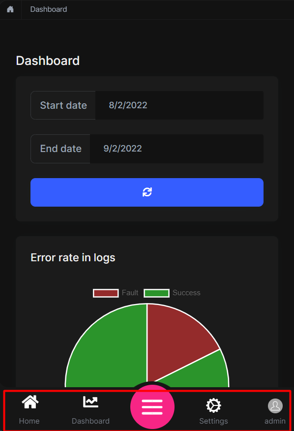
Layout: Layout of main application. Default value isLeptonXMvcLayouts.SideMenuConfigure<LeptonXThemeBlazorOptions>(options => { options.Layout = LeptonXBlazorLayouts.SideMenu; // Or your custom implemented layout: options.Layout = typeof(MyCustomLayoutComponent); });MobileMenuSelector: Defines items to be displayed at mobile menu. Default value is first 2 items from main menu items.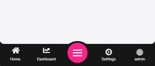
Configure<LeptonXThemeBlazorOptions>(options =>
{
    options.MobileMenuSelector = items => items.Where(x => x.MenuItem.Name == "MyProjectName.Home" || x.MenuItem.Name == "MyProjectName.Dashboard");
});
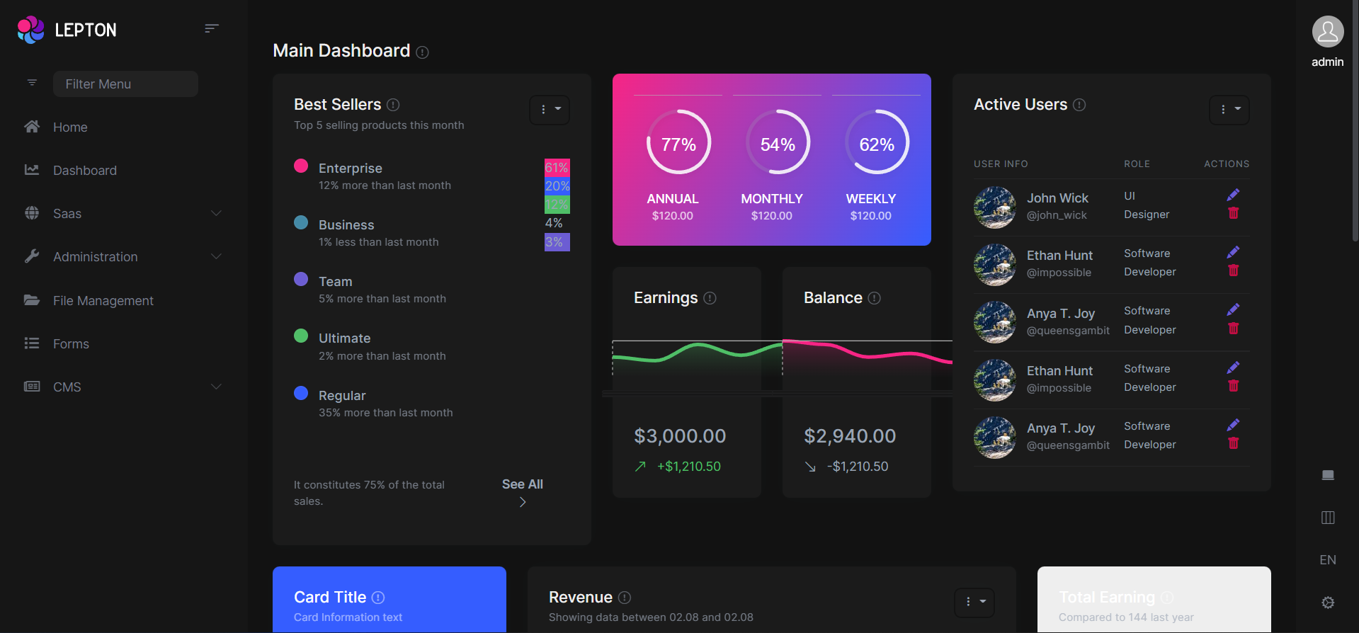
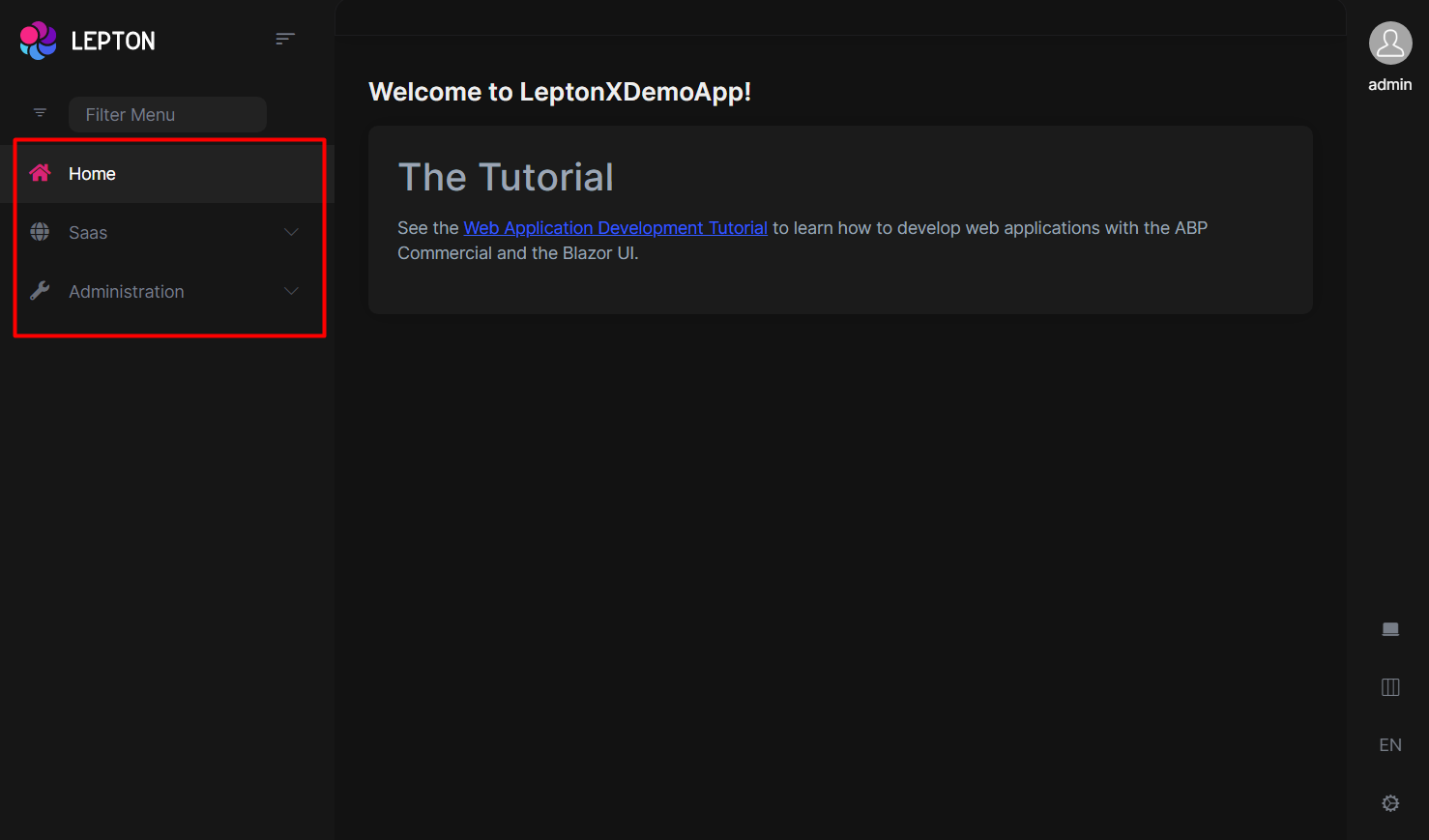
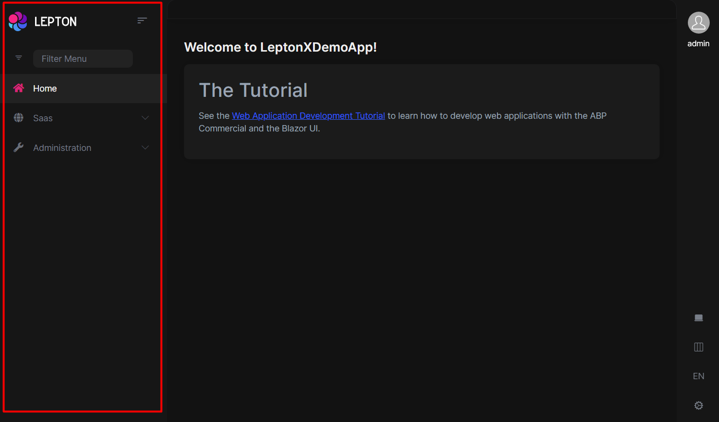
Layouts
LeptonX offers two ready-made layouts for your web application. One of them is placed with the menu items on the top and the other with the menu items on the sides.
Top Menu Layout
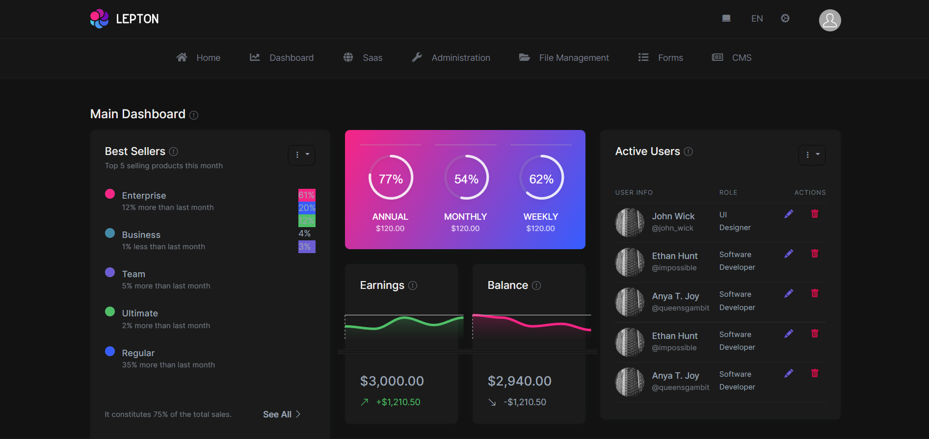
Side Menu Layout
You can override layouts by following the steps below:
- Create a razor page, like
MySideMenuLayout.razor, in your blazor application as shown below:
@using Volo.Abp.AspNetCore.Components.Web.LeptonXTheme.Components.ApplicationLayout;
@using Volo.Abp.DependencyInjection

@inherits SideMenuLayout
@attribute [ExposeServices(typeof(SideMenuLayout))]
@attribute [Dependency(ReplaceServices = true)]

@Name
- If you prefer to use a code-behind file for the C# code of your component, create a razor component, like
MySideMenuLayout.razor.cs, in your blazor application as shown below:
using Volo.Abp.AspNetCore.Components.Web.LeptonXTheme.Components.ApplicationLayout;
using Volo.Abp.DependencyInjection;

namespace LeptonXLite.DemoApp.Blazor.MyComponents
{
    [ExposeServices(typeof(SideMenuLayout))]
    [Dependency(ReplaceServices = true)]
    public partial class MySideMenuLayout
    {
        public string Name = "My Top Layout";
    }
}
Don't forget to remove repeated attributes from the razor page!
Common Components
Commonly used components in all layouts.
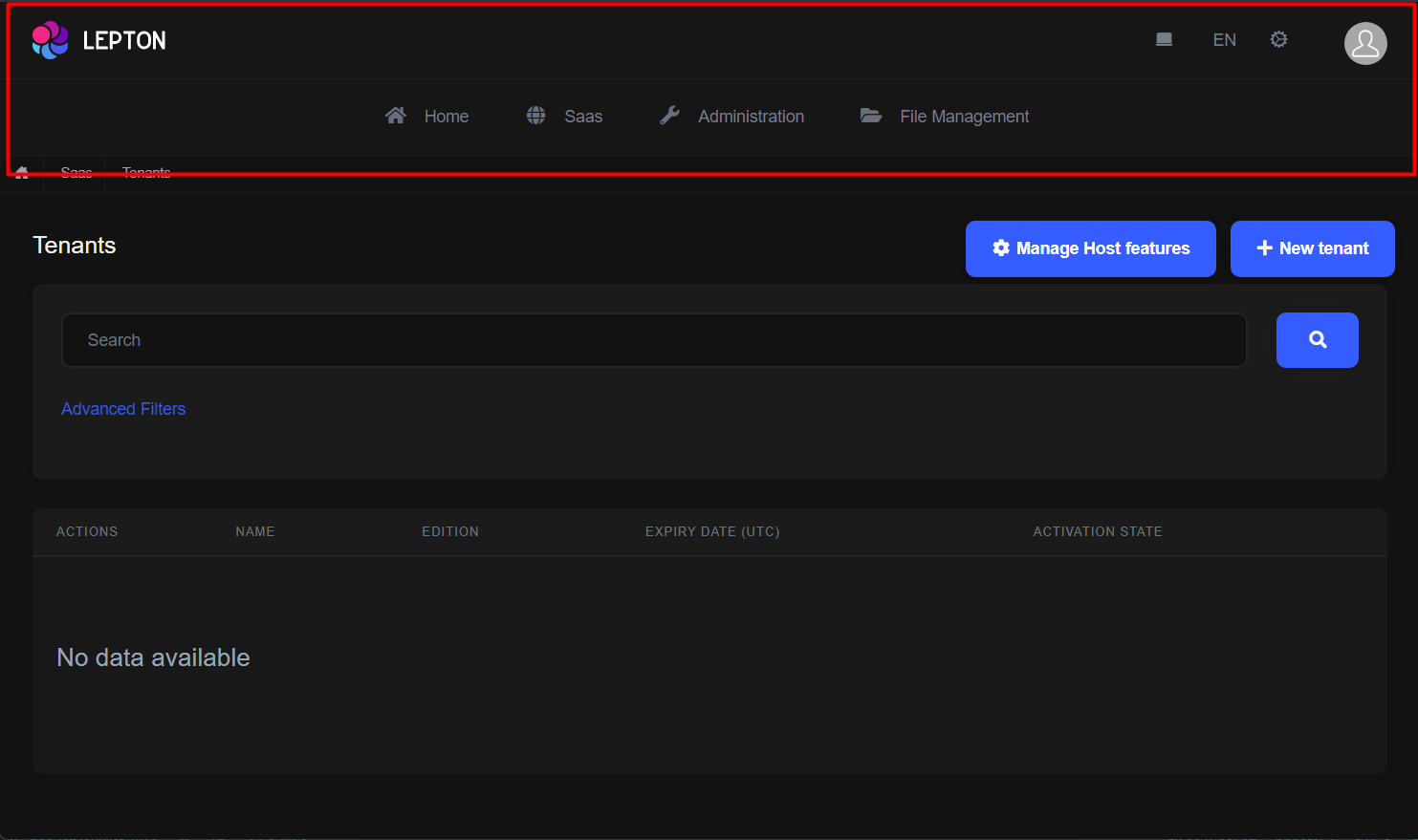
Breadcrumb
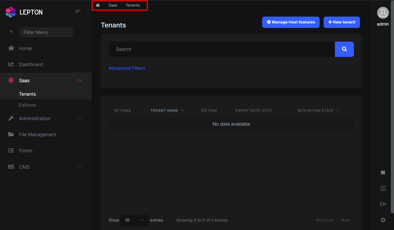
Breadcrumbs can be customized by using the PageLayout service. See the PageLayout - BreadCrumb section for more information.
If you need to replace the component, you can follow the steps below.
- Create a razor page, like
MyBreadcrumbs.razor, in your blazor application as shown below:
@using Volo.Abp.AspNetCore.Components.Web.LeptonXTheme.Components.ApplicationLayout.Common;
@using Volo.Abp.DependencyInjection

@inherits Breadcrumbs
@attribute [ExposeServices(typeof(Breadcrumbs))]
@attribute [Dependency(ReplaceServices = true)]

@Name
- If you prefer to use a code-behind file for the C# code of your component, create a razor component, like
MyBreadcrumbs.razor.cs, in your blazor application as shown below:
using Volo.Abp.AspNetCore.Components.Web.LeptonXTheme.Components.ApplicationLayout.Common;
using Volo.Abp.DependencyInjection;

namespace LeptonXLite.DemoApp.Blazor.MyComponents
{
    [ExposeServices(typeof(Breadcrumbs))]
    [Dependency(ReplaceServices = true)]
    public partial class MyBreadcrumbsComponent
    {
        public string Name = "My Breadcrumbs";
    }
}
Content Toolbar
- Create a razor page, like
MyContentToolbar.razor, in your blazor application as shown below:
@using Volo.Abp.AspNetCore.Components.Web.LeptonXTheme.Components.ApplicationLayout.Common;
@using Volo.Abp.DependencyInjection

@inherits ContentToolbar
@attribute [ExposeServices(typeof(ContentToolbar))]
@attribute [Dependency(ReplaceServices = true)]

@Name
- If you prefer to use a code-behind file for the C# code of your component, create a razor component, like
MyContentToolbar.razor.cs, in your blazor application as shown below:
using Volo.Abp.AspNetCore.Components.Web.LeptonXTheme.Components.ApplicationLayout.Common;
using Volo.Abp.DependencyInjection;

namespace LeptonXLite.DemoApp.Blazor.MyComponents
{
    [ExposeServices(typeof(ContentToolbar))]
    [Dependency(ReplaceServices = true)]
    public partial class MyContentToolbarComponent
    {
        public string Name = "My Content Toolbar";
    }
}
General Settings
- Create a razor page, like
MyGeneralSettings.razor, in your blazor application as shown below:
@using Volo.Abp.AspNetCore.Components.Web.LeptonXTheme.Components.ApplicationLayout.Common;
@using Volo.Abp.DependencyInjection

@inherits GeneralSettings
@attribute [ExposeServices(typeof(GeneralSettings))]
@attribute [Dependency(ReplaceServices = true)]

@Name
- If you prefer to use a code-behind file for the C# code of your component, create a razor component, like
MyGeneralSettings.razor.cs, in your blazor application as shown below:
using Volo.Abp.AspNetCore.Components.Web.LeptonXTheme.Components.ApplicationLayout.Common;
using Volo.Abp.DependencyInjection;

namespace LeptonXLite.DemoApp.Blazor.MyComponents
{
    [ExposeServices(typeof(GeneralSettings))]
    [Dependency(ReplaceServices = true)]
    public partial class MyGeneralSettings
    {
        public string Name = "My General Settings";
    }
}
Mobile General Settings
- Create a razor page, like
MyMobileGeneralSettings.razor, in your blazor application as shown below:
@using Volo.Abp.AspNetCore.Components.Web.LeptonXTheme.Components.ApplicationLayout.Common;
@using Volo.Abp.DependencyInjection

@inherits MobileGeneralSettings
@attribute [ExposeServices(typeof(MobileGeneralSettings))]
@attribute [Dependency(ReplaceServices = true)]

@Name
- If you prefer to use a code-behind file for the C# code of your component, create a razor component, like
MyMobileGeneralSettings.razor.cs, in your blazor application as shown below:
using Volo.Abp.AspNetCore.Components.Web.LeptonXTheme.Components.ApplicationLayout.Common;
using Volo.Abp.DependencyInjection;

namespace LeptonXLite.DemoApp.Blazor.MyComponents
{
    [ExposeServices(typeof(MobileGeneralSettings))]
    [Dependency(ReplaceServices = true)]
    public partial class MyMobileGeneralSettings
    {
        public string Name = "My Mobile General Settings";
    }
}
Side Menu Components
Components used in the side menu layout.
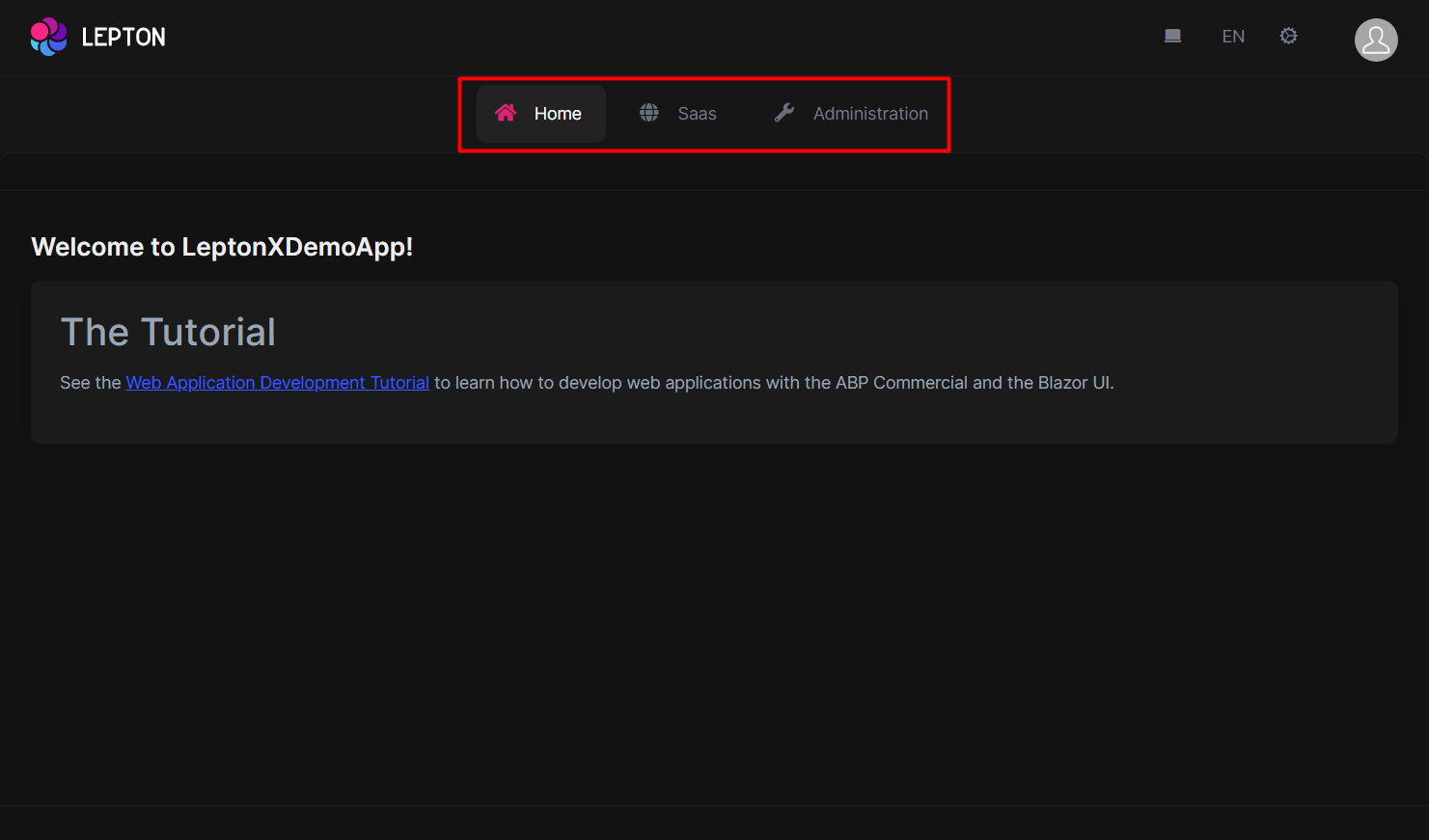
Main Menu
- Create a razor page, like
MyMainMenu.razor, in your blazor application as shown below:
@using Volo.Abp.AspNetCore.Components.Web.LeptonXTheme.Components.ApplicationLayout.TopMenu.Navigation;
@using Volo.Abp.DependencyInjection

@inherits MainMenu
@attribute [ExposeServices(typeof(MainMenu))]
@attribute [Dependency(ReplaceServices = true)]

@Name
- If you prefer to use a code-behind file for the C# code of your component, create a razor component, like
MyMainMenu.razor.cs, in your blazor application as shown below:
using Volo.Abp.AspNetCore.Components.Web.LeptonXTheme.Components.ApplicationLayout.SideMenu.Navigation;
using Volo.Abp.DependencyInjection;

namespace LeptonXLite.DemoApp.Blazor.MyComponents
{
    [ExposeServices(typeof(MainMenu))]
    [Dependency(ReplaceServices = true)]
    public partial class MyMainMenuComponent
    {
        public string Name = "My Main Menu";
    }
}
Main Menu Item
- Create a razor page, like
MyMainMenuItem.razor, in your blazor application as shown below:
@using Volo.Abp.AspNetCore.Components.Web.LeptonXTheme.Components.ApplicationLayout.SideMenu.Navigation;
@using Volo.Abp.DependencyInjection

@inherits MainMenuItem
@attribute [ExposeServices(typeof(MainMenuItem))]
@attribute [Dependency(ReplaceServices = true)]

@Name
- If you prefer to use a code-behind file for the C# code of your component, create a razor component, like
MyMainMenuItem.razor.cs, in your blazor application as shown below:
using Volo.Abp.AspNetCore.Components.Web.LeptonXTheme.Components.ApplicationLayout.SideMenu.Navigation;
using Volo.Abp.DependencyInjection;

namespace LeptonXLite.DemoApp.Blazor.MyComponents
{
    [ExposeServices(typeof(MainMenu))]
    [Dependency(ReplaceServices = true)]
    public partial class MyMainMenuItemComponent
    {
        public string Name = "My Main Menu Item";
    }
}
Mobile Navbar
- Create a razor page, like
MyMobileNavbar.razor, in your blazor application as shown below:
@using Volo.Abp.AspNetCore.Components.Web.LeptonXTheme.Components.ApplicationLayout.SideMenu.Navigation;
@using Volo.Abp.DependencyInjection

@inherits MobileNavbar
@attribute [ExposeServices(typeof(MobileNavbar))]
@attribute [Dependency(ReplaceServices = true)]

@Name
- If you prefer to use a code-behind file for the C# code of your component, create a razor component, like
MyMobileNavbar.razor.cs, in your blazor application as shown below:
using Volo.Abp.AspNetCore.Components.Web.LeptonXTheme.Components.ApplicationLayout.SideMenu.Navigation;
using Volo.Abp.DependencyInjection;

namespace LeptonXLite.DemoApp.Blazor.MyComponents
{
    [ExposeServices(typeof(MobileNavbar))]
    [Dependency(ReplaceServices = true)]
    public partial class MyMobileNavbar
    {
        public string Name = "My Mobile Navbar";
    }
}
Main Header
- Create a razor page, like
MyMainHeader.razor, in your blazor application as shown below:
@using Volo.Abp.AspNetCore.Components.Web.LeptonXTheme.Components.ApplicationLayout.SideMenu.MainHeader
@using Volo.Abp.DependencyInjection

@inherits MainHeader
@attribute [ExposeServices(typeof(MainHeader))]
@attribute [Dependency(ReplaceServices = true)]

@Name
- If you prefer to use a code-behind file for the C# code of your component, create a razor component, like
MyMainHeader.razor.cs, in your blazor application as shown below:
using Volo.Abp.AspNetCore.Components.Web.LeptonXTheme.Components.ApplicationLayout.SideMenu.MainHeader;
using Volo.Abp.DependencyInjection;

namespace LeptonXLite.DemoApp.Blazor.MyComponents
{
    [ExposeServices(typeof(MainHeader))]
    [Dependency(ReplaceServices = true)]
    public partial class MyMainHeader
    {
        public string Name = "My Main Header";
    }
}
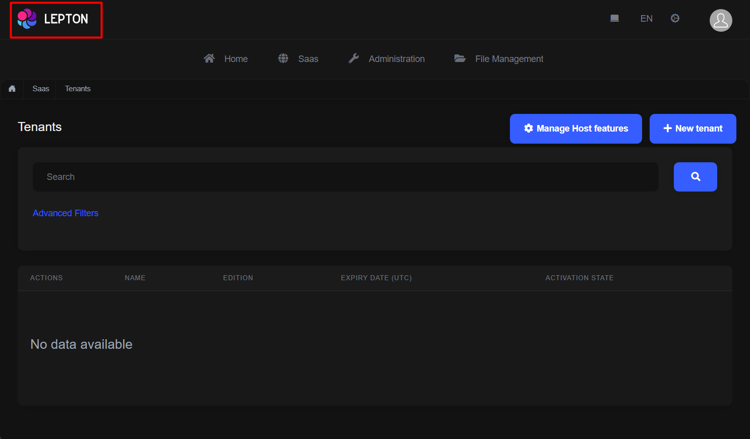
Main Header Branding
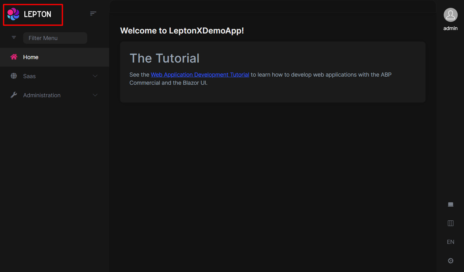
Application branding can be customized with the IBrandingProvider. See the Branding section for more information.
If you need to replace the component, you can follow the steps below.
- Create a razor page, like
MyMainHeaderBranding.razor, in your blazor application as shown below:
@using Volo.Abp.AspNetCore.Components.Web.LeptonXTheme.Components.ApplicationLayout.SideMenu.MainHeader
@using Volo.Abp.DependencyInjection

@inherits MainHeaderBranding
@attribute [ExposeServices(typeof(MainHeaderBranding))]
@attribute [Dependency(ReplaceServices = true)]

@Name
- If you prefer to use a code-behind file for the C# code of your component, create a razor component, like
MyMainHeaderBranding.razor.cs, in your blazor application as shown below:
using Volo.Abp.AspNetCore.Components.Web.LeptonXTheme.Components.ApplicationLayout.SideMenu.MainHeader;
using Volo.Abp.DependencyInjection;

namespace LeptonXLite.DemoApp.Blazor.MyComponents
{
    [ExposeServices(typeof(MainHeaderBranding))]
    [Dependency(ReplaceServices = true)]
    public partial class MyMainHeaderBranding
    {
        public string Name = "My Main Header Branding";
    }
}
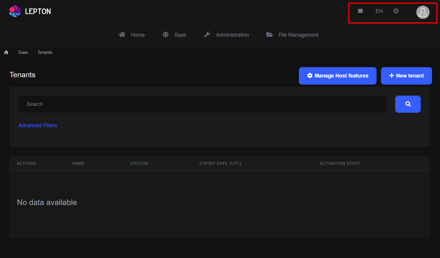
Main Header Toolbar
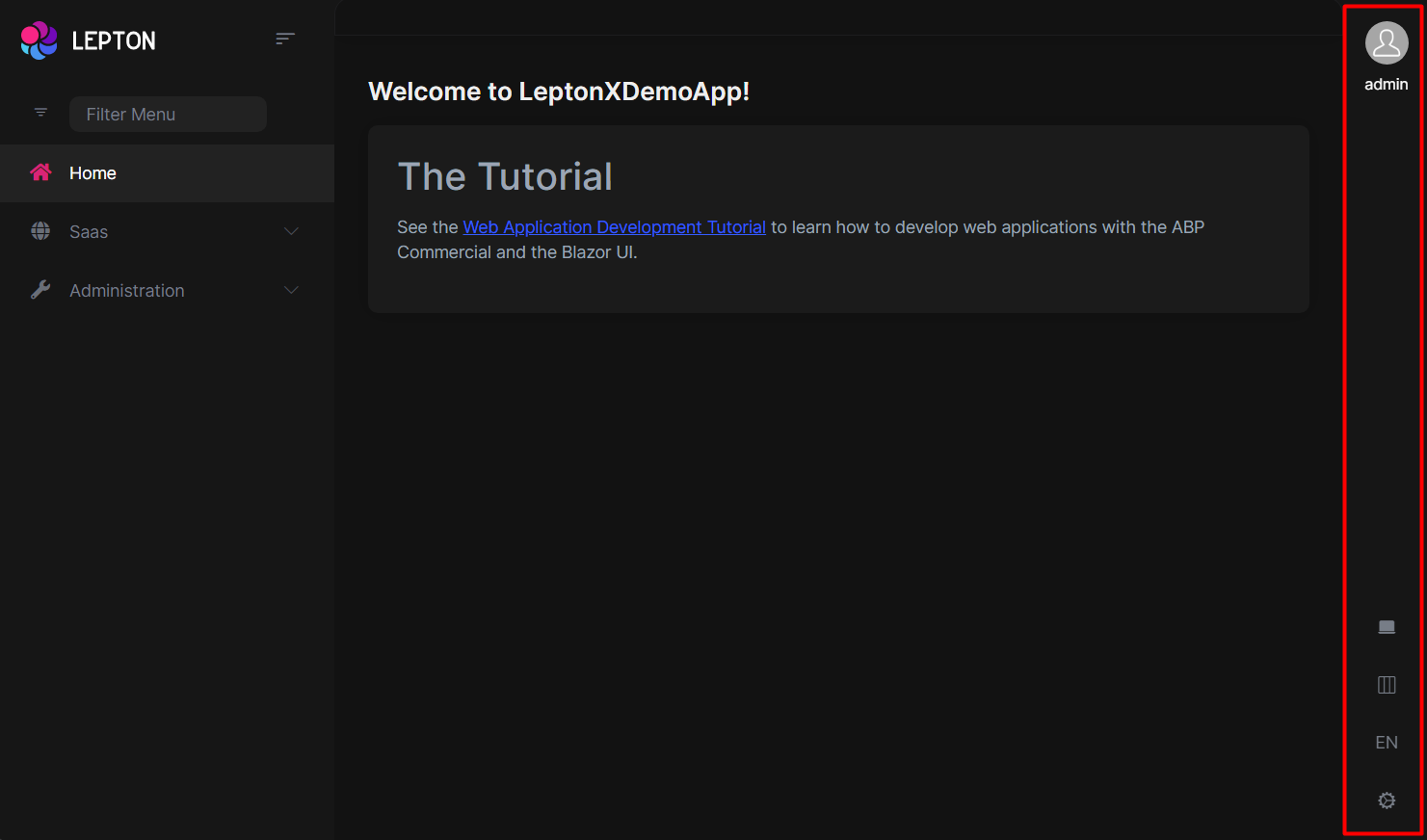
The main toolbar can be managed by using the ToolbarContributor classes. See the Toolbars section for more information.
If you need to replace the component, you can follow the steps below.
- Create a razor page, like
MyMainHeaderToolbar.razor, in your blazor application as shown below:
@using Volo.Abp.AspNetCore.Components.Web.LeptonXTheme.Components.ApplicationLayout.SideMenu.MainHeader
@using Volo.Abp.DependencyInjection

@inherits MainHeaderToolbar
@attribute [ExposeServices(typeof(MainHeaderToolbar))]
@attribute [Dependency(ReplaceServices = true)]

@Name
- If you prefer to use a code-behind file for the C# code of your component, create a razor component, like
MyMainHeaderToolbar.razor.cs, in your blazor application as shown below:
using Volo.Abp.AspNetCore.Components.Web.LeptonXTheme.Components.ApplicationLayout.SideMenu.MainHeader;
using Volo.Abp.DependencyInjection;

namespace LeptonXLite.DemoApp.Blazor.MyComponents
{
    [ExposeServices(typeof(MainHeaderToolbar))]
    [Dependency(ReplaceServices = true)]
    public partial class MyMainHeaderToolbar
    {
        public string Name = "My Main Header Toolbar";
    }
}
Top Menu Components
Components used in the top menu layout.
Main Menu
- Create a razor page, like
MyMainMenu.razor, in your blazor application as shown below:
@using Volo.Abp.AspNetCore.Components.Web.LeptonXTheme.Components.ApplicationLayout.TopMenu.Navigation;
@using Volo.Abp.DependencyInjection

@inherits MainMenu
@attribute [ExposeServices(typeof(MainMenu))]
@attribute [Dependency(ReplaceServices = true)]

@Name
- If you prefer to use a code-behind file for the C# code of your component, create a razor component, like
MyMainMenu.razor.cs, in your blazor application as shown below:
using Volo.Abp.AspNetCore.Components.Web.LeptonXTheme.Components.ApplicationLayout.TopMenu.Navigation;
using Volo.Abp.DependencyInjection;

namespace LeptonXLite.DemoApp.Blazor.MyComponents
{
    [ExposeServices(typeof(MainMenu))]
    [Dependency(ReplaceServices = true)]
    public partial class MyMainMenuComponent
    {
        public string Name = "My Main Menu";
    }
}
Main Menu Item
- Create a razor page, like
MyMainMenuItem.razor, in your blazor application as shown below:
@using Volo.Abp.AspNetCore.Components.Web.LeptonXTheme.Components.ApplicationLayout.TopMenu.Navigation;
@using Volo.Abp.DependencyInjection

@inherits MainMenuItem
@attribute [ExposeServices(typeof(MainMenuItem))]
@attribute [Dependency(ReplaceServices = true)]

@Name
- If you prefer to use a code-behind file for the C# code of your component, create a razor component, like
MyMainMenuItem.razor.cs, in your blazor application as shown below:
using Volo.Abp.AspNetCore.Components.Web.LeptonXTheme.Components.ApplicationLayout.TopMenu.Navigation;
using Volo.Abp.DependencyInjection;

namespace LeptonXLite.DemoApp.Blazor.MyComponents
{
    [ExposeServices(typeof(MainMenu))]
    [Dependency(ReplaceServices = true)]
    public partial class MyMainMenuItemComponent
    {
        public string Name = "My Main Menu Item";
    }
}
Mobile Navbar
- Create a razor page, like
MyMobileNavbar.razor, in your blazor application as shown below:
@using Volo.Abp.AspNetCore.Components.Web.LeptonXTheme.Components.ApplicationLayout.TopMenu.Navigation;
@using Volo.Abp.DependencyInjection

@inherits MobileNavbar
@attribute [ExposeServices(typeof(MobileNavbar))]
@attribute [Dependency(ReplaceServices = true)]

@Name
- If you prefer to use a code-behind file for the C# code of your component, create a razor component, like
MyMobileNavbar.razor.cs, in your blazor application as shown below:
using Volo.Abp.AspNetCore.Components.Web.LeptonXTheme.Components.ApplicationLayout.TopMenu.Navigation;
using Volo.Abp.DependencyInjection;

namespace LeptonXLite.DemoApp.Blazor.MyComponents
{
    [ExposeServices(typeof(MobileNavbar))]
    [Dependency(ReplaceServices = true)]
    public partial class MyMobileNavbar
    {
        public string Name = "My Mobile Navbar";
    }
}
Main Header
- Create a razor page, like
MyMainHeader.razor, in your blazor application as shown below:
@using Volo.Abp.AspNetCore.Components.Web.LeptonXTheme.Components.ApplicationLayout.TopMenu.MainHeader
@using Volo.Abp.DependencyInjection

@inherits MainHeader
@attribute [ExposeServices(typeof(MainHeader))]
@attribute [Dependency(ReplaceServices = true)]

@Name
- If you prefer to use a code-behind file for the C# code of your component, create a razor component, like
MyMainHeader.razor.cs, in your blazor application as shown below:
using Volo.Abp.AspNetCore.Components.Web.LeptonXTheme.Components.ApplicationLayout.TopMenu.MainHeader;
using Volo.Abp.DependencyInjection;

namespace LeptonXLite.DemoApp.Blazor.MyComponents
{
    [ExposeServices(typeof(MainHeader))]
    [Dependency(ReplaceServices = true)]
    public partial class MyMainHeader
    {
        public string Name = "My Main Header";
    }
}
Main Header Branding
Application branding can be customized with the IBrandingProvider. See the Branding section for more information.
- Create a razor page, like
MyMainHeaderBranding.razor, in your blazor application as shown below:
@using Volo.Abp.AspNetCore.Components.Web.LeptonXTheme.Components.ApplicationLayout.TopMenu.MainHeader
@using Volo.Abp.DependencyInjection

@inherits MainHeaderBranding
@attribute [ExposeServices(typeof(MainHeaderBranding))]
@attribute [Dependency(ReplaceServices = true)]

@Name
- If you prefer to use a code-behind file for the C# code of your component, create a razor component, like
MyMainHeaderBranding.razor.cs, in your blazor application as shown below:
using Volo.Abp.AspNetCore.Components.Web.LeptonXTheme.Components.ApplicationLayout.TopMenu.MainHeader;
using Volo.Abp.DependencyInjection;

namespace LeptonXLite.DemoApp.Blazor.MyComponents
{
    [ExposeServices(typeof(MainHeaderBranding))]
    [Dependency(ReplaceServices = true)]
    public partial class MyMainHeaderBranding
    {
        public string Name = "My Main Header Branding";
    }
}
Main Header Toolbar
The main toolbar can be managed by using the ToolbarContributor classes. See the Toolbars section for more information.
If you need to replace the component, you can follow the steps below.
- Create a razor page, like
MyMainHeaderToolbar.razor, in your blazor application as shown below:
@using Volo.Abp.AspNetCore.Components.Web.LeptonXTheme.Components.ApplicationLayout.TopMenu.MainHeader
@using Volo.Abp.DependencyInjection

@inherits MainHeaderToolbar
@attribute [ExposeServices(typeof(MainHeaderToolbar))]
@attribute [Dependency(ReplaceServices = true)]

@Name
- If you prefer to use a code-behind file for the C# code of your component, create a razor component, like
MyMainHeaderToolbar.razor.cs, in your blazor application as shown below:
using Volo.Abp.AspNetCore.Components.Web.LeptonXTheme.Components.ApplicationLayout.TopMenu.MainHeader;
using Volo.Abp.DependencyInjection;

namespace LeptonXLite.DemoApp.Blazor.MyComponents
{
    [ExposeServices(typeof(MainHeaderToolbar))]
    [Dependency(ReplaceServices = true)]
    public partial class MyMainHeaderToolbar
    {
        public string Name = "My Main Header Toolbar";
    }
}


