


Confirmation Popup
You can use the ConfirmationService in @abp/ng.theme.shared package to display a confirmation popup by placing at the root level in your project.
Getting Started
You do not have to provide the ConfirmationService at component level, because it is already provided in root. You can inject and start using it immediately in your components, directives, or services.
import { ConfirmationService } from '@abp/ng.theme.shared';
import { inject } from '@angular/core';

@Component({
  /* class metadata here */
})
class DemoComponent {
  private confirmation = inject(ConfirmationService);
}
Usage
You can use the success, warn, error, and info methods of ConfirmationService to display a confirmation popup.
How to Display a Confirmation Popup
const confirmationStatus$ = this.confirmation.success("Message", "Title");
- The
ConfirmationServicemethods accept three parameters that aremessage,title, andoptions. success,warn,error, andinfomethods return an RxJS Subject to listen to confirmation popup closing event. The type of event value isConfirmation.Statusthat is an enum.
How to Listen Closing Event
You can subscribe to the confirmation closing event like below:
import { Confirmation, ConfirmationService } from '@abp/ng.theme.shared';
import { inject } from '@angular/core';

// inside the class:
private confirmation = inject(ConfirmationService);

this.confirmation
  .warn('::WillBeDeleted', { key: '::AreYouSure', defaultValue: 'Are you sure?' })
  .subscribe((status: Confirmation.Status) => {
    // your code here
  });
- The
messageandtitleparameters accept a string, localization key or localization object. See the localization document Confirmation.Statusis an enum and has three properties;Confirmation.Status.confirmis a closing event value that will be emitted when the popup is closed by the confirm button.Confirmation.Status.rejectis a closing event value that will be emitted when the popup is closed by the cancel button.Confirmation.Status.dismissis a closing event value that will be emitted when the popup is closed by pressing the escape or clicking the backdrop.
If you are not interested in the confirmation status, you do not have to subscribe to the returned observable:
this.confirmation.error("You are not authorized.", "Error");
How to Display a Confirmation Popup With Given Options
Options can be passed as the third parameter to success, warn, error, and info methods:
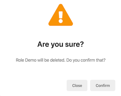
const options: Partial<Confirmation.Options> = {
  hideCancelBtn: false,
  hideYesBtn: false,
  dismissible: false,
  cancelText: "Close",
  yesText: "Confirm",
  messageLocalizationParams: ["Demo"],
  titleLocalizationParams: [],
  // You can customize icon
  // icon: 'fa fa-exclamation-triangle', // or
  // iconTemplate : '<img src="custom-image-path.jpg" alt=""/>'
};

this.confirmation.warn(
  "AbpIdentity::RoleDeletionConfirmationMessage",
  "Are you sure?",
  options
);
hideCancelBtnoption hides the cancellation button whentrue. Default value isfalse.hideYesBtnoption hides the confirmation button whentrue. Default value isfalse.dismissibleoption allows dismissing the confirmation popup by pressing escape or clicking the backdrop. Default value istrue.cancelTextis the text of the cancellation button. A localization key or localization object can be passed. Default value isAbpUi::Cancel.yesTextis the text of the confirmation button. A localization key or localization object can be passed. Default value isAbpUi::Yes.messageLocalizationParamsis the interpolation parameters for the localization of the message.titleLocalizationParamsis the interpolation parameters for the localization of the title.iconis the custom class of the icon. Default value isundefined.iconTemplateis the template for icon. Default value isundefined.
With the options above, the confirmation popup looks like this:
You are able to pass in an HTML string as title, message, or button texts. Here is an example:
const options: Partial<Confirmation.Options> = {
  yesText: '<i class="fa fa-trash mr-1"></i>Yes, delete it',
};

this.confirmation.warn(
  `
    <strong>Role Demo</strong> will be <strong>deleted</strong>
    <br>
    Do you confirm that?
  `,
  '<span class="my-custom-title">Are you sure?</span>',
  options
);
Since the values are HTML now, localization should be handled manually. Check out the LocalizationService to see how you can accomplish that.
Please note that all strings will be sanitized by Angular and not every HTML string will work. Only values that are considered as "safe" by Angular will be displayed.
### How to Remove a Confirmation Popup
The open confirmation popup can be removed manually via the clear method:
this.confirmation.clear();
How to Change Icons of The Confirmation Popup
You can change icons with the withConfirmationIcon() method inside provideAbpThemeShared function in the app.config.ts. The changes will affect all confirmation popup in the project.
import {
  provideAbpThemeShared,
  withConfirmationIcon,
} from "@abp/ng.theme.shared";

export const appConfig: ApplicationConfig = {
  providers: [
    // ...
    provideAbpThemeShared(
      withConfirmationIcon({
        info: 'fa fa-info-circle',
        success: 'fa fa-check-circle',
        warning: 'fa fa-exclamation-triangle',
        error: 'fa fa-times-circle',
        default: 'fa fa-question-circle',
      })
    ),
  ],
};
API
success
success(
  message: Config.LocalizationParam,
  title: Config.LocalizationParam,
  options?: Partial<Confirmation.Options>,
): Observable<Confirmation.Status>
See the
LocalizationParamtype andConfirmationnamespace
warn
warn(
  message: Config.LocalizationParam,
  title: Config.LocalizationParam,
  options?: Partial<Confirmation.Options>,
): Observable<Confirmation.Status>
error
error(
  message: Config.LocalizationParam,
  title: Config.LocalizationParam,
  options?: Partial<Confirmation.Options>,
): Observable<Confirmation.Status>
info
info(
  message: Config.LocalizationParam,
  title: Config.LocalizationParam,
  options?: Partial<Confirmation.Options>,
): Observable<Confirmation.Status>
clear
clear(
  status: Confirmation.Status = Confirmation.Status.dismiss
): void
statusparameter is the value of the confirmation closing event.

