


Blazor UI: Toolbars
The Toolbar system is used to define toolbars on the user interface. Modules (or your application) can add items to a toolbar, then the theme renders the toolbar on the layout.
There is only one standard toolbar named "Main" (defined as a constant: StandardToolbars.Main). The Basic Theme renders the main toolbar as shown below:
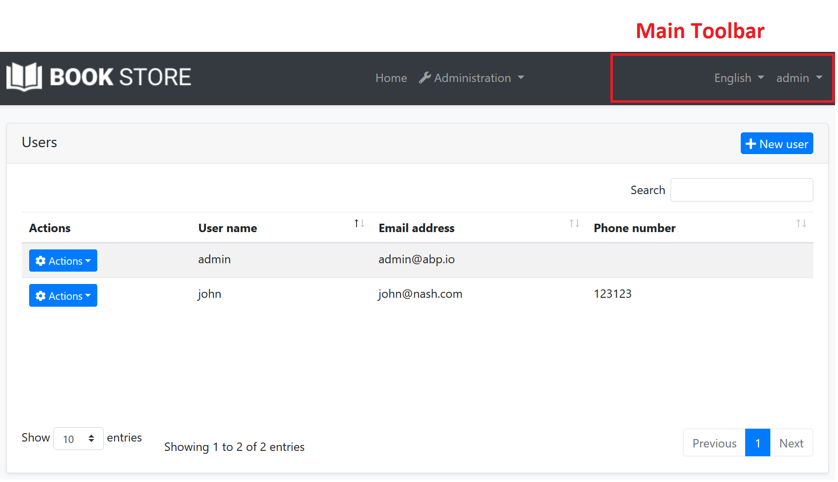
In the screenshot above, there are two items added to the main toolbar: Language switch component & user menu. You can add your own items here.
Also, LeptonX Lite Theme and LeptonX Theme has 2 different toolbars for desktop and mobile views which defined as constants.
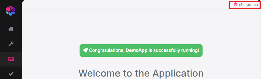
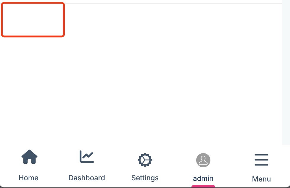
LeptonX Lite Theme
LeptonXLiteToolbars.MainLeptonXLiteToolbars.MainMobile
| LeptonXLiteToolbars.Main | LeptonXLiteToolbars.MainMobile |
|---|---|
 |
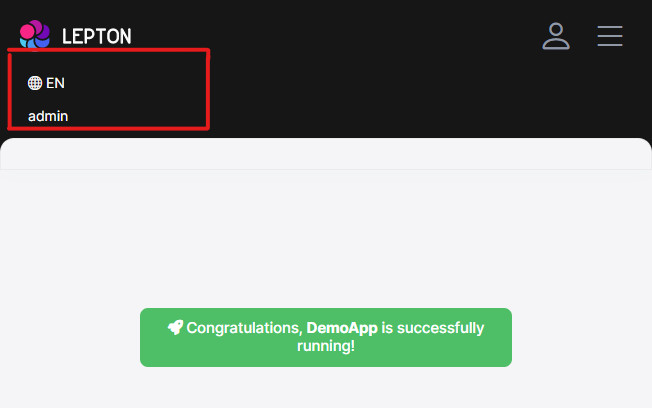 |
LeptonX Theme
LeptonXToolbars.MainLeptonXToolbars.MainMobile
| LeptonXToolbars.Main | LeptonXToolbars.MainMobile |
|---|---|
 |
 |
Example: Add a Notification Icon
In this example, we will add a notification (bell) icon to the left of the language switch item. A item in the toolbar should be a Razor Component. So, first, create a new razor component in your project (the location of the component doesn't matter):
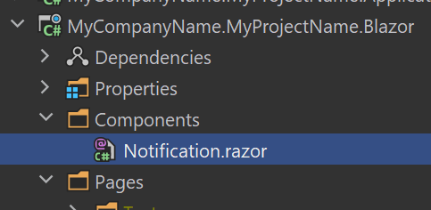
The content of the Notification.razor is shown below:
@inherits Volo.Abp.AspNetCore.Components.AbpComponentBase
<div style="color: white; margin: 8px;">
    <i class="far fa-bell" @onclick="ShowNotifications"></i>
</div>
@code {
    private async Task ShowNotifications()
    {
        await Message.Info("TODO: Show notifications");
    }
}
This sample simply shows a message. In real life, you probably want to call an HTTP API to get notifications and show on the UI.
Now, we can create a class implementing the IToolbarContributor interface:
using Volo.Abp.AspNetCore.Components.Web.Theming.Toolbars;

// ...

public class MyToolbarContributor : IToolbarContributor
{
    public Task ConfigureToolbarAsync(IToolbarConfigurationContext context)
    {
        if (context.Toolbar.Name == StandardToolbars.Main)
        {
            context.Toolbar.Items.Insert(0, new ToolbarItem(typeof(Notification)));
        }

        return Task.CompletedTask;
    }
}
This class adds the NotificationViewComponent as the first item in the Main toolbar.
Finally, you need to add this contributor to the AbpToolbarOptions, in the ConfigureServices of your module:
using Volo.Abp.AspNetCore.Components.Web.Theming.Toolbars;
Configure<AbpToolbarOptions>(options =>
{
    options.Contributors.Add(new MyToolbarContributor());
});
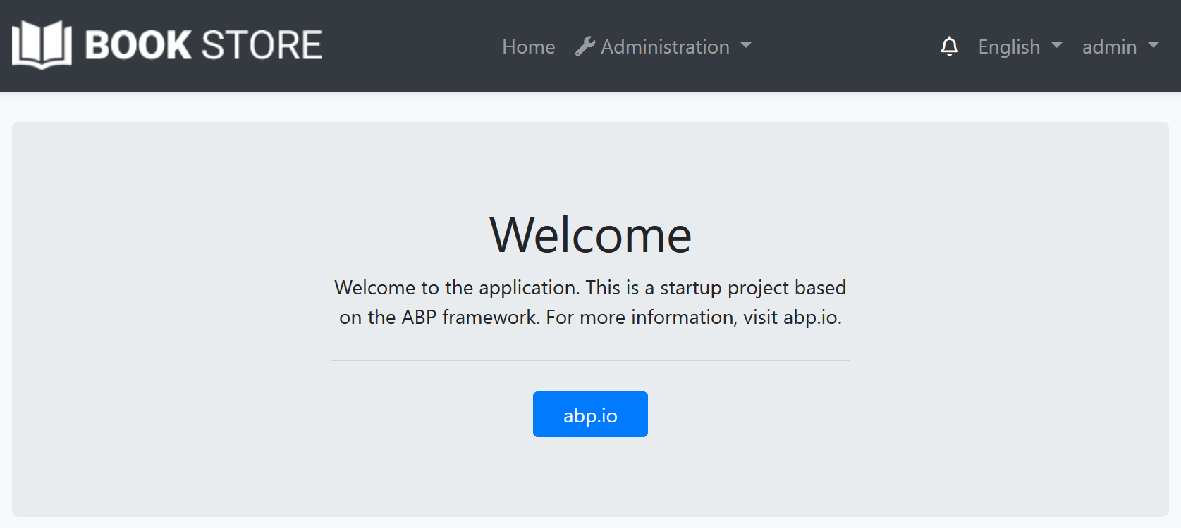
That's all, you will see the notification icon on the toolbar when you run the application:
IToolbarManager
IToolbarManager is used to render the toolbar. It returns the toolbar items by a toolbar name. This is generally used by the themes to render the toolbar on the layout.

