


Show Password Directive
In password input, text can be shown easily via changing input type attribute to text. To make this even easier, you can use the ShowPasswordDirective which has been exposed by the @abp/ng.core package.
Getting Started
ShowPasswordDirective is standalone. In order to use the it in an HTML template, import it to your component:
Importing to Component
import { ShowPasswordDirective } from '@abp/ng.core';

@Component({
  //...
  imports: [
   // ...,
   ShowPasswordDirective
  ],
})
export class TestComponent {}
Usage
The ShowPasswordDirective is very easy to use. The directive's selector is abpShowPassword. By adding the abpShowPassword attribute to an input element, you can activate the ShowPasswordDirective for the input element.
See an example usage:
import { ShowPasswordDirective } from '@abp/ng.core';
@Component({
  selector: 'sample-component',
  template: `
    <div class="d-flex flex-column">
      <label>Password</label>
      <input [abpShowPassword]="showPassword"/>
      <i (click)="showPassword = !showPassword">icon</i>
    </div>
  `,
  imports: [ShowPasswordDirective]
})
export class SampleComponent{
  showPassword = false;
}
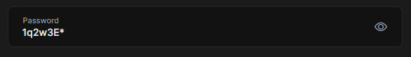
The abpShowPassword attribute has been added to the <input> element. Click icon to activate the ShowPasswordDirective.
See the result:
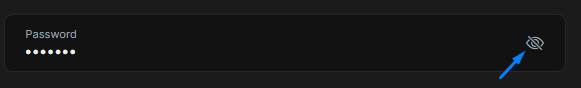
To see password input click icon.

