


LeptonX Blazor UI
LeptonX theme is implemented and ready to use with ABP. No custom implementation is needed for Blazor Server & WebAssembly.
Installation
Complete the MVC Razor Pages Installation for the HttpApi.Host application first. If the solution is tiered/micro-service, complete the MVC steps for all MVC applications such as HttpApi.Host and if Auth Server is separated, install to the OpenIddict.
Add Volo.Abp.AspNetCore.Components.WebAssembly.LeptonXTheme.Bundling package to your Blazor application with the following command:
dotnet add package Volo.Abp.AspNetCore.Components.WebAssembly.LeptonXTheme.Bundling --prereleaseRemove Volo.Abp.AspNetCore.Components.WebAssembly.LeptonTheme.Bundling reference from the project since it's not necessary after switching to LeptonX Lite.
Remove the old theme from the DependsOn attribute in your module class and add the AbpAspNetCoreComponentsWebAssemblyLeptonXThemeBundlingModule type to the DependsOn attribute.
[DependsOn(
     // Remove LeptonTheme module from DependsOn attribute
-    typeof(AbpAspNetCoreComponentsWebAssemblyLeptonThemeBundlingModule),

    // Add LeptonX Lite module to DependsOn attribute
+    typeof(AbpAspNetCoreComponentsWebAssemblyLeptonXThemeBundlingModule),
)]
Add Volo.Abp.AspNetCore.Components.WebAssembly.LeptonXTheme package to your Blazor.Client application with the following command:
dotnet add package Volo.Abp.AspNetCore.Components.WebAssembly.LeptonXTheme --prereleaseRemove Volo.Abp.AspNetCore.Components.WebAssembly.LeptonTheme reference from the project since it's not necessary after switching to LeptonX Lite.
Remove the old theme from the DependsOn attribute in your module class and add the AbpAspNetCoreComponentsWebAssemblyLeptonXThemeModule type to the DependsOn attribute.
[DependsOn(
     // Remove LeptonTheme module from DependsOn attribute
-    typeof(AbpAspNetCoreComponentsWebAssemblyLeptonThemeModule),

    // Add LeptonX Lite module to DependsOn attribute
+    typeof(AbpAspNetCoreComponentsWebAssemblyLeptonXThemeModule),
)]
Update Routes.razor file in Blazor.Client project as below:
@using Microsoft.Extensions.Options
@using Microsoft.Extensions.Localization
@using global::Localization.Resources.AbpUi
@using Volo.Abp.AspNetCore.Components.Web.LeptonXTheme
@using Volo.Abp.AspNetCore.Components.Web.LeptonXTheme.Components
@using Volo.Abp.AspNetCore.Components.Web.LeptonXTheme.Components.ApplicationLayout
@using Volo.Abp.AspNetCore.Components.Web.Theming.Routing
@using Volo.Abp.AspNetCore.Components.WebAssembly.WebApp
@inject IOptions<AbpRouterOptions> RouterOptions
@inject IOptions<LeptonXThemeBlazorOptions> LayoutOptions
@inject IStringLocalizer<AbpUiResource> UiLocalizer

<CascadingAuthenticationState>
    <Router AppAssembly="RouterOptions.Value.AppAssembly" AdditionalAssemblies="WebAppAdditionalAssembliesHelper.GetAssemblies<YourBlazorClientModule>()">
        <Found Context="routeData">
            <AuthorizeRouteView RouteData="@routeData" DefaultLayout="@LayoutOptions.Value.Layout">
                <NotAuthorized>
                    @if (context.User?.Identity?.IsAuthenticated != true)
                    {
                        <RedirectToLogin/>
                    }
                    else
                    {
                        <ErrorView
                            Title="@UiLocalizer["403Message"]"
                            HttpStatusCode="403"
                            Message="@UiLocalizer["403MessageDetail"]"/>
                    }
                </NotAuthorized>
            </AuthorizeRouteView>
        </Found>
        <NotFound>
            <LayoutView Layout="@LayoutOptions.Value.Layout">
                <ErrorView
                    Title="@UiLocalizer["404Message"]"
                    HttpStatusCode="404"
                    Message="@UiLocalizer["404MessageDetail"]"/>
            </LayoutView>
        </NotFound>
    </Router>
</CascadingAuthenticationState>
Source-Code
You can download the source-code of the LeptonX Theme according to you your ABP License.
Visit the LeptonX Source Code section to download the source-code.
Customization
Before starting to customize the theme, you can consider downloading the source code of the theme. You can find the original codes of related components below in the source code.
Themes
You can set default theme or add or remove themes via using LeptonXThemeOptions.
DefaultStyle: Defines deffault fallback theme. Default value is DimConfigure<LeptonXThemeOptions>(options => { options.DefaultStyle = LeptonXStyleNames.Dark; });Styles: Defines selectable themes from UI.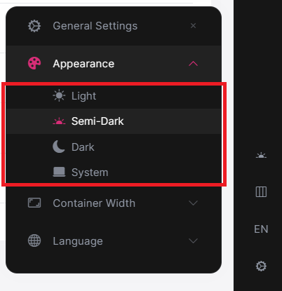
Configure<LeptonXThemeOptions>(options => { // Removing existing themes options.Styles.Remove(LeptonXStyleNames.Light); // Adding a new theme options.Styles.Add("red", new LeptonXThemeStyle( LocalizableString.Create<YourResource>("Theme:Red"), "bi bi-circle-fill")); });red.cssandbootstrap-red.csshave to be added under thewwwroot/_content/Volo.Abp.AspNetCore.Components.Web.LeptonXTheme/side-menu/css/folder to switch to your custom theme properly when selected.If your layout is TopMenu, then you have to add them under the
wwwroot/_content/Volo.Abp.AspNetCore.Components.Web.LeptonXTheme/top-menu/css/folder.
LeptonXThemeBlazorOptions
Layout options of Blazor UI can be manageable via using LeptonXThemeMvcOptions.
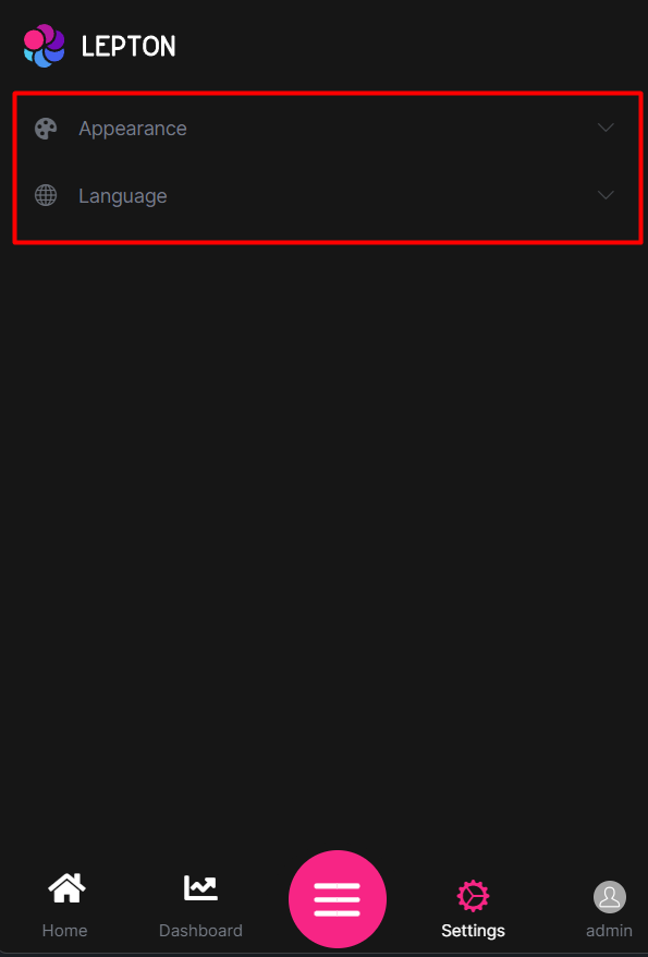
Layout: Layout of main application. Default value isLeptonXMvcLayouts.SideMenuConfigure<LeptonXThemeBlazorOptions>(options => { options.Layout = LeptonXBlazorLayouts.SideMenu; // Or your custom implemented layout: options.Layout = typeof(MyCustomLayoutComponent); });MobileMenuSelector: Defines items to be displayed at mobile menu. Default value is first 2 items from main menu items.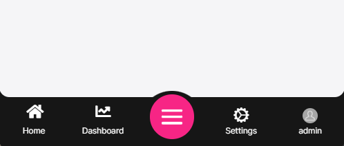
Configure<LeptonXThemeBlazorOptions>(options =>
{
    options.MobileMenuSelector = items => items.Where(x => x.MenuItem.Name == "MyProjectName.Home" || x.MenuItem.Name == "MyProjectName.Dashboard");
});
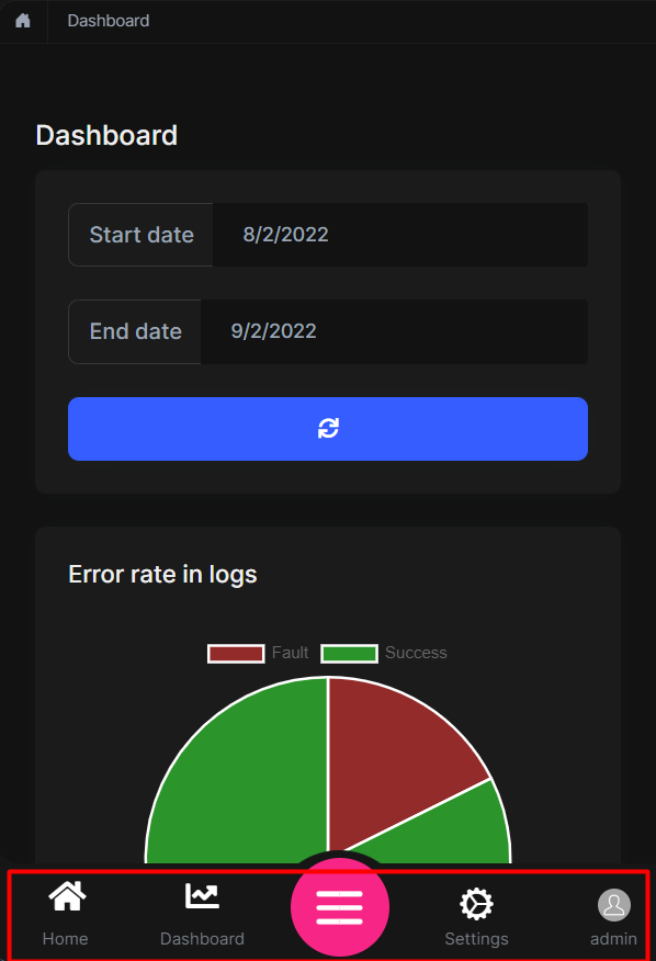
Toolbars
LeptonX includes separeted toolbars for desktop & mobile. You can manage toolbars independently. Toolbar names can be accessible in the LeptonXToolbars class.
LeptonXToolbars.MainLeptonXToolbars.MainMobile
public async Task ConfigureToolbarAsync(IToolbarConfigurationContext context)
{
    if (context.Toolbar.Name == LeptonXToolbars.Main)
    {
        context.Toolbar.Items.Add(new ToolbarItem(typeof(MyDesktopComponent)));
    }

    if (context.Toolbar.Name == LeptonXToolbars.MainMobile)
    {
        context.Toolbar.Items.Add(new ToolbarItem(typeof(MyMobileComponent)));
    }

    return Task.CompletedTask;
}
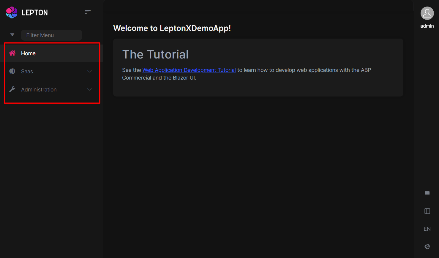
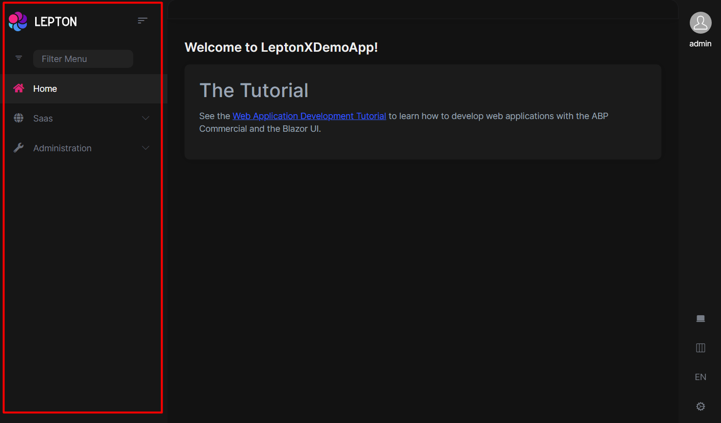
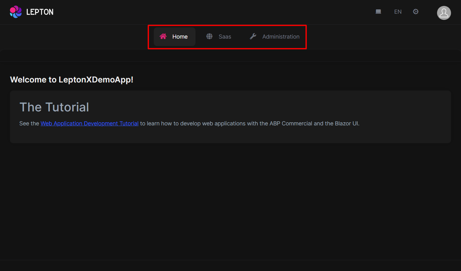
Layouts
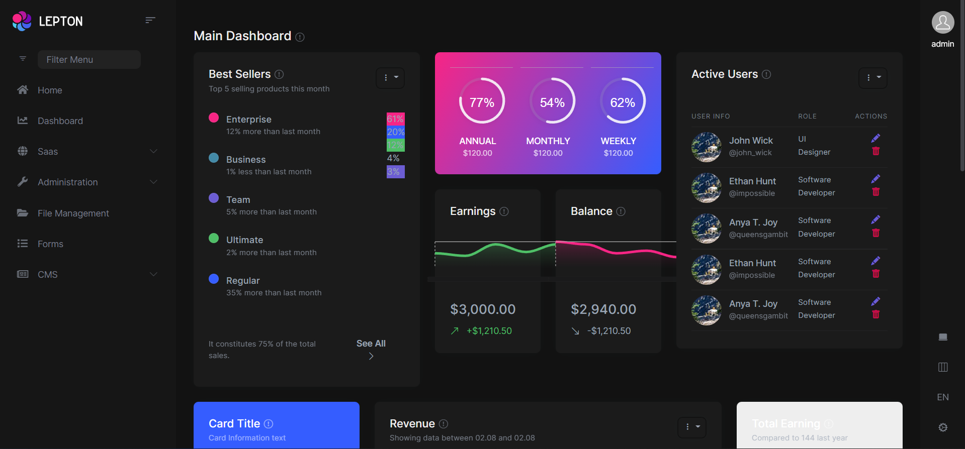
LeptonX offers two ready-made layouts for your web application. One of them is placed with the menu items on the top and the other with the menu items on the sides.
Top Menu Layout
Side Menu Layout
You can override layouts by following the steps below:
- Create a razor page, like
MySideMenuLayout.razor, in your blazor application as shown below:
@using Volo.Abp.AspNetCore.Components.Web.LeptonXTheme.Components.ApplicationLayout;
@using Volo.Abp.DependencyInjection

@inherits SideMenuLayout
@attribute [ExposeServices(typeof(SideMenuLayout))]
@attribute [Dependency(ReplaceServices = true)]

@Name
- If you prefer to use a code-behind file for the C# code of your component, create a razor component, like
MySideMenuLayout.razor.cs, in your blazor application as shown below:
using Volo.Abp.AspNetCore.Components.Web.LeptonXTheme.Components.ApplicationLayout;
using Volo.Abp.DependencyInjection;

namespace LeptonX.DemoApp.Blazor.MyComponents
{
    [ExposeServices(typeof(SideMenuLayout))]
    [Dependency(ReplaceServices = true)]
    public partial class MySideMenuLayout
    {
        public string Name = "My Top Layout";
    }
}
Don't forget to remove repeated attributes from the razor page!
Customizing the Footer Section
You can add a new LeptonXFooter.razor file and override the Footer component as follows:
@using Volo.Abp.DependencyInjection
@using Volo.Abp.AspNetCore.Components.Web.LeptonXTheme.Components.ApplicationLayout.SideMenu

@inherits Footer
@attribute [ExposeServices(typeof(Footer))]
@attribute [Dependency(ReplaceServices = true)]

<div class="lpx-footbar-container">
    <div class="lpx-footbar">
        <div class="lpx-footbar-copyright">
            <span>@DateTime.UtcNow.Year©</span>
            <a href="https://leptontheme.com/" target="_blank">Lepton ThemeXXX</a>
            <span>by</span>
            <a href="https://volosoft.com/" target="_blank">Volosoft</a>
        </div>
        <div class="lpx-footbar-solo-links">
            <a href="#">About</a>
            <a href="#">Privacy</a>
            <a href="#">Contact</a>
        </div>
    </div>
</div>
If you are using Top Menu Layout, then you can change the namespace as follows:
- @using Volo.Abp.AspNetCore.Components.Web.LeptonXTheme.Components.ApplicationLayout.SideMenu
+ @using Volo.Abp.AspNetCore.Components.Web.LeptonXTheme.Components.ApplicationLayout.TopMenu
You can use the same approach customize the other components always.
Common Components
Commonly used components in all layouts.
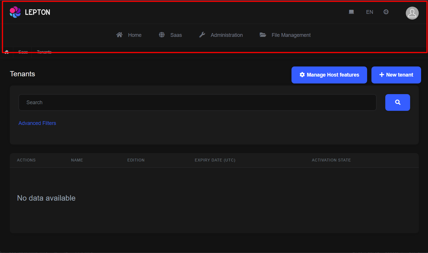
Breadcrumb
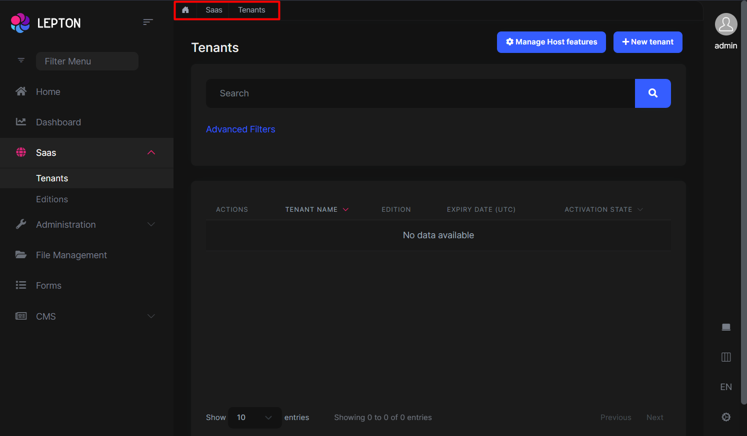
Breadcrumbs can be customized by using the PageLayout service. See the PageLayout - BreadCrumb section for more information.
If you need to replace the component, you can follow the steps below.
- Create a razor page, like
MyBreadcrumbs.razor, in your blazor application as shown below:
@using Volo.Abp.AspNetCore.Components.Web.LeptonXTheme.Components.ApplicationLayout.Common;
@using Volo.Abp.DependencyInjection

@inherits Breadcrumbs
@attribute [ExposeServices(typeof(Breadcrumbs))]
@attribute [Dependency(ReplaceServices = true)]

@Name
- If you prefer to use a code-behind file for the C# code of your component, create a razor component, like
MyBreadcrumbs.razor.cs, in your blazor application as shown below:
using Volo.Abp.AspNetCore.Components.Web.LeptonXTheme.Components.ApplicationLayout.Common;
using Volo.Abp.DependencyInjection;

namespace LeptonX.DemoApp.Blazor.MyComponents
{
    [ExposeServices(typeof(Breadcrumbs))]
    [Dependency(ReplaceServices = true)]
    public partial class MyBreadcrumbsComponent
    {
        public string Name = "My Breadcrumbs";
    }
}
Content Toolbar
- Create a razor page, like
MyContentToolbar.razor, in your blazor application as shown below:
@using Volo.Abp.AspNetCore.Components.Web.LeptonXTheme.Components.ApplicationLayout.Common;
@using Volo.Abp.DependencyInjection

@inherits ContentToolbar
@attribute [ExposeServices(typeof(ContentToolbar))]
@attribute [Dependency(ReplaceServices = true)]

@Name
- If you prefer to use a code-behind file for the C# code of your component, create a razor component, like
MyContentToolbar.razor.cs, in your blazor application as shown below:
using Volo.Abp.AspNetCore.Components.Web.LeptonXTheme.Components.ApplicationLayout.Common;
using Volo.Abp.DependencyInjection;

namespace LeptonX.DemoApp.Blazor.MyComponents
{
    [ExposeServices(typeof(ContentToolbar))]
    [Dependency(ReplaceServices = true)]
    public partial class MyContentToolbarComponent
    {
        public string Name = "My Content Toolbar";
    }
}
General Settings
- Create a razor page, like
MyGeneralSettings.razor, in your blazor application as shown below:
@using Volo.Abp.AspNetCore.Components.Web.LeptonXTheme.Components.ApplicationLayout.Common;
@using Volo.Abp.DependencyInjection

@inherits GeneralSettings
@attribute [ExposeServices(typeof(GeneralSettings))]
@attribute [Dependency(ReplaceServices = true)]

@Name
- If you prefer to use a code-behind file for the C# code of your component, create a razor component, like
MyGeneralSettings.razor.cs, in your blazor application as shown below:
using Volo.Abp.AspNetCore.Components.Web.LeptonXTheme.Components.ApplicationLayout.Common;
using Volo.Abp.DependencyInjection;

namespace LeptonX.DemoApp.Blazor.MyComponents
{
    [ExposeServices(typeof(GeneralSettings))]
    [Dependency(ReplaceServices = true)]
    public partial class MyGeneralSettings
    {
        public string Name = "My General Settings";
    }
}
Mobile General Settings
- Create a razor page, like
MyMobileGeneralSettings.razor, in your blazor application as shown below:
@using Volo.Abp.AspNetCore.Components.Web.LeptonXTheme.Components.ApplicationLayout.Common;
@using Volo.Abp.DependencyInjection

@inherits MobileGeneralSettings
@attribute [ExposeServices(typeof(MobileGeneralSettings))]
@attribute [Dependency(ReplaceServices = true)]

@Name
- If you prefer to use a code-behind file for the C# code of your component, create a razor component, like
MyMobileGeneralSettings.razor.cs, in your blazor application as shown below:
using Volo.Abp.AspNetCore.Components.Web.LeptonXTheme.Components.ApplicationLayout.Common;
using Volo.Abp.DependencyInjection;

namespace LeptonX.DemoApp.Blazor.MyComponents
{
    [ExposeServices(typeof(MobileGeneralSettings))]
    [Dependency(ReplaceServices = true)]
    public partial class MyMobileGeneralSettings
    {
        public string Name = "My Mobile General Settings";
    }
}
Side Menu Components
Components used in the side menu layout.
Main Menu
- Create a razor page, like
MyMainMenu.razor, in your blazor application as shown below:
@using Volo.Abp.AspNetCore.Components.Web.LeptonXTheme.Components.ApplicationLayout.TopMenu.Navigation;
@using Volo.Abp.DependencyInjection

@inherits MainMenu
@attribute [ExposeServices(typeof(MainMenu))]
@attribute [Dependency(ReplaceServices = true)]

@Name
- If you prefer to use a code-behind file for the C# code of your component, create a razor component, like
MyMainMenu.razor.cs, in your blazor application as shown below:
using Volo.Abp.AspNetCore.Components.Web.LeptonXTheme.Components.ApplicationLayout.SideMenu.Navigation;
using Volo.Abp.DependencyInjection;

namespace LeptonX.DemoApp.Blazor.MyComponents
{
    [ExposeServices(typeof(MainMenu))]
    [Dependency(ReplaceServices = true)]
    public partial class MyMainMenuComponent
    {
        public string Name = "My Main Menu";
    }
}
Main Menu Item
- Create a razor page, like
MyMainMenuItem.razor, in your blazor application as shown below:
@using Volo.Abp.AspNetCore.Components.Web.LeptonXTheme.Components.ApplicationLayout.SideMenu.Navigation;
@using Volo.Abp.DependencyInjection

@inherits MainMenuItem
@attribute [ExposeServices(typeof(MainMenuItem))]
@attribute [Dependency(ReplaceServices = true)]

@Name
- If you prefer to use a code-behind file for the C# code of your component, create a razor component, like
MyMainMenuItem.razor.cs, in your blazor application as shown below:
using Volo.Abp.AspNetCore.Components.Web.LeptonXTheme.Components.ApplicationLayout.SideMenu.Navigation;
using Volo.Abp.DependencyInjection;

namespace LeptonX.DemoApp.Blazor.MyComponents
{
    [ExposeServices(typeof(MainMenu))]
    [Dependency(ReplaceServices = true)]
    public partial class MyMainMenuItemComponent
    {
        public string Name = "My Main Menu Item";
    }
}
Mobile Navbar
- Create a razor page, like
MyMobileNavbar.razor, in your blazor application as shown below:
@using Volo.Abp.AspNetCore.Components.Web.LeptonXTheme.Components.ApplicationLayout.SideMenu.Navigation;
@using Volo.Abp.DependencyInjection

@inherits MobileNavbar
@attribute [ExposeServices(typeof(MobileNavbar))]
@attribute [Dependency(ReplaceServices = true)]

@Name
- If you prefer to use a code-behind file for the C# code of your component, create a razor component, like
MyMobileNavbar.razor.cs, in your blazor application as shown below:
using Volo.Abp.AspNetCore.Components.Web.LeptonXTheme.Components.ApplicationLayout.SideMenu.Navigation;
using Volo.Abp.DependencyInjection;

namespace LeptonX.DemoApp.Blazor.MyComponents
{
    [ExposeServices(typeof(MobileNavbar))]
    [Dependency(ReplaceServices = true)]
    public partial class MyMobileNavbar
    {
        public string Name = "My Mobile Navbar";
    }
}
Main Header
- Create a razor page, like
MyMainHeader.razor, in your blazor application as shown below:
@using Volo.Abp.AspNetCore.Components.Web.LeptonXTheme.Components.ApplicationLayout.SideMenu.MainHeader
@using Volo.Abp.DependencyInjection

@inherits MainHeader
@attribute [ExposeServices(typeof(MainHeader))]
@attribute [Dependency(ReplaceServices = true)]

@Name
- If you prefer to use a code-behind file for the C# code of your component, create a razor component, like
MyMainHeader.razor.cs, in your blazor application as shown below:
using Volo.Abp.AspNetCore.Components.Web.LeptonXTheme.Components.ApplicationLayout.SideMenu.MainHeader;
using Volo.Abp.DependencyInjection;

namespace LeptonX.DemoApp.Blazor.MyComponents
{
    [ExposeServices(typeof(MainHeader))]
    [Dependency(ReplaceServices = true)]
    public partial class MyMainHeader
    {
        public string Name = "My Main Header";
    }
}
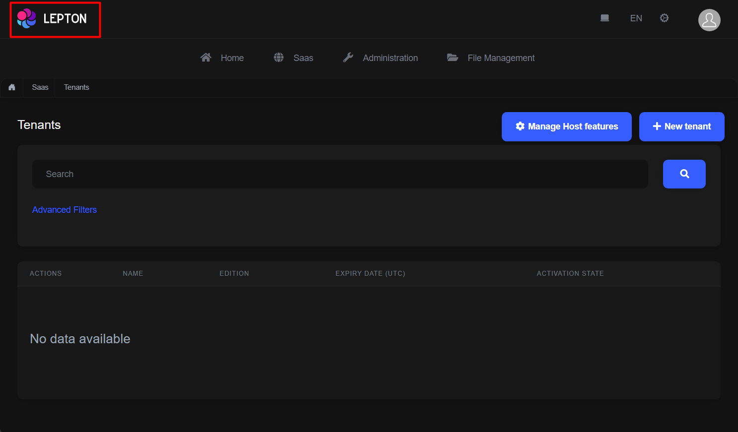
Main Header Branding
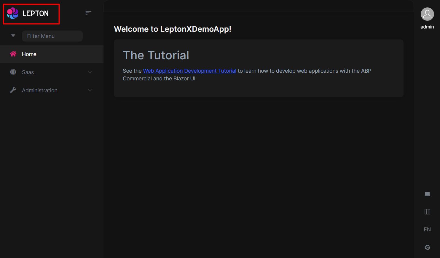
Application branding can be customized with the IBrandingProvider. See the Branding section for more information.
If you need to replace the component, you can follow the steps below.
- Create a razor page, like
MyMainHeaderBranding.razor, in your blazor application as shown below:
@using Volo.Abp.AspNetCore.Components.Web.LeptonXTheme.Components.ApplicationLayout.SideMenu.MainHeader
@using Volo.Abp.DependencyInjection

@inherits MainHeaderBranding
@attribute [ExposeServices(typeof(MainHeaderBranding))]
@attribute [Dependency(ReplaceServices = true)]

@Name
- If you prefer to use a code-behind file for the C# code of your component, create a razor component, like
MyMainHeaderBranding.razor.cs, in your blazor application as shown below:
using Volo.Abp.AspNetCore.Components.Web.LeptonXTheme.Components.ApplicationLayout.SideMenu.MainHeader;
using Volo.Abp.DependencyInjection;

namespace LeptonX.DemoApp.Blazor.MyComponents
{
    [ExposeServices(typeof(MainHeaderBranding))]
    [Dependency(ReplaceServices = true)]
    public partial class MyMainHeaderBranding
    {
        public string Name = "My Main Header Branding";
    }
}
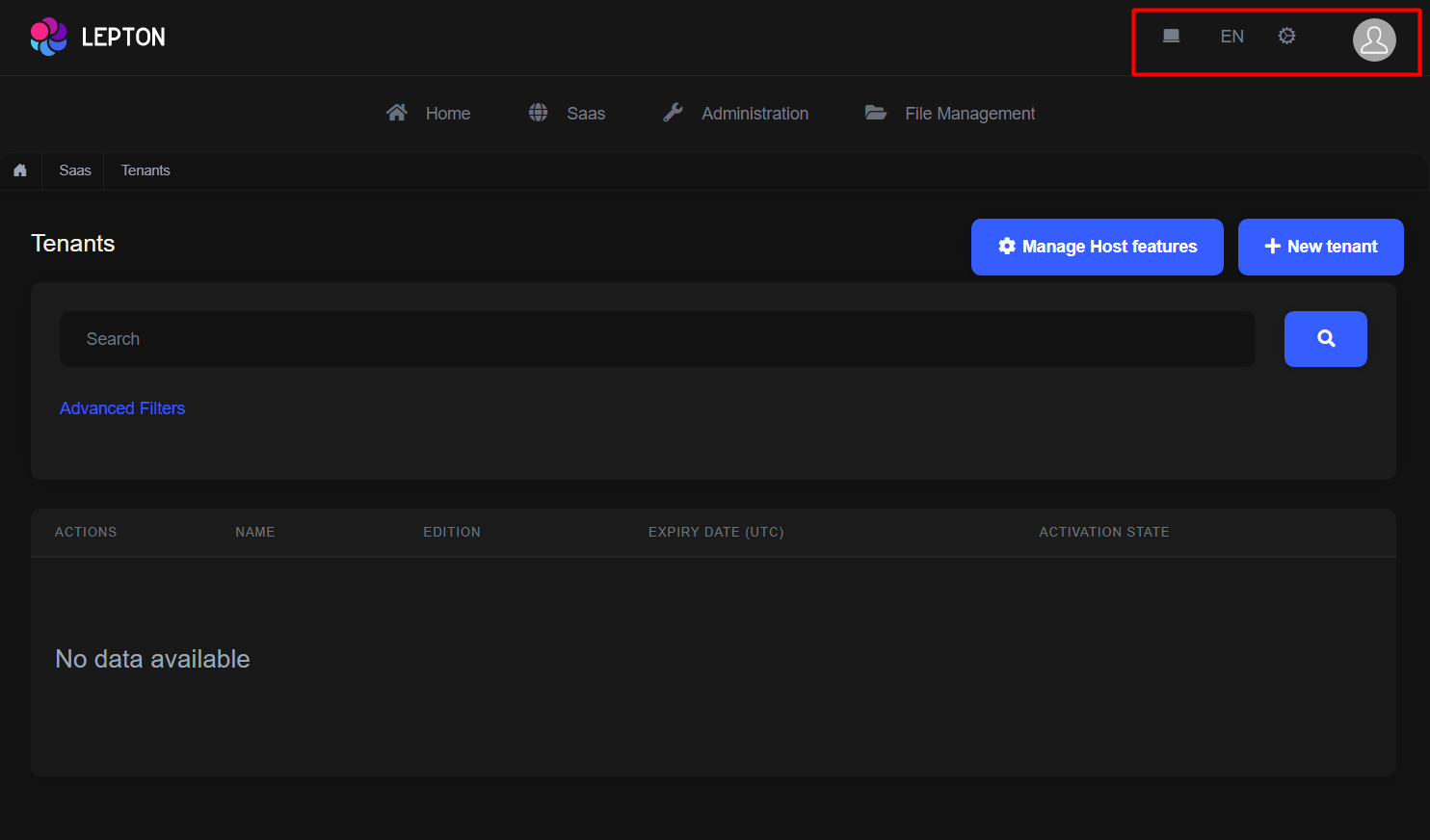
Main Header Toolbar
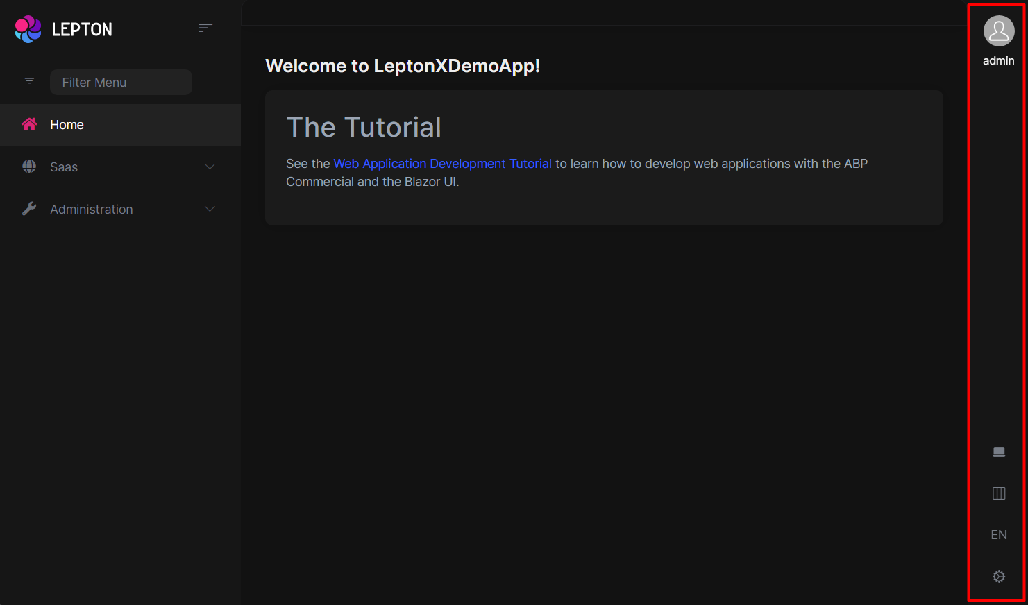
The main toolbar can be managed by using the ToolbarContributor classes. See the Toolbars section for more information.
If you need to replace the component, you can follow the steps below.
- Create a razor page, like
MyMainHeaderToolbar.razor, in your blazor application as shown below:
@using Volo.Abp.AspNetCore.Components.Web.LeptonXTheme.Components.ApplicationLayout.SideMenu.MainHeader
@using Volo.Abp.DependencyInjection

@inherits MainHeaderToolbar
@attribute [ExposeServices(typeof(MainHeaderToolbar))]
@attribute [Dependency(ReplaceServices = true)]

@Name
- If you prefer to use a code-behind file for the C# code of your component, create a razor component, like
MyMainHeaderToolbar.razor.cs, in your blazor application as shown below:
using Volo.Abp.AspNetCore.Components.Web.LeptonXTheme.Components.ApplicationLayout.SideMenu.MainHeader;
using Volo.Abp.DependencyInjection;

namespace LeptonX.DemoApp.Blazor.MyComponents
{
    [ExposeServices(typeof(MainHeaderToolbar))]
    [Dependency(ReplaceServices = true)]
    public partial class MyMainHeaderToolbar
    {
        public string Name = "My Main Header Toolbar";
    }
}
Top Menu Components
Components used in the top menu layout.
Main Menu
- Create a razor page, like
MyMainMenu.razor, in your blazor application as shown below:
@using Volo.Abp.AspNetCore.Components.Web.LeptonXTheme.Components.ApplicationLayout.TopMenu.Navigation;
@using Volo.Abp.DependencyInjection

@inherits MainMenu
@attribute [ExposeServices(typeof(MainMenu))]
@attribute [Dependency(ReplaceServices = true)]

@Name
- If you prefer to use a code-behind file for the C# code of your component, create a razor component, like
MyMainMenu.razor.cs, in your blazor application as shown below:
using Volo.Abp.AspNetCore.Components.Web.LeptonXTheme.Components.ApplicationLayout.TopMenu.Navigation;
using Volo.Abp.DependencyInjection;

namespace LeptonX.DemoApp.Blazor.MyComponents
{
    [ExposeServices(typeof(MainMenu))]
    [Dependency(ReplaceServices = true)]
    public partial class MyMainMenuComponent
    {
        public string Name = "My Main Menu";
    }
}
Main Menu Item
- Create a razor page, like
MyMainMenuItem.razor, in your blazor application as shown below:
@using Volo.Abp.AspNetCore.Components.Web.LeptonXTheme.Components.ApplicationLayout.TopMenu.Navigation;
@using Volo.Abp.DependencyInjection

@inherits MainMenuItem
@attribute [ExposeServices(typeof(MainMenuItem))]
@attribute [Dependency(ReplaceServices = true)]

@Name
- If you prefer to use a code-behind file for the C# code of your component, create a razor component, like
MyMainMenuItem.razor.cs, in your blazor application as shown below:
using Volo.Abp.AspNetCore.Components.Web.LeptonXTheme.Components.ApplicationLayout.TopMenu.Navigation;
using Volo.Abp.DependencyInjection;

namespace LeptonX.DemoApp.Blazor.MyComponents
{
    [ExposeServices(typeof(MainMenu))]
    [Dependency(ReplaceServices = true)]
    public partial class MyMainMenuItemComponent
    {
        public string Name = "My Main Menu Item";
    }
}
Mobile Navbar
- Create a razor page, like
MyMobileNavbar.razor, in your blazor application as shown below:
@using Volo.Abp.AspNetCore.Components.Web.LeptonXTheme.Components.ApplicationLayout.TopMenu.Navigation;
@using Volo.Abp.DependencyInjection

@inherits MobileNavbar
@attribute [ExposeServices(typeof(MobileNavbar))]
@attribute [Dependency(ReplaceServices = true)]

@Name
- If you prefer to use a code-behind file for the C# code of your component, create a razor component, like
MyMobileNavbar.razor.cs, in your blazor application as shown below:
using Volo.Abp.AspNetCore.Components.Web.LeptonXTheme.Components.ApplicationLayout.TopMenu.Navigation;
using Volo.Abp.DependencyInjection;

namespace LeptonX.DemoApp.Blazor.MyComponents
{
    [ExposeServices(typeof(MobileNavbar))]
    [Dependency(ReplaceServices = true)]
    public partial class MyMobileNavbar
    {
        public string Name = "My Mobile Navbar";
    }
}
Main Header
- Create a razor page, like
MyMainHeader.razor, in your blazor application as shown below:
@using Volo.Abp.AspNetCore.Components.Web.LeptonXTheme.Components.ApplicationLayout.TopMenu.MainHeader
@using Volo.Abp.DependencyInjection

@inherits MainHeader
@attribute [ExposeServices(typeof(MainHeader))]
@attribute [Dependency(ReplaceServices = true)]

@Name
- If you prefer to use a code-behind file for the C# code of your component, create a razor component, like
MyMainHeader.razor.cs, in your blazor application as shown below:
using Volo.Abp.AspNetCore.Components.Web.LeptonXTheme.Components.ApplicationLayout.TopMenu.MainHeader;
using Volo.Abp.DependencyInjection;

namespace LeptonX.DemoApp.Blazor.MyComponents
{
    [ExposeServices(typeof(MainHeader))]
    [Dependency(ReplaceServices = true)]
    public partial class MyMainHeader
    {
        public string Name = "My Main Header";
    }
}
Main Header Branding
Application branding can be customized with the IBrandingProvider. See the Branding section for more information.
- Create a razor page, like
MyMainHeaderBranding.razor, in your blazor application as shown below:
@using Volo.Abp.AspNetCore.Components.Web.LeptonXTheme.Components.ApplicationLayout.TopMenu.MainHeader
@using Volo.Abp.DependencyInjection

@inherits MainHeaderBranding
@attribute [ExposeServices(typeof(MainHeaderBranding))]
@attribute [Dependency(ReplaceServices = true)]

@Name
- If you prefer to use a code-behind file for the C# code of your component, create a razor component, like
MyMainHeaderBranding.razor.cs, in your blazor application as shown below:
using Volo.Abp.AspNetCore.Components.Web.LeptonXTheme.Components.ApplicationLayout.TopMenu.MainHeader;
using Volo.Abp.DependencyInjection;

namespace LeptonX.DemoApp.Blazor.MyComponents
{
    [ExposeServices(typeof(MainHeaderBranding))]
    [Dependency(ReplaceServices = true)]
    public partial class MyMainHeaderBranding
    {
        public string Name = "My Main Header Branding";
    }
}
Main Header Toolbar
The main toolbar can be managed by using the ToolbarContributor classes. See the Toolbars section for more information.
If you need to replace the component, you can follow the steps below.
- Create a razor page, like
MyMainHeaderToolbar.razor, in your blazor application as shown below:
@using Volo.Abp.AspNetCore.Components.Web.LeptonXTheme.Components.ApplicationLayout.TopMenu.MainHeader
@using Volo.Abp.DependencyInjection

@inherits MainHeaderToolbar
@attribute [ExposeServices(typeof(MainHeaderToolbar))]
@attribute [Dependency(ReplaceServices = true)]

@Name
- If you prefer to use a code-behind file for the C# code of your component, create a razor component, like
MyMainHeaderToolbar.razor.cs, in your blazor application as shown below:
using Volo.Abp.AspNetCore.Components.Web.LeptonXTheme.Components.ApplicationLayout.TopMenu.MainHeader;
using Volo.Abp.DependencyInjection;

namespace LeptonX.DemoApp.Blazor.MyComponents
{
    [ExposeServices(typeof(MainHeaderToolbar))]
    [Dependency(ReplaceServices = true)]
    public partial class MyMainHeaderToolbar
    {
        public string Name = "My Main Header Toolbar";
    }
}

